About this animation
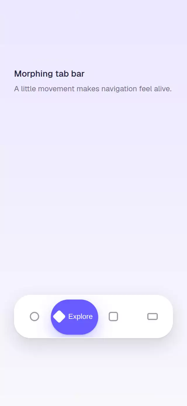
A React Native animated tab bar can show direction and destination with more character than a sliding underline. This bottom bar stretches its active capsule toward the next tab, then settles around the selected icon and label. Use it for four- or five-destination navigation in consumer apps, media libraries, dashboards, or compact product flows. The container measures its own width, and independent Reanimated springs move the capsule edges at different stiffnesses so the leading edge arrives first. At either end, extra width shifts inward to preserve the full silhouette instead of clipping. The component supports controlled and uncontrolled selection, light, dark, or automatic appearance, a custom accent color, and semantic tab roles with selected state.
When to use it
- Animate bottom navigation between four or five destinations.
- Emphasize the selected icon and label with a capsule.
- Fit an indicator to bars with different measured widths.
- Support controlled or locally managed tab selection.
A bottom bar whose active capsule stretches toward each new destination and settles around its icon and label.
How it works
- The container measures itself, so the indicator works at any width and keeps an even inset at both ends.
- Independent left and right edge springs move at different stiffnesses, so the leading edge arrives before the trailing edge.
- At the first and last tabs, the capsule shifts its extra width inward instead of clipping against the bar.
- The capsule settles to 82% of the bar height behind a white active icon and label.
Why this one
The indicator preserves its full silhouette at every tab. Edge transitions stay inside the bar while directing their stretch toward the content, so the same spring effect feels intentional rather than cropped.
Install
npx expo install react-native-reanimatedUsage
<MorphingTabBar items={[{ id: 'home', label: 'Home' }, { id: 'library', label: 'Library' }]} />Props
| Prop | Type | Default | Description |
|---|---|---|---|
items | TabBarItem[] | — | Four or five navigation options. |
value | string | — | Controlled active id. |
defaultValue | string | First item | Initial tab. |
accentColor | string | '#675CFF' | Drop color. |
colorScheme | light | dark | auto | auto | Appearance mode. |
Compatibility
Expo SDK 57, React Native 0.86, and Reanimated 4.5; iOS, Android, and web supported but unverified on devices.
Accessibility
Uses tab roles and selected state. Reduced Motion moves the capsule directly to its destination.
FAQ
- How many items does the animated tab bar support?
- The public API is designed for four or five navigation options. Each item has an id and label, and selection can be controlled with value or initialized with defaultValue.
- Does the morphing indicator clip at the first or last tab?
- No. At the bar edges, the capsule shifts its extra width inward so its stretched silhouette stays within the measured container.
- Is this React Native tab bar verified on devices?
- Not yet. iOS, Android, and web are listed as supported but unverified. Tabs expose their role and selected state, and Reduce Motion moves the capsule directly to its destination.