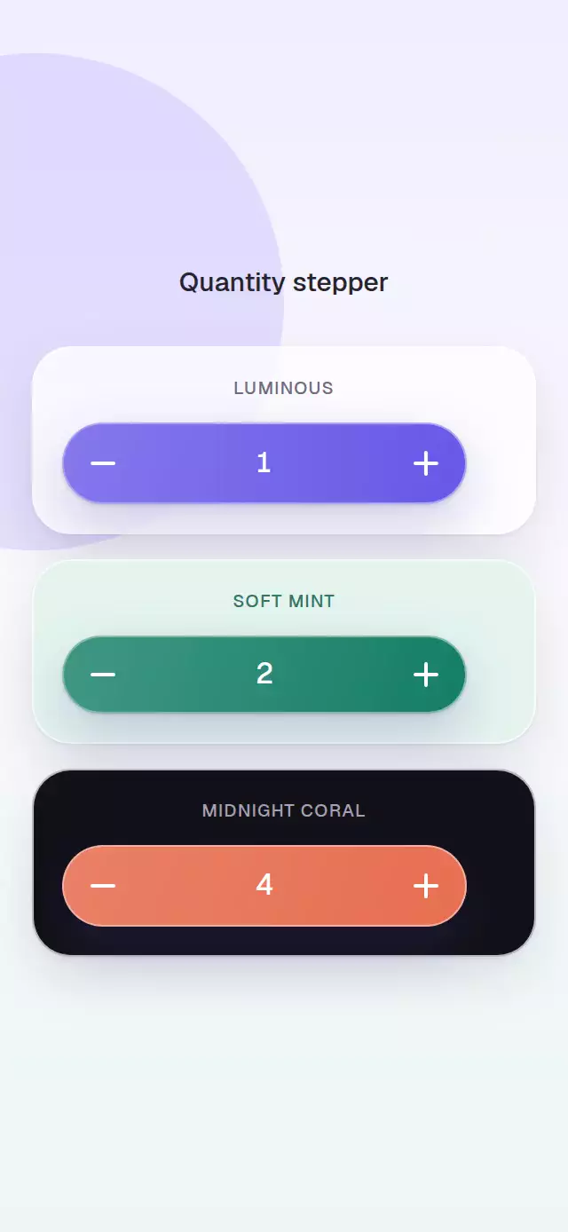
About this animation
An Add button that expands into a compact rolling quantity control and collapses again at zero.
How it works
- A shared progress value springs the control width and crossfades its two modes.
- Value changes commit outgoing and incoming numbers together before the roll begins.
- Press-and-hold starts after 420 ms and repeats every 110 ms.
- The first expansion triggers a short accent halo and clipped light sweep across the surface.
- Controlled and uncontrolled modes clamp every request to the configured range.
Install
npx expo install expo-linear-gradient react-native-reanimatedUsage
import QuantityStepper from './QuantityStepper';

<QuantityStepper onChange={(quantity) => updateCart(quantity)} />;
<QuantityStepper defaultValue={2} min={0} max={12} accentColor="#137D68" colorScheme="dark" />;
Props
| Prop | Type | Default | Description |
|---|---|---|---|
value / defaultValue | number | — / 0 | Controlled or initial quantity. |
onChange | (value: number) => void | — | Receives clamped requests. |
min / max | number | 0 / 99 | Quantity bounds. |
accentColor / textColor | string | Purple / white | Control colors. |
addLabel | string | 'Add' | Collapsed label. |
width / collapsedWidth / height | number | 142 / 88 / 46 | Control dimensions. |
duration | number | 240 | Expand/collapse duration. |
fontFamily | string | System font | Label and number font. |
colorScheme | 'light' | 'dark' | 'auto' | 'auto' | Surface appearance, with system-aware dark mode. |
repeatOnHold | boolean | true | Enables press-and-hold repeat. |
| accessibility labels | string | Descriptive defaults | Add, increase, and decrease labels. |
style / testID | style / string | — | Container and test customization. |
The ref exposes increment(), decrement(), setValue(value), and reset().
Compatibility
- Expo SDK 57, React Native 0.86, and Reanimated 4.5
- iOS, Android, and web supported; device verification pending
- Works in Expo Go
Accessibility
Each action is a labeled button and plus/minus controls announce disabled bounds. Reduced Motion removes expansion, scale, and rolling travel while retaining a short number crossfade.