About this animation
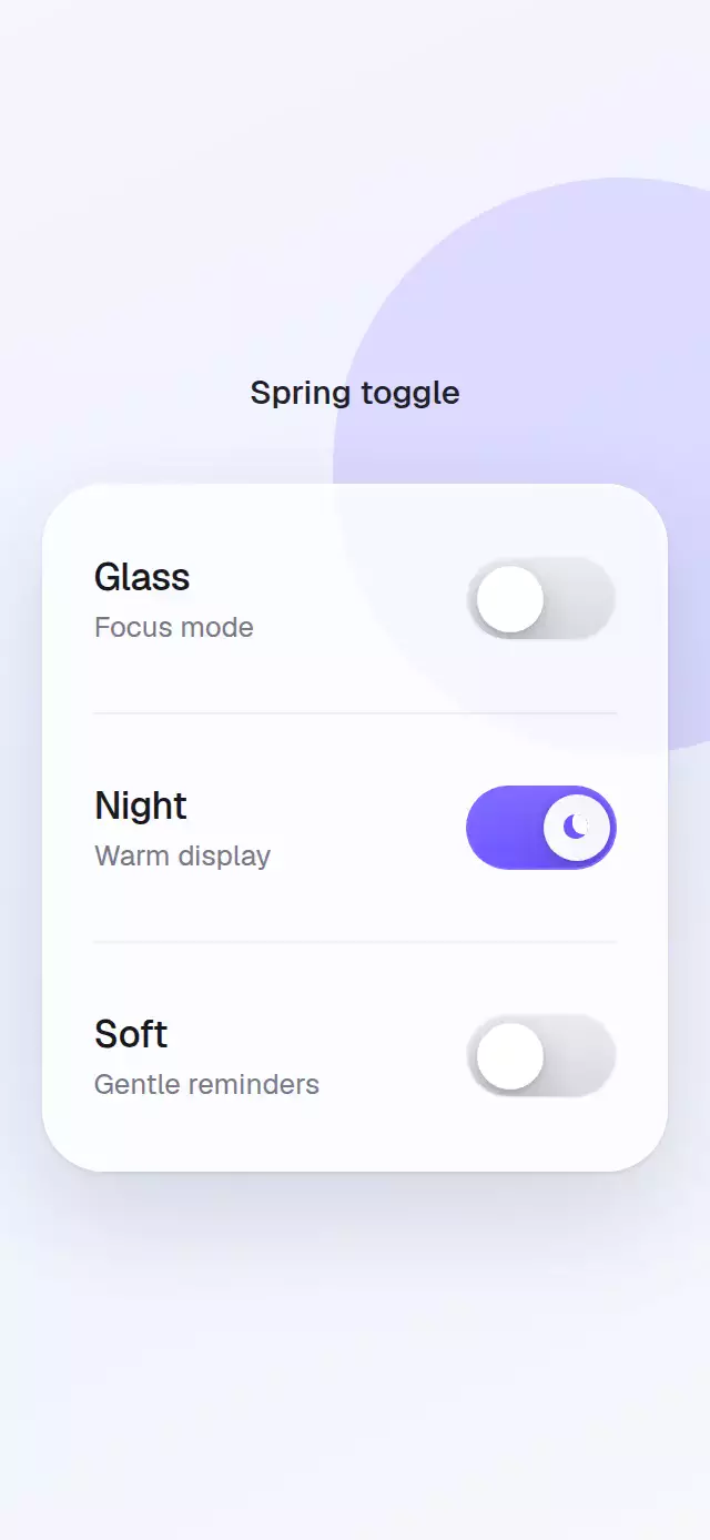
A draggable, light-reactive switch whose thumb stretches, glows, and settles with a spring.
How it works
- One shared progress value drives thumb position, track color, and icon blending.
- A pan gesture maps horizontal travel to progress and uses release velocity to choose the final state.
- Thumb width peaks halfway through the transition before returning to its resting shape.
- Controlled and uncontrolled state share the same request path, including the imperative API.
- A short active-state glow and light sweep provide the success beat without delaying input.
Install
npx expo install expo-linear-gradient react-native-gesture-handler react-native-reanimated react-native-workletsUsage
<SpringToggle defaultValue onValueChange={setEnabled} />

<SpringToggle size="lg" thumbIcon="sun-moon" onColor="#625BF6" springDamping={20} />

<SpringToggle colorScheme="dark" glowColor="#1FC28B" onColor="#1FC28B" />
Props
| Prop | Type | Default | Description |
|---|---|---|---|
value | boolean | — | Controlled value. |
defaultValue | boolean | false | Initial uncontrolled value. |
onValueChange | (value: boolean) => void | — | Receives requested values. |
size | 'sm' | 'md' | 'lg' | 'md' | Control size. |
onColor | string | '#625BF6' | On-track color. |
offColor | string | '#D7D7DE' | Off-track color. |
colorScheme | 'light' | 'dark' | 'auto' | 'auto' | Thumb and material appearance. |
glowColor | string | onColor | Active thumb glow color. |
thumbIcon | 'none' | 'sun-moon' | 'check' | 'none' | Thumb artwork. |
springDamping | number | 18 | Spring damping. |
springStiffness | number | 280 | Spring stiffness. |
accessibilityLabel | string | 'Toggle setting' | Screen-reader label. |
style | StyleProp<ViewStyle> | — | Outer style. |
testID | string | — | Test identifier. |
The ref exposes toggle() and setValue(value).
Compatibility
- Expo SDK 57, React Native 0.86, Reanimated 4.5
- iOS and Android supported but not device-verified; web verified by the project gate
- Works in Expo Go
Accessibility
The control exposes the switch role and checked state. Reduced Motion removes travel and stretch while preserving immediate state changes.
Source code
Free with an account
Sign in with your email to read the full source here, or install it in one command with the CLI.