About this animation
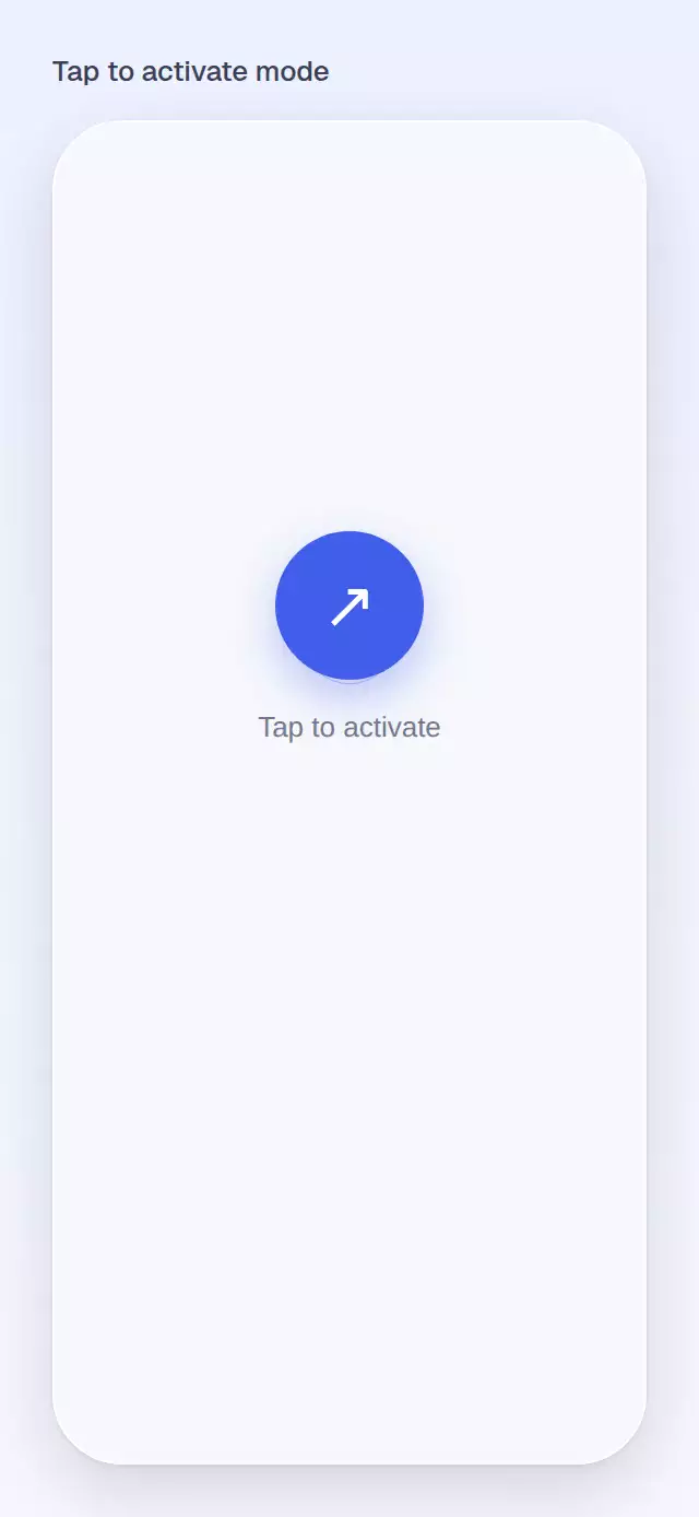
A focused activation moment with expanding waves and a compact status summary.
How it works
Tap the central control or provide active for controlled state. A spring drives the surface transition and summary reveal.
Install
npx expo install react-native-reanimated
Usage
<TapToActivateMode active={active} onToggle={setActive} />Props
| Prop | Type | Default | Description |
|---|---|---|---|
active | boolean | — | Controls the state externally. |
defaultActive | boolean | false | Initial state when uncontrolled. |
onToggle | (active: boolean) => void | — | Called after each toggle. |
rows | { label: string; value: string }[] | Mode, Apps blocked, Duration | Summary rows. |
accentColor | string | '#415EEA' | Active surface and wave color. |
accessibilityLabel | string | 'Focus mode' | Screen-reader label. |
style | StyleProp<ViewStyle> | — | Container style. |
testID | string | — | Test identifier. |
The forwarded ref exposes toggle() for guided demos and external controls.
Compatibility
Built for Expo SDK 57, React Native 0.86 and Reanimated 4.5. iOS and Android are supported but device-unverified; web is verified by the project gate. Works in Expo Go for SDK 57.
Accessibility
The control reports its selected state and reduced motion removes the wave expansion.