About this animation
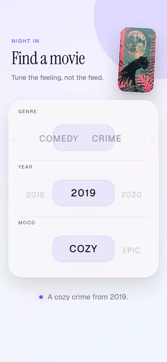
A React Native wheel picker should center short and long labels with equal precision instead of forcing every option into a fixed-width cell. This horizontal picker measures each label, then resolves taps, drags, momentum, and programmatic changes against its true center. Use it for genres, years, sizes, filters, or any compact choice set that benefits from a tactile browsing rhythm. One continuous Reanimated offset drives translation, scale, opacity, color, vertical curvature, and optional 3D rotation, while Gesture Handler preserves release velocity before the nearest option settles. The component supports controlled and uncontrolled values, custom label rendering, adjustable curve strength, colors, typography, change callbacks, and imperative next, previous, and select controls.
When to use it
- Choose genres, years, sizes, or filter values.
- Center labels with different measured widths.
- Add momentum and an optional 3D curve to selection.
- Control a picker through gestures, taps, or a ref.
A reusable horizontal wheel picker that gives uneven labels a precise center, physical momentum, and an optional 3D curve.
Why this one
Most horizontal pickers assume every option has the same width or hide the behavior inside a single screen. This component measures every label, supports controlled and uncontrolled state, and resolves momentum against the real center of each option. Its optional perspective curve, touch targets, imperative controls, and adjustable screen-reader actions make it useful beyond the included movie-filter demo.
How it works
- Every option reports its real layout center, so labels such as “Crime” and “Science Fiction” align without a fixed cell width.
- One continuous pixel offset drives track translation, scale, opacity, color, vertical curvature, and Y-axis rotation.
- A pan directly updates that offset with elastic edge resistance. On release,
withDecaypreserves momentum before a spring settles on the nearest measured center. - Tapping an option, calling the forwarded ref, or using an accessibility increment/decrement action follows the same selection path.
- The centered item emits a short violet glow pulse while reduced-motion mode replaces physical movement with a brief transition.
Install
npx expo install expo-linear-gradient react-native-gesture-handler react-native-reanimated react-native-workletsUsage
import WheelPicker from './WheelPicker';

export function GenreFilter() {
  return (
    <WheelPicker
      options={['Comedy', 'Drama', 'Science Fiction']}
      defaultValue="Comedy"
      onChange={(genre) => applyGenre(genre)}
    />
  );
}
Use controlled state and personality knobs when the picker belongs to a larger form:
const [year, setYear] = useState(2019);

<WheelPicker
  accessibilityLabel="Release year"
  activeColor="#15151C"
  curve={0.8}
  fontFamily="YourSansMedium"
  fontSize={20}
  inactiveColor="#9898A6"
  onChange={setYear}
  options={[2018, 2019, 2020, 2021]}
  renderLabel={(value) => String(value)}
  value={year}
/>;
The forwarded ref exposes next(), previous(), and select(value).
Props
| Prop | Type | Default | Description |
|---|---|---|---|
options | T[] | Required | Values displayed from first to last. |
value | T | — | Controlled selected value. |
defaultValue | T | First option | Initial uncontrolled value. |
onChange | (value: T) => void | — | Called whenever the centered value changes. |
renderLabel | (value: T) => string | String(value) | Produces the visible and accessible label. |
curve | number | 0.6 | Perspective strength from 0 to 1. |
fontFamily | string | System font | Option-label font family. |
activeColor | string | '#111111' | Centered-option color. |
inactiveColor | string | '#A3A3A3' | Side-option color. |
fontSize | number | 18 | Base label size in points. |
accessibilityLabel | string | 'Option picker' | Label for the adjustable control. |
style | StyleProp<ViewStyle> | — | Outer-container style. |
testID | string | — | Test identifier for the outer container. |
Compatibility
- Expo SDK 57
- React Native 0.86
- Reanimated 4.5 and Worklets 0.10
- iOS: supported, not yet verified on a device
- Android: supported, not yet verified on a device
- Web: supported, verified by the project export and bundle gate
- Works in Expo Go because its native dependencies are included in the SDK
Accessibility
The gesture surface uses the adjustable role, announces the selected label and position, and supports increment and decrement actions. Every option is also a labeled button, so tapping is an alternative to dragging. Reduced-motion mode removes perspective movement and decay, then settles with a short 180 ms transition.
FAQ
- Does this React Native wheel picker work in Expo Go?
- Yes. Expo Linear Gradient, Gesture Handler, Reanimated, and Worklets are included with Expo SDK 57. Web is verified; iOS and Android are supported with device verification still pending.
- Can the wheel picker handle labels with different widths?
- Yes. It measures the real center of every option, so labels such as short years and longer category names settle precisely without fixed-width cells.
- How can people use the picker without dragging?
- Every option is a labeled button, the adjustable control supports increment and decrement actions, and the ref exposes next, previous, and select. Reduce Motion removes perspective and decay.