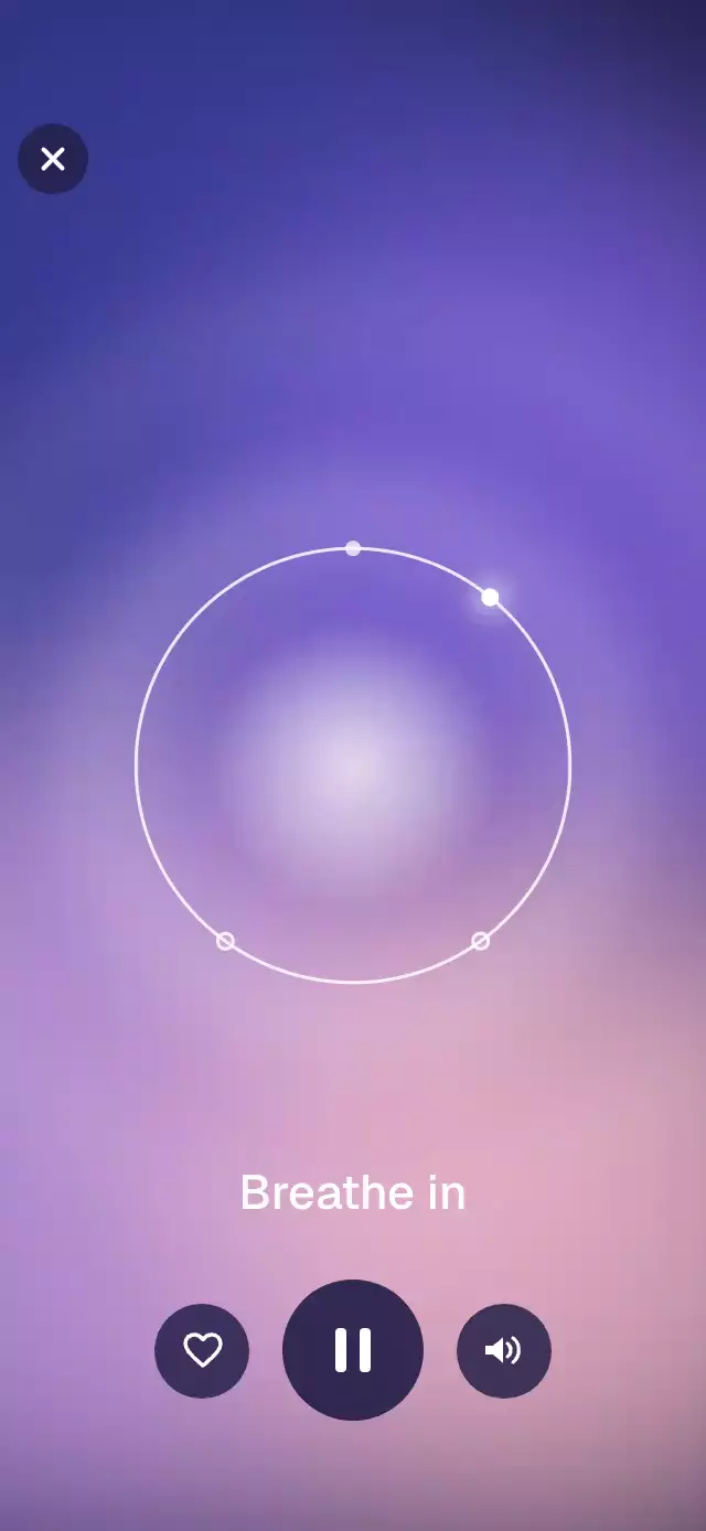
About this animation
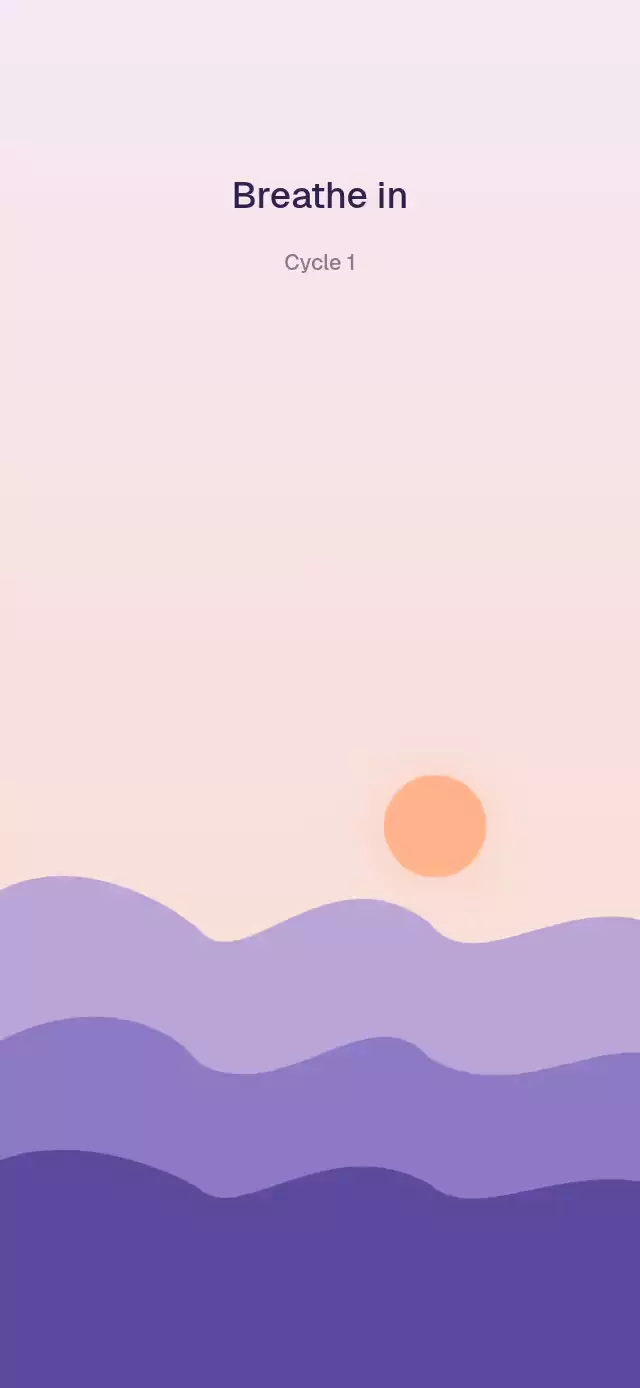
A guided breathing screen with a fluid color field, a phase-aware center glow, and a progress point that travels around a timed ring.
How it works
- The component measures its own container with
onLayout; every visual anchor and scalable size is derived from that width and height. - One
cycleTimeshared value advances in auseFrameCallbackworklet and folds at the combined inhale, hold, and exhale duration. Breath fullness, the orbital point, phase boundaries, waves, and glow all derive from that clock. - A second ambient clock moves four blurred Skia circles along slow elliptical paths. Both clocks read the same eased speed factor, so pausing gently slows the complete scene without moving the cycle position.
- A Reanimated reaction detects phase boundaries on the UI thread. Only those three changes per cycle cross to JavaScript to update the accessible label and call
onPhaseChange. - The three ring marks are calculated from the configured phase durations, so the constant-speed point reaches each mark exactly when its phase changes.
Install
npx expo install @shopify/react-native-skia react-native-reanimated react-native-workletsOn web, CanvasKit must finish loading before this component mounts. Call LoadSkiaWeb in your web entry point, then render the application:
import { LoadSkiaWeb } from '@shopify/react-native-skia/lib/module/web';

LoadSkiaWeb().then(() => {
  root.render(<App />);
});
Usage
import BreathingRing from './BreathingRing';

export function BreathingScreen() {
  return <BreathingRing />;
}
Customize the timing, copy, palette, callbacks, and imperative controls:
import { useRef } from 'react';
import BreathingRing, { type BreathingRingRef } from './BreathingRing';

export function BreathingScreen() {
  const breathingRef = useRef<BreathingRingRef>(null);

  return (
    <BreathingRing
      ref={breathingRef}
      inhaleSeconds={5}
      holdSeconds={2}
      exhaleSeconds={6}
      palette="lagoon"
      inhaleLabel="Breathe in"
      holdLabel="Hold"
      exhaleLabel="Breathe out"
      onPhaseChange={(phase, cycle) => trackPhase(phase, cycle)}
      onPausedChange={(paused) => trackPause(paused)}
      onClose={() => navigation.goBack()}
    />
  );
}
The forwarded ref exposes pause(), resume(), togglePause(), and restart().
Props
| Prop | Type | Default | Description |
|---|---|---|---|
inhaleSeconds | number | 4 | Seconds spent inhaling. |
holdSeconds | number | 2 | Seconds spent holding. |
exhaleSeconds | number | 4 | Seconds spent exhaling. |
palette | 'dusk' | 'lagoon' | BreathingPalette | 'dusk' | Built-in preset or custom base, blob, glow, and button colors. |
inhaleLabel | string | 'Breathe in' | Label shown while inhaling. |
holdLabel | string | 'Hold' | Label shown while holding. |
exhaleLabel | string | 'Breathe out' | Label shown while exhaling. |
initiallyPaused | boolean | false | Starts paused. |
initiallyFavorite | boolean | false | Starts favorited. |
initialSoundOn | boolean | true | Starts with sound enabled. |
fontFamily | string | System font | Font family for the phase label. |
onPhaseChange | (phase, cycle) => void | — | Called when a phase begins, with its zero-based cycle number. |
onPausedChange | (paused: boolean) => void | — | Called when the paused state changes. |
onFavoriteChange | (favorite: boolean) => void | — | Called when the favorite state changes. |
onSoundChange | (on: boolean) => void | — | Called when the sound state changes. |
onClose | () => void | — | Handles close; the close button is hidden when omitted. |
closeAccessibilityLabel | string | 'Close' | Close button label. |
pauseAccessibilityLabel | string | 'Pause' / 'Resume' | Pause button label. |
favoriteAccessibilityLabel | string | 'Favorite' | Favorite button label. |
soundAccessibilityLabel | string | 'Sound' | Sound button label. |
style | StyleProp<ViewStyle> | — | Outer-container style. |
testID | string | — | Test identifier for the outer container. |
Compatibility
- Expo SDK 57
- React Native 0.86
- Reanimated 4.5
- React Native Worklets 0.10
- React Native Skia 2.6
- iOS: supported, not yet verified on a device
- Android: supported, not yet verified on a device
- Web: verified
- Works in Expo Go because Skia, Reanimated, and Worklets are included in the SDK
Accessibility
Every control is a labeled button and toggle state is exposed to assistive technology. The active phase is a polite live-region text update, while inactive overlapping labels are hidden from the accessibility tree. With reduced motion enabled, the progress point and phase timing remain informative, but ambient blobs stop, breathing waves disappear, and the glow uses a steady opacity.