About this animation
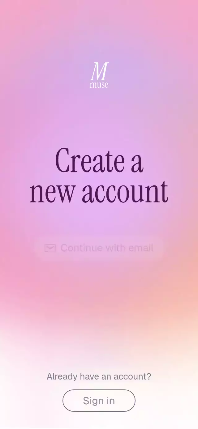
A React Native animated signup screen can introduce account options with a soft visual reveal. This component begins with a defined pastel orb, expands it into a luminous upper arc, and brings in the identity mark, headline, and staggered actions. Four blurred Skia circles and a vertical gradient create the bloom, while one Reanimated intro value coordinates the entrance over measured time windows. A separate clock adds gentle breathing after the composition settles. Use it for account creation, email or phone signup, an onboarding entry, or a welcoming authentication-choice screen. Configure one to three actions with optional icons and callbacks, replace the title and footer prompt, and adjust orb and base colors, typography, and title color. Control automatic start, receive entrance completion, or replay through the ref.
When to use it
- Present account-creation choices.
- Offer email and phone signup actions.
- Create a soft onboarding entrance.
- Lead existing users to sign-in.
A gentle account-creation screen where a compact pastel orb blooms into a luminous upper arc before the headline and actions appear.
How it works
- The component measures its own container with
onLayout, then derives every position, radius, type size, and travel distance from that width and height. - One linear
introshared value runs for 1.7 seconds. Measured time windows apply their own easing curves to the orb, logo, two headline lines, and staggered actions. - Four blurred Skia circles overlap above a vertical
LinearGradient. Their scale, blur, center, and lateral offsets turn the initial defined orb into a broad wash of light. - After the entrance, a separate UI-thread clock drives slow sine waves for the orb scale and side-circle drift. Replaying cancels both clocks, resets the entrance, and starts it again.
- Each action keeps its own press-scale shared value, using a short timing animation on press-in and a spring on release.
Install
npx expo install @shopify/react-native-skia expo-linear-gradient react-native-reanimated react-native-workletsOn web, CanvasKit must finish loading before this component mounts. Copy canvaskit.wasm to your public assets and call LoadSkiaWeb from the web entry point:
import { LoadSkiaWeb } from '@shopify/react-native-skia/lib/module/web';

await LoadSkiaWeb({ locateFile: () => '/canvaskit.wasm' });
Usage
import SoftBloomSignup from './SoftBloomSignup';

export function SignupScreen() {
  return <SoftBloomSignup />;
}
Customize the content, palette, typography, callbacks, and replay control:
import { useRef } from 'react';
import SoftBloomSignup, { type SoftBloomSignupRef } from './SoftBloomSignup';

export function SignupScreen() {
  const signupRef = useRef<SoftBloomSignupRef>(null);

  return (
    <SoftBloomSignup
      ref={signupRef}
      logo={<YourBrandMark />}
      title={'Start something\nbeautiful'}
      actions={[
        { label: 'Continue with email', onPress: openEmailSignup },
        { label: 'Continue with phone', onPress: openPhoneSignup },
      ]}
      orbColors={['#B9B8FF', '#F48FB8', '#F7A98A', '#E3B5FF']}
      baseColors={['#F3A9CB', '#FFFFFF']}
      titleColor="#4A1A4F"
      titleFontFamily="YourSerifFont"
      fontFamily="YourSansFont"
      onSecondaryPress={openSignIn}
      onEntranceEnd={trackEntrance}
    />
  );
}
The forwarded ref exposes replay().
Props
| Prop | Type | Default | Description |
|---|---|---|---|
logo | ReactNode | — | Brand mark shown at the top; hidden when omitted. |
title | string | 'Create a\nnew account' | Headline; newline characters break lines. |
actions | SignupAction[] | Email and phone actions | One to three primary actions with optional icons, callbacks, and accessibility labels. |
footerText | string | 'Already have an account?' | Footer prompt. |
secondaryLabel | string | 'Sign in' | Secondary action text and default screen-reader label. |
onSecondaryPress | () => void | — | Called when the secondary action is pressed. |
orbColors | [string, string, string, string] | Pastel purple, pink, peach, lavender | Top, left, right, and center orb colors. |
baseColors | [string, string] | ['#F3A9CB', '#FFFFFF'] | Top and bottom page colors. |
titleColor | string | '#4A1A4F' | Headline color. |
titleFontFamily | string | System font | Headline font family. |
fontFamily | string | System font | Button and footer font family. |
autoStart | boolean | true | Plays the entrance after the component is measured. |
onEntranceEnd | () => void | — | Called after the entrance or reduced-motion fade finishes. |
style | StyleProp<ViewStyle> | — | Outer-container style. |
testID | string | — | Test identifier for the outer container. |
Compatibility
- Expo SDK 57
- React Native 0.86
- Reanimated 4.5
- React Native Worklets 0.10
- React Native Skia 2.6
- iOS: supported, not yet verified on a device
- Android: supported, not yet verified on a device
- Web: supported; verification status is recorded in
piece.json - Works in Expo Go because the required native modules are included in Expo SDK 57
Accessibility
Every interactive element is a labeled button. Primary action labels can be overridden individually, while the secondary button uses secondaryLabel. With reduced motion enabled, the component skips positional motion and breathing, presents the final composition with a 200 ms fade, and still calls onEntranceEnd.
FAQ
- Can I replace the signup actions with my own options?
- Yes. actions accepts one to three entries with label and optional icon, onPress, and accessibilityLabel. The component supplies presentation and callbacks rather than an authentication backend.
- Can I customize and replay the blooming orb?
- Yes. Set orbColors, baseColors, titleColor, headline and action fonts, title, and optional logo. autoStart controls the entrance, and replay restarts it through the ref.
- Does the signup animation support Reduce Motion?
- Yes. It skips positional movement and breathing, fades the final composition in over 200 ms, and still calls onEntranceEnd. Every interactive element remains a labeled button.