About this animation
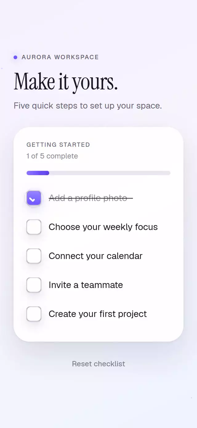
A tactile 24-point checkbox with a center-out spring fill, a hand-drawn mark, and an animated label strike-through.
How it works
- A clipped Skia circle expands from the center with an interruptible spring.
- Path
endreveals the check or mixed-state dash with rounded caps and joins. - The same progress value attenuates the label and draws a measured strike-through from left to right.
- Unchecking reverses the path before the background contracts.
- Press feedback starts on touch-down, while a brief halo emphasizes completion.
Why this one
Most checkbox demos stop at the box. This one treats the full task row as a coordinated state change: tactile press feedback, a center-out material fill, a precisely drawn mark, and a strike-through that follows the real label width. The included onboarding demo adds a spring-driven progress bar and a restrained “All set” payoff without changing the reusable component API.
Install
npx expo install @shopify/react-native-skia expo-linear-gradient react-native-reanimatedFor web, follow Expo's Skia CanvasKit setup if your bundler does not already copy the WASM asset.
Usage
<DrawnCheckbox label="Connect your calendar" defaultChecked />

<DrawnCheckbox checked={accepted} onChange={setAccepted} color="#17A673" duration={320} />

<DrawnCheckbox colorScheme="dark" glowColor="#6E56FF" label="Invite a teammate" />
Props
| Prop | Type | Default | Description |
|---|---|---|---|
checked | boolean | — | Controlled checked state. |
defaultChecked | boolean | false | Initial uncontrolled state. |
indeterminate | boolean | false | Shows a mixed-state dash. |
onChange | (checked: boolean) => void | — | Receives requested state. |
label | string | — | Pressable label. |
size | number | 24 | Box size. |
radius | number | 7 | Corner radius. |
color | string | '#6E56FF' | Active color. |
borderColor | string | '#B8B5C4' | Inactive border color. |
colorScheme | 'light' | 'dark' | 'auto' | 'auto' | Material and default-label appearance. |
glowColor | string | color | Completion halo color. |
markColor | string | '#FFFFFF' | Check or dash color. |
duration | number | 240 | Drawing duration in milliseconds. |
labelColor | string | Theme contrast color | Explicit label color. |
fontFamily | string | System font | Label font family. |
accessibilityLabel | string | Label or 'Checkbox' | Screen-reader label. |
style | StyleProp<ViewStyle> | — | Outer style. |
labelStyle | StyleProp<TextStyle> | — | Label style. |
testID | string | — | Test identifier. |
The ref exposes toggle() and setChecked(checked).
Compatibility
- Expo SDK 57, React Native 0.86, Reanimated 4.5, Skia 2.6
- iOS and Android supported but not device-verified; web verified by the project gate
- Works in Expo Go
Accessibility
The full row exposes the checkbox role and boolean or mixed checked state. Labels keep high contrast in either theme. Reduced Motion completes fill, mark, strike-through, and completion feedback immediately.
Source code
Free with an account
Sign in with your email to read the full source here, or install it in one command with the CLI.