About this animation
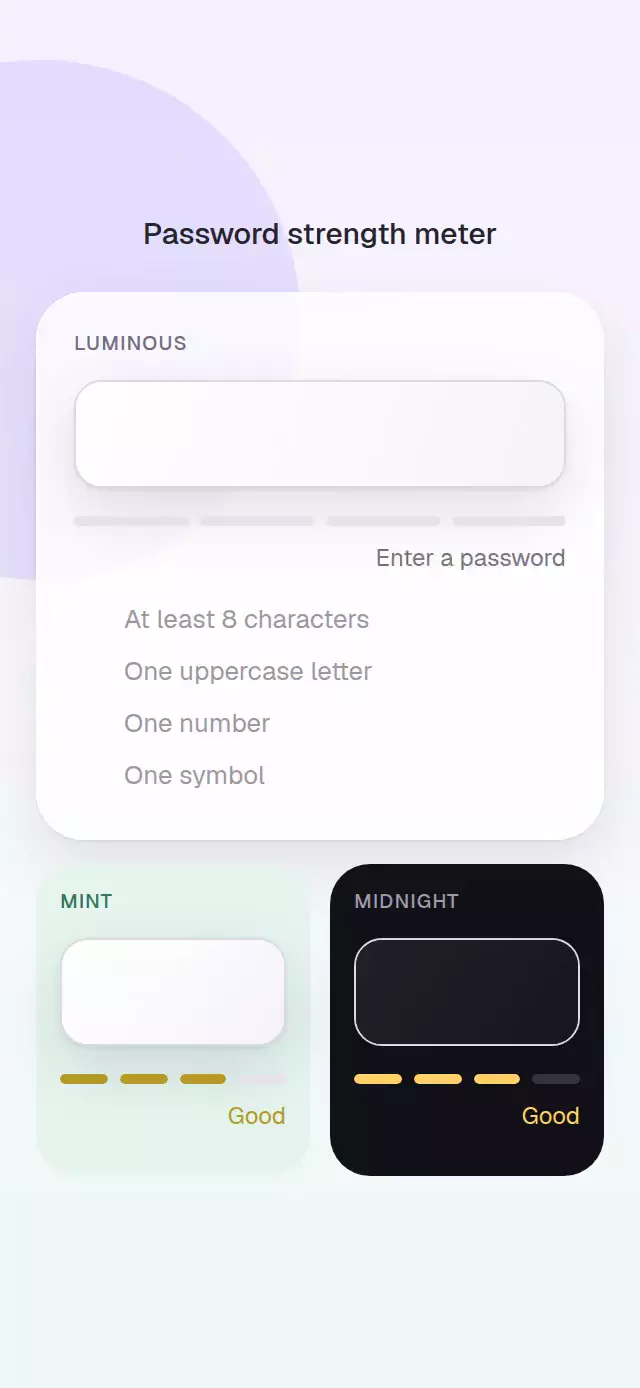
A password field that pairs clear strength feedback with an animated requirement checklist.
How it works
scorePasswordawards one point for length, uppercase, number, and symbol rules.- Four shared-value segments fill with the active strength color.
- Each fulfilled requirement springs in a View-built check.
- A View-built eye toggles secure text without an icon dependency.
- Reaching Strong triggers a short glow pulse, surface pop, and light sweep across the meter.
Install
npx expo install expo-linear-gradient react-native-reanimatedUsage
import PasswordStrengthMeter, { scorePassword } from './PasswordStrengthMeter';

<PasswordStrengthMeter onChange={(value) => save(value)} />;
<PasswordStrengthMeter
  defaultValue="Sample8!"
  colorScheme="dark"
  levelColors={['#C75165', '#D77A44', '#B59A24', '#347C68']}
/>;
Props
| Prop | Type | Default | Description |
|---|---|---|---|
value / defaultValue | string | — / '' | Controlled or initial password. |
onChange | (password: string) => void | — | Password callback. |
requirements | PasswordRequirement[] | Four built-ins | Displayed checklist. |
placeholder | string | 'Create a password' | Input placeholder. |
levelColors | four-color tuple | Red through green | Strength colors. |
inputHeight | number | 54 | Input height. |
backgroundColor / textColor | string | '#FFFFFF' / '#1E1B25' | Surface and copy colors. |
fontFamily | string | System font | Copy font. |
colorScheme | 'light' | 'dark' | 'auto' | 'auto' | Surface appearance, with system-aware dark mode. |
duration | number | 240 | Fill duration. |
accessibilityLabel | string | 'Password' | Input label. |
showAccessibilityLabel / hideAccessibilityLabel | string | Show/hide labels | Visibility-button labels. |
inputProps | TextInputProps | — | Additional native-input props. |
style / testID | style / string | — | Container customization. |
The ref exposes focus(), clear(), show(), and hide().
Compatibility
- Expo SDK 57, React Native 0.86, and Reanimated 4.5
- iOS, Android, and web supported; device verification pending
- Works in Expo Go
Accessibility
The input and visibility button have configurable labels, the button announces its selected state, and the strength label is a polite live region. Reduced Motion makes fills and checks update immediately.