About this animation
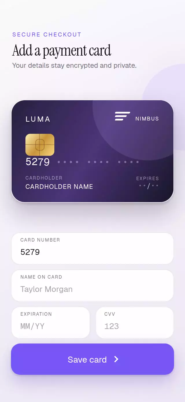
A polished payment form with live rolling digits and a spring-driven 3D card that reveals its security-code side at exactly the right moment.
Why this one
Most card forms treat the preview as decoration. This one turns it into functional feedback: focusing CVV reveals the correct side, prefix detection swaps between original geometric card networks, and the same flip progress drives perspective, visibility, chip light, and a reflection contained inside the material. The full checkout composition, responsive spacing, and realistic content make it useful as a finished product screen instead of an isolated effect.
How it works
onLayoutmeasures the component and sizes the card and typography from its own container, not the window.- Four native
TextInputfields sanitize and format card details while keeping the source values easy to submit. - A single continuous
flipProgressshared value drives both 3D faces, the reflected light, and the chip glow with an interruptible spring. - Stable digit slots use a layout-synchronized transition so the previous character rolls out as its replacement enters.
- The first number digit selects one of three fictional networks and original geometric marks.
- The forwarded ref supports guided checkout, autofill, reset, and side control without adding demo behavior to the component.
Install
npx expo install expo-linear-gradient react-native-reanimatedUsage
import FlipCreditCard from './FlipCreditCard';

export function AddCardScreen() {
  return <FlipCreditCard onSubmit={(values) => saveCard(values)} />;
}
Customize its visual personality and guide the form when needed:
import { useRef } from 'react';
import FlipCreditCard, { type FlipCreditCardRef } from './FlipCreditCard';

export function WalletScreen() {
  const cardRef = useRef<FlipCreditCardRef>(null);

  return (
    <FlipCreditCard
      ref={cardRef}
      issuerName="AURORA"
      accentColor="#FF6B5E"
      cardColors={['#30202D', '#743D53', '#19151D']}
      submitLabel="Add to wallet"
      onCardSideChange={(side) => trackCardSide(side)}
    />
  );
}
The forwarded ref exposes focusField(field), setFieldValue(field, value), showFront(), showBack(), and reset().
Props
| Prop | Type | Default | Description |
|---|---|---|---|
defaultValues | Partial<CreditCardValues> | — | Initial uncontrolled field values. |
title | string | 'Add a payment card' | Screen heading. |
subtitle | string | 'Your details stay encrypted and private.' | Supporting security message. |
issuerName | string | 'NORTH' | Generic issuer printed on the card. |
submitLabel | string | 'Save card' | Primary-action label. |
accentColor | string | '#7C5CFC' | Focus, glow, and action color. |
cardColors | [string, string, ...string[]] | Purple trio | Card gradient stops. |
backgroundColor | string | '#F4F1F8' | Scene background. |
textColor | string | '#17151D' | Main heading color. |
fontFamily | string | System font | Interface and card-copy family. |
monoFontFamily | string | System monospace | Rolling-digit family. |
titleFontFamily | string | System font | Display-heading family. |
onValuesChange | (values) => void | — | Called after a field changes. |
onCardSideChange | (side) => void | — | Called when a side is requested. |
onSubmit | (values) => void | — | Called from the primary action. |
style | StyleProp<ViewStyle> | — | Outer-container style. |
testID | string | — | Outer-container test identifier. |
Compatibility
- Expo SDK 57
- React Native 0.86
- Reanimated 4.5
- iOS: supported, not yet verified on a device
- Android: supported, not yet verified on a device
- Web: supported, not yet visually verified
- Works in Expo Go because its native dependencies are included in the SDK
Accessibility
Every native field has a visible label and screen-reader label. The card itself is a 44-point-plus button, so keyboard and assistive-technology users have an alternative way to reveal either side. The primary action responds on press-in. With Reduce Motion enabled, digit values update immediately and the card changes sides with a crossfade instead of rotation, reflection, or glow.