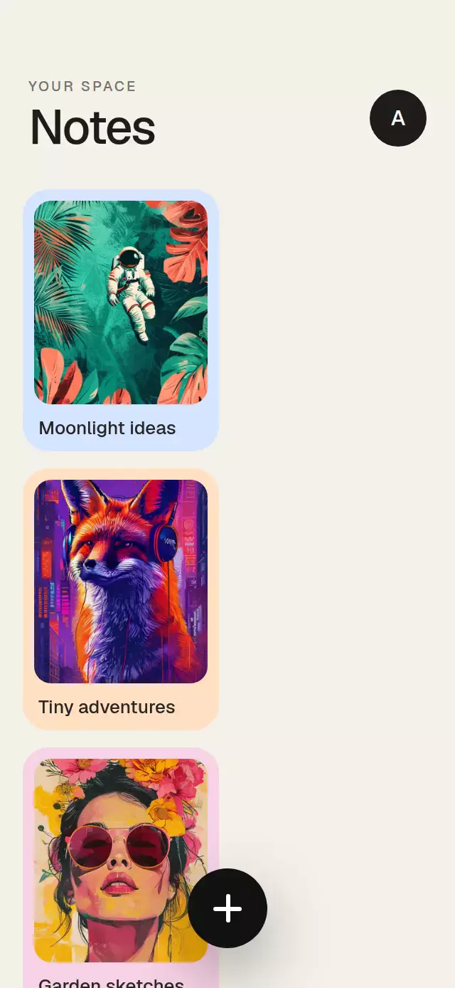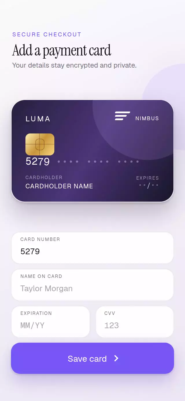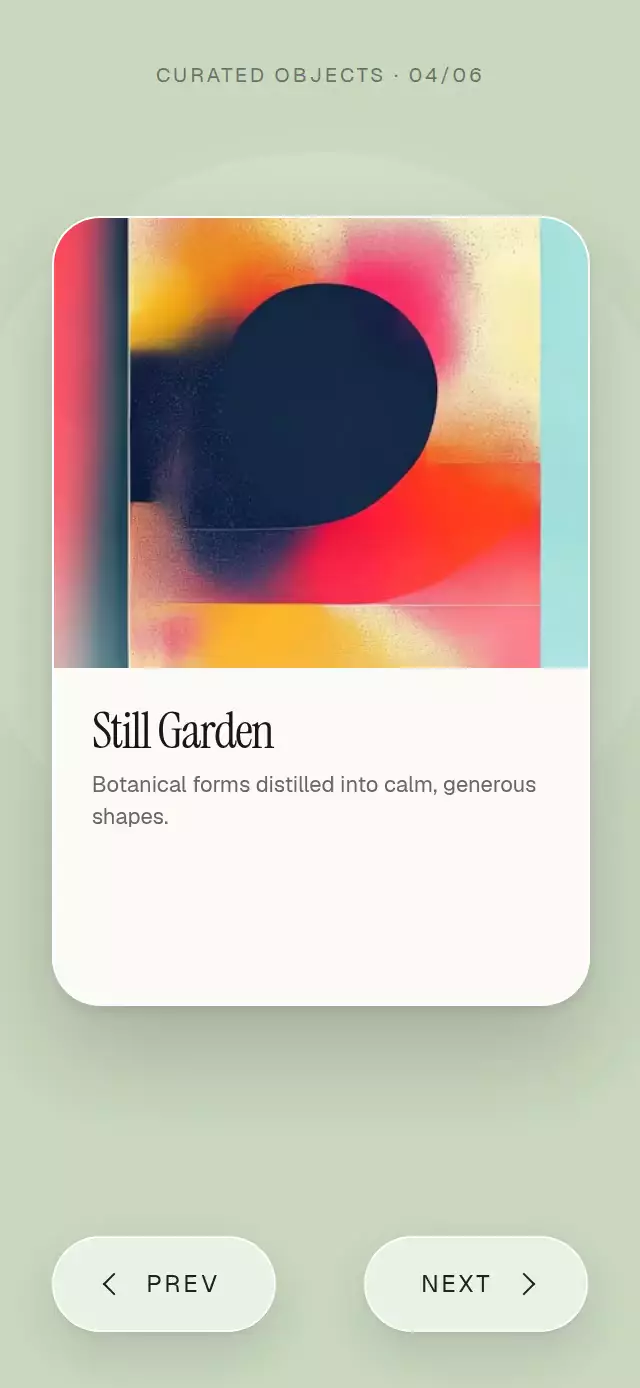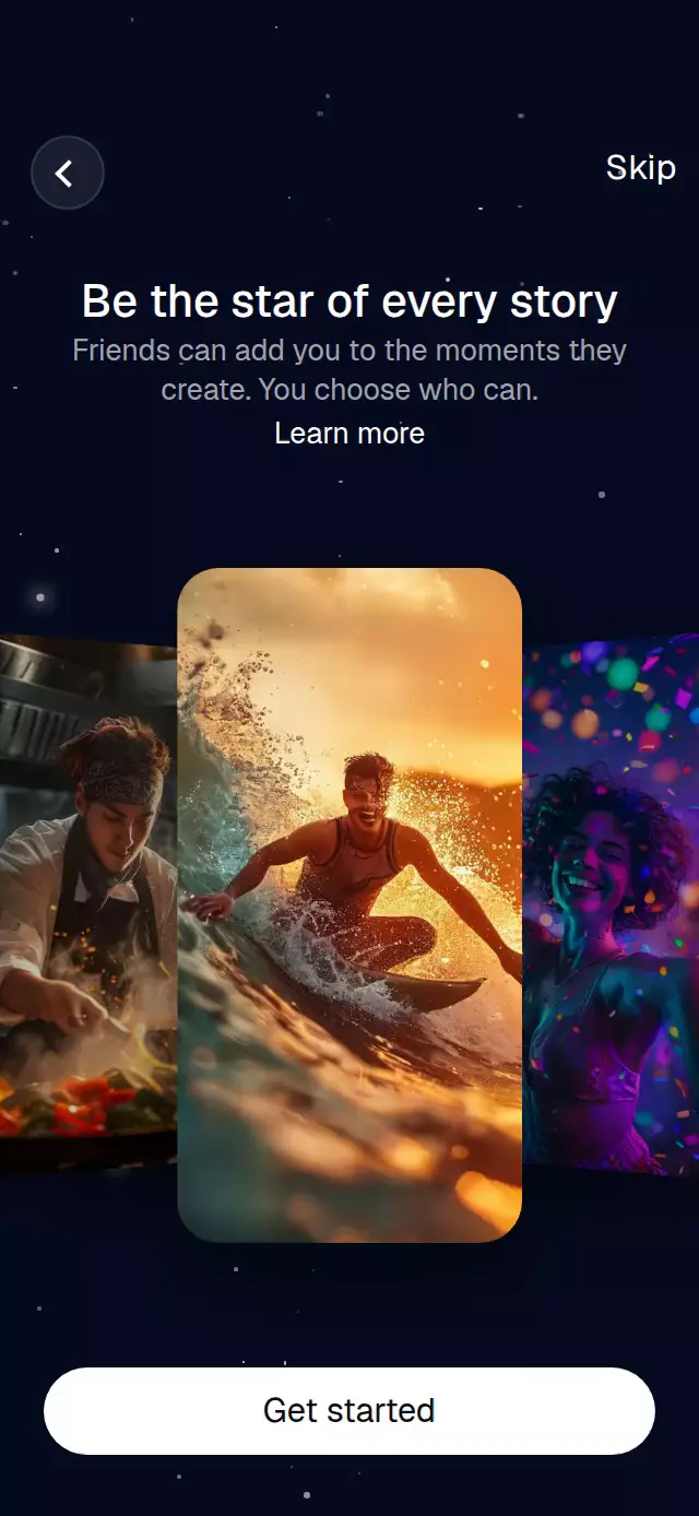
About this animation
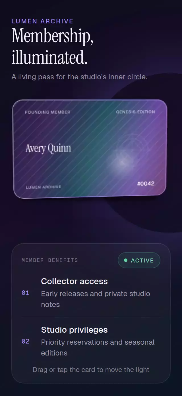
An interactive membership card whose foil, specular highlight, depth, and shadow respond continuously to touch.
How it works
- The component measures its own container and sizes the card proportionally, so it works in compact phones, sheets, and tablet layouts.
- A reveal progress turns the card from its 90-degree edge into place with a spring, while the same progress drives a narrow light sweep through the foil material.
- One vector shared value stores normalized horizontal and vertical tilt. Dragging, autoplay, imperative controls, perspective, shadow, hue position, and light all use that same source of truth.
- A Gesture Handler pan maps the pointer to a maximum 14-degree perspective tilt and interrupts any animation already in progress.
- Skia renders the iridescent gradient, light-reactive engraved lines and seal, local reflection, and a border whose highlight follows the same light position.
- Release returns to rest with a spring. A tap provides an equivalent short foil reveal for people who do not drag.
Why this one
Most tilt cards stop at perspective and place a translucent shine above the content. This version makes the light part of the material: a moving multi-hue foil field, light-reactive engraving, geometric seal, local specular bloom, responsive shadow, and edge treatment all agree on one light position. Its edge-on opening and in-material sweep create a memorable reveal, while the self-contained product demo shows the card at true hero scale inside a credible membership screen.
Install
npx expo install @shopify/react-native-skia react-native-gesture-handler react-native-reanimated react-native-workletsPlace GestureHandlerRootView at the root of your app if it is not already there.
Usage
import { HolographicFoilCard } from './HolographicFoilCard';

export function MembershipScreen() {
  return (
    <HolographicFoilCard
      memberName="Avery Quinn"
      memberNumber="#0042"
      organization="LUMEN ARCHIVE"
    />
  );
}
Customize the material and control the effect from a ref:
import { useRef } from 'react';
import {
  HolographicFoilCard,
  type HolographicFoilCardRef,
} from './HolographicFoilCard';

export function CollectorCard() {
  const cardRef = useRef<HolographicFoilCardRef>(null);

  return (
    <HolographicFoilCard
      ref={cardRef}
      accentColor="#A876FF"
      cardColor="#16101F"
      displayFontFamily="YourDisplayFont"
      foilIntensity={0.9}
      fontFamily="YourSansFont"
      maxTilt={12}
      memberName="Jordan Lee"
      memberNumber="#0188"
      onTiltEnd={(x, y) => trackTilt(x, y)}
    />
  );
}
The forwarded ref exposes play(), tiltTo(x, y), and reset(). play() runs the edge-on entrance and light sweep before starting the continuous foil orbit.
Props
| Prop | Type | Default | Description |
|---|---|---|---|
eyebrow | string | 'FOUNDING MEMBER' | Small uppercase membership label. |
memberName | string | 'Member Name' | Name shown prominently on the card. |
memberNumber | string | '#0001' | Membership or collectible number. |
organization | string | 'MEMBERSHIP COLLECTIVE' | Organization name along the bottom edge. |
editionLabel | string | 'EDITION 2026' | Edition or expiration label. |
maxTilt | number | 14 | Maximum perspective tilt in degrees, capped at 20. |
foilIntensity | number | 0.82 | Foil and specular strength from 0 to 1. |
cardColor | string | '#171225' | Base material color. |
accentColor | string | '#8A6CFF' | Primary iridescent accent. |
fontFamily | string | System font | Label and supporting-text font. |
displayFontFamily | string | System font | Member-name display font. |
accessibilityLabel | string | Card content | Screen-reader label for the card. |
onTiltEnd | (x: number, y: number) => void | — | Receives normalized release tilt. |
style | StyleProp<ViewStyle> | — | Outer-container style. |
testID | string | — | Test identifier for the outer container. |
Compatibility
- Expo SDK 57
- React Native 0.86
- Reanimated 4.5 and Worklets 0.10
- React Native Skia 2.6
- iOS: supported, not yet verified on a device
- Android: supported, not yet verified on a device
- Web: supported, not yet visually verified
- Works in Expo Go because the required native modules are bundled with Expo SDK 57
Accessibility
The complete card is one labeled button with a 44-point-or-larger target. Dragging has a tap alternative that reveals the same material response. When Reduce Motion is enabled, drag, tap, autoplay, perspective, and spring movement are disabled while the full static foil treatment and readable content remain visible.