About this animation
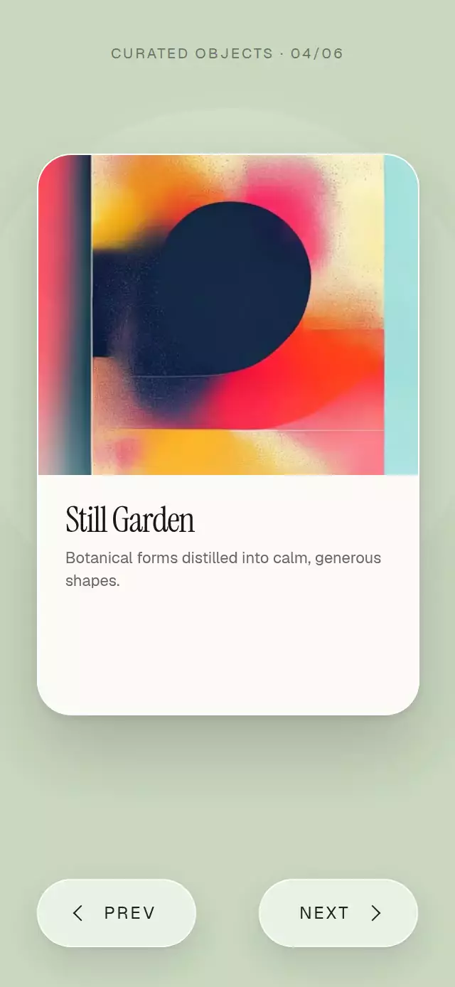
A premium product carousel that turns each card from its edge like a physical page, with direct dragging, rolling prices, and a color-responsive scene.
Why this one
Most 3D carousels rotate cards around their center and reveal a mirrored back. This version hinges each page on the edge that the gesture is moving toward, hides the back face beyond 90 degrees, deepens the fold shadow, and adds a bright edge glint at the midpoint. The same continuous position drives dragging, button navigation, card lighting, price changes, and the ambient background, so an in-progress turn can always be interrupted.
How it works
- The component measures its own container with
onLayoutand derives the card, type, and control sizes locally. - One continuous
positionshared value moves between product indexes. Every page derives its angle, edge origin, visibility, shadow, glint, and stacking order from that value. - A horizontal pan follows the finger, applies progressive resistance past the first and last items, projects release velocity, and springs to the nearest valid page.
- The active pastel background interpolates from each product's
color, while a short glow pulse emphasizes the midpoint of every turn. - The price swaps in the same layout frame and rolls vertically in the direction of travel.
Install
npx expo install expo-image expo-linear-gradient react-native-gesture-handler react-native-reanimated react-native-workletsUsage
import FlipProductCarousel from './FlipProductCarousel';

export function ShopScreen() {
  return (
    <FlipProductCarousel
      products={[
        {
          image: require('./artwork.jpg'),
          name: 'Tidal Print',
          description: 'Layered currents in mineral blue and warm sand.',
          price: 84,
          color: '#BFD8DE',
        },
      ]}
    />
  );
}
Control navigation and typography from outside:
import { useRef } from 'react';
import FlipProductCarousel, {
  type FlipProductCarouselRef,
} from './FlipProductCarousel';

export function CollectionScreen() {
  const carouselRef = useRef<FlipProductCarouselRef>(null);

  return (
    <FlipProductCarousel
      ref={carouselRef}
      products={products}
      prevLabel="BACK"
      nextLabel="VIEW NEXT"
      fontFamily="YourSansFont"
      titleFontFamily="YourDisplayFont"
      onIndexChange={(index) => trackProduct(index)}
    />
  );
}
The forwarded ref exposes next() and prev().
Props
| Prop | Type | Default | Description |
|---|---|---|---|
products | FlipProduct[] | Required | Product images, names, descriptions, prices, optional currencies, and scene colors. |
prevLabel | string | 'PREV' | Previous-page button label. |
nextLabel | string | 'NEXT' | Next-page button label. |
fontFamily | string | System font | Font for descriptions, prices, and controls. |
titleFontFamily | string | System font | Font for product names. |
onIndexChange | (index: number) => void | — | Called when the visible product index changes. |
style | StyleProp<ViewStyle> | — | Outer-container style. |
testID | string | — | Test identifier for the outer container. |
FlipProduct contains image, name, description, price, optional currency (defaults to '$'), and color.
Compatibility
- Expo SDK 57
- React Native 0.86
- Reanimated 4.5 and Worklets 0.10
- iOS: supported, not yet verified on a device
- Android: supported, not yet verified on a device
- Web: supported, not yet verified
- Works in Expo Go because its native dependencies are included in the SDK
Accessibility
The carousel exposes adjustable increment and decrement actions for screen readers, announces the active product and position, and provides labeled buttons that are disabled at the endpoints. With reduced motion enabled, page rotation becomes a short crossfade, price movement becomes a fade, and the ambient pulse is suppressed.