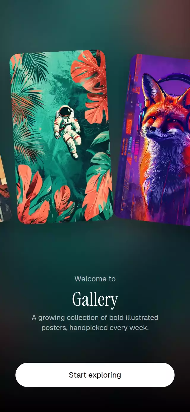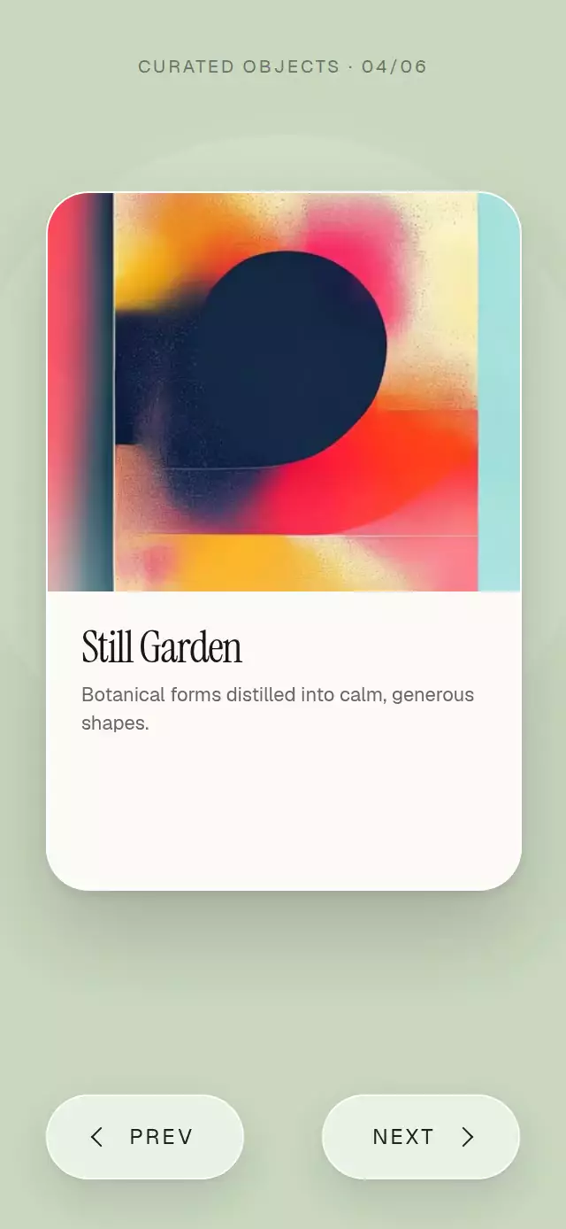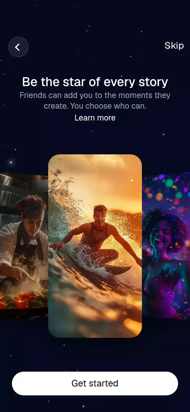
About this animation
A cinematic onboarding carousel that presents portrait cards in a looping 3D stack against a softly twinkling night sky.
How it works
- The component measures its own container and derives every card, control, and type size from that width and height.
- One continuous
positionshared value drives each card's wrapped relative position, horizontal offset, scale, perspective rotation, opacity, veil, and layer order. - Autoplay advances to the next integer with a measured timing curve, while a horizontal pan updates the same value directly and springs to the intended card on release.
- The centered image slowly scales and drifts for a subtle Ken Burns effect, then resets as the next card arrives.
- Seventy deterministic stars share a lightweight animation clock, with individual periods and phases so their twinkle does not repeat as a group.
Install
npx expo install expo-image react-native-gesture-handler react-native-reanimated react-native-workletsUsage
import StarfieldCardCarousel from './StarfieldCardCarousel';

export function OnboardingScreen() {
  return (
    <StarfieldCardCarousel
      images={[
        require('./assets/story-1.jpg'),
        require('./assets/story-2.jpg'),
        require('./assets/story-3.jpg'),
      ]}
    />
  );
}
Customize the timing, content, colors, fonts, and actions:
import { useRef } from 'react';
import StarfieldCardCarousel, {
  type StarfieldCardCarouselRef,
} from './StarfieldCardCarousel';

export function OnboardingScreen() {
  const carouselRef = useRef<StarfieldCardCarouselRef>(null);

  return (
    <StarfieldCardCarousel
      ref={carouselRef}
      images={photos}
      title="Make every moment yours"
      body="Collect the moments you love and decide who gets to share them."
      linkLabel="How sharing works"
      ctaLabel="Continue"
      interval={2.4}
      backgroundColor="#071127"
      fontFamily="YourSansFont"
      titleFontFamily="YourDisplayFont"
      onIndexChange={(index) => trackSlide(index)}
      onCtaPress={finishOnboarding}
    />
  );
}
The forwarded ref exposes next(), prev(), pause(), and resume().
Props
| Prop | Type | Default | Description |
|---|---|---|---|
images | ImageSourcePropType[] | Required | Three or more portrait photos. |
title | string | 'Be the star of every story' | Main onboarding message. |
body | string | 'Friends can add you to the moments they create. You choose who can.' | Supporting onboarding copy. |
linkLabel | string | 'Learn more' | Supporting link label. |
ctaLabel | string | 'Get started' | Primary action label. |
skipLabel | string | 'Skip' | Skip action label. |
interval | number | 1.8 | Seconds between advances; 0 disables autoplay. |
backgroundColor | string | '#050A1E' | Scene background color. |
fontFamily | string | System font | Font for body copy and controls. |
titleFontFamily | string | System font | Font for the title. |
onCtaPress | () => void | — | Called when the primary action is pressed. |
onSkip | () => void | — | Called when Skip is pressed. |
onBack | () => void | — | Called when Back is pressed. |
onLinkPress | () => void | — | Called when the supporting link is pressed. |
onIndexChange | (index: number) => void | — | Called when the centered card index changes. |
style | StyleProp<ViewStyle> | — | Outer-container style. |
testID | string | — | Test identifier for the outer container. |
Compatibility
- Expo SDK 57
- React Native 0.86
- Reanimated 4.5 and Worklets 0.10
- iOS: supported, not yet verified on a device
- Android: supported, not yet verified on a device
- Web: supported, not yet verified
- Works in Expo Go because its native dependencies are included in the SDK
Accessibility
Back, Skip, the supporting link, and the primary action are labeled buttons. The carousel exposes adjustable increment and decrement actions for screen readers. With reduced motion enabled, twinkling and Ken Burns stop, and card changes become a 250 ms crossfade.