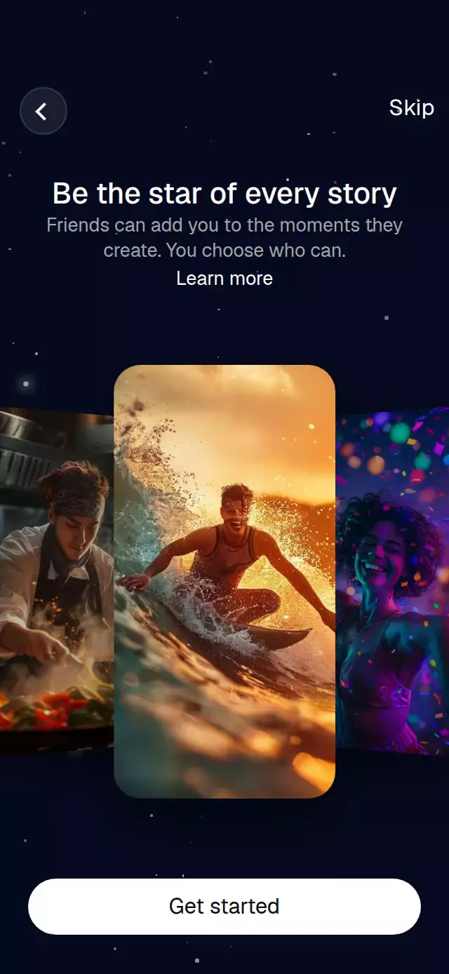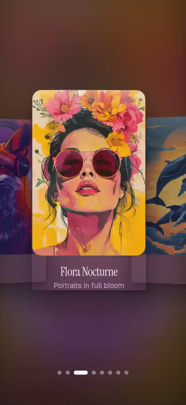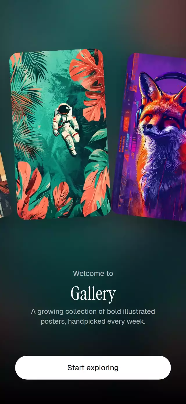
About this animation
An infinite welcome carousel that fans portrait posters across a color-shifting cinematic background.
How it works
- The component measures its own container and derives the cards, spacing, typography, and controls from that width and height.
- One continuous
offsetshared value drives every card. Three copies of the image list cover the viewport while modular positioning keeps the row visually seamless. - A UI-thread frame callback advances the row at the requested point-per-second speed. A pan takes over the same offset, releases into decay, and eases back to cruising speed.
- The centered index is derived from the offset. Two blurred
expo-imagelayers crossfade when that index changes, avoiding a live blur effect. - Each card derives its fan rotation, vertical drop, scale, and layer order from its horizontal distance to the center.
Why this one
Unlike a passive marquee, this carousel lets the viewer grab the moving row without a jump, coast with momentum, and return smoothly to its original speed. A tap pauses or resumes it. Reduced Motion replaces continuous movement with deliberate tap pagination, and tintFor can give each background a controlled brand color without image processing.
Install
npx expo install expo-image expo-linear-gradient react-native-gesture-handler react-native-reanimated react-native-workletsUsage
import TiltedMarqueeCarousel from './TiltedMarqueeCarousel';

export function WelcomeScreen() {
  return (
    <TiltedMarqueeCarousel
      images={[
        require('./assets/poster-1.jpg'),
        require('./assets/poster-2.jpg'),
        require('./assets/poster-3.jpg'),
      ]}
    />
  );
}
Customize its motion, color, typography, and action:
import { useRef } from 'react';
import TiltedMarqueeCarousel, {
  type TiltedMarqueeCarouselRef,
} from './TiltedMarqueeCarousel';

export function WelcomeScreen() {
  const carouselRef = useRef<TiltedMarqueeCarouselRef>(null);

  return (
    <TiltedMarqueeCarousel
      ref={carouselRef}
      images={posters}
      eyebrow="Meet the collection"
      title="Paper Moon"
      subtitle="Independent illustration, selected with care."
      ctaLabel="Browse posters"
      speed={46}
      tilt={7}
      tintFor={(index) => palette[index]}
      fontFamily="YourSansFont"
      titleFontFamily="YourDisplayFont"
      onActiveChange={(index) => trackPoster(index)}
      onCtaPress={openCollection}
    />
  );
}
The forwarded ref exposes pause() and resume().
Props
| Prop | Type | Default | Description |
|---|---|---|---|
images | ImageSourcePropType[] | Required | Portrait images displayed in the infinite marquee. |
eyebrow | string | 'Welcome to' | Small introductory line above the title. |
title | string | 'Gallery' | Main welcome title. |
subtitle | string | 'A growing collection of bold illustrated posters, handpicked every week.' | Supporting copy below the title. |
ctaLabel | string | 'Start exploring' | Primary action label. |
speed | number | 38 | Automatic marquee speed in points per second. |
tilt | number | 9 | Maximum card rotation in degrees. |
tintFor | (index: number) => string | — | Returns an optional tint for each background image. |
fontFamily | string | System font | Font for supporting copy and controls. |
titleFontFamily | string | System font | Font for the main title. |
onCtaPress | () => void | — | Called when the primary action is pressed. |
onActiveChange | (index: number) => void | — | Called when a new image reaches the center. |
style | StyleProp<ViewStyle> | — | Outer-container style. |
testID | string | — | Test identifier for the outer container. |
Compatibility
- Expo SDK 57
- React Native 0.86
- Reanimated 4.5 and Worklets 0.10
- iOS: supported, not yet verified on a device
- Android: supported, not yet verified on a device
- Web: supported, not yet verified
- Works in Expo Go because its native dependencies are included in the SDK
Accessibility
The primary action is exposed as a labeled button, and the carousel exposes adjustable increment and decrement actions for screen readers. Its hint explains the available touch behavior. With Reduced Motion enabled, continuous movement and transition animations stop; each tap advances exactly one poster.