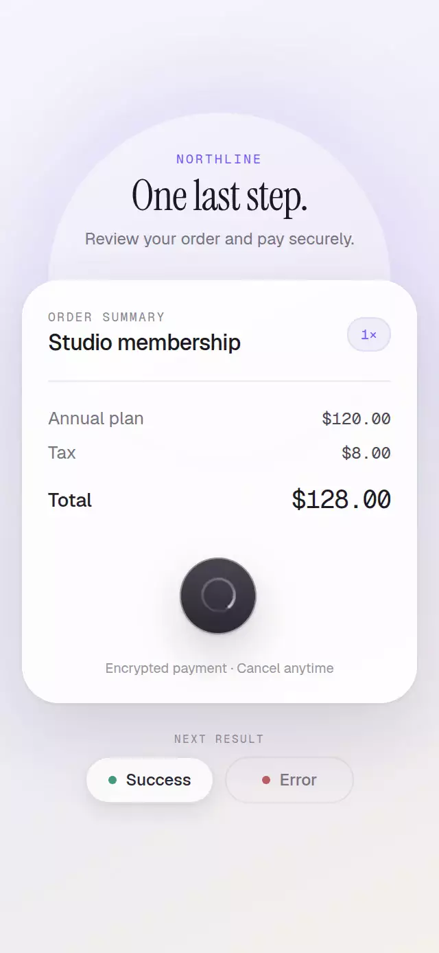
About this animation
A premium async action pill that contracts into a gradient progress arc and resolves with drawn success or tactile retry feedback.
Why this one
Most loading buttons swap text for a stock spinner. This version treats the surface as one continuous object: the label lifts away with a soft blur, the pill springs into a circle, and a fine gradient-tailed arc appears only after the shape is ready. Success expands before drawing its check and releasing a single halo; failure expands into a muted error surface with a three-oscillation shake and a clear “Try again” action. Controlled state and the imperative reset can interrupt every transition.
How it works
- The uncontrolled component awaits
onPress; a request token ignores stale promises after reset. - A shared morph value springs between the full pill and its circular loading diameter.
- A continuous Skia path uses a sweep-gradient trail and UI-thread rotation.
- Success draws a Skia check and releases one expanding outline halo.
- Error uses a shrinking three-cycle horizontal shake and exposes “Try again.”
- Reduced Motion keeps state feedback while removing rotation, travel, shake, and celebration.
Install
npx expo install expo-linear-gradient @shopify/react-native-skia react-native-reanimatedUsage
<LoadingMorphButton label="Pay $128.00" onPress={submitPayment} />

<LoadingMorphButton
  label="Place order"
  width={260}
  height={56}
  color="#25232C"
  successColor="#439B76"
  errorColor="#B85D5B"
  resetMs={2200}
  onPress={submitOrder}
/>
Props
| Prop | Type | Default | Description |
|---|---|---|---|
state | 'idle' | 'loading' | 'success' | 'error' | — | Controlled visual state. |
defaultState | State | 'idle' | Initial uncontrolled state. |
onPress | () => Promise<unknown> | Required | Resolve for success or reject for error. |
onStateChange | (state) => void | — | Receives requested states. |
label | string | 'Continue' | Idle action text. |
width | number | 220 | Full pill width. |
height | number | 54 | Pill height and loading diameter. |
color | string | '#19191F' | Idle/loading surface color. |
surfaceHighlightColor | string | Scheme-aware | Top material highlight. |
successColor | string | '#3F9D78' | Success surface and halo color. |
errorColor | string | '#B85D5B' | Error surface color. |
contentColor | string | '#FFFFFF' | Label, arc, and check color. |
resetMs | number | 1800 | Uncontrolled result display duration. |
fontFamily | string | System font | Button label font. |
colorScheme | 'light' | 'dark' | 'auto' | 'auto' | Material treatment. |
accessibilityLabel | string | Uses label | Screen-reader label. |
style | StyleProp<ViewStyle> | — | Outer-area style. |
testID | string | — | Test identifier. |
The forwarded ref exposes press() and reset().
Compatibility
Built for Expo SDK 57, React Native 0.86, Reanimated 4.5, and React Native Skia 2.6. iOS and Android are supported but device-unverified; web is verified by the project gate. Works in Expo Go.
Accessibility
The pressable exposes button, busy, disabled, and contextual retry labels. Its touch target stays at full width while the surface contracts. Reduced Motion removes travel, rotation, shake, spring bounce, and the halo while retaining immediate shape, color, check, and text feedback.