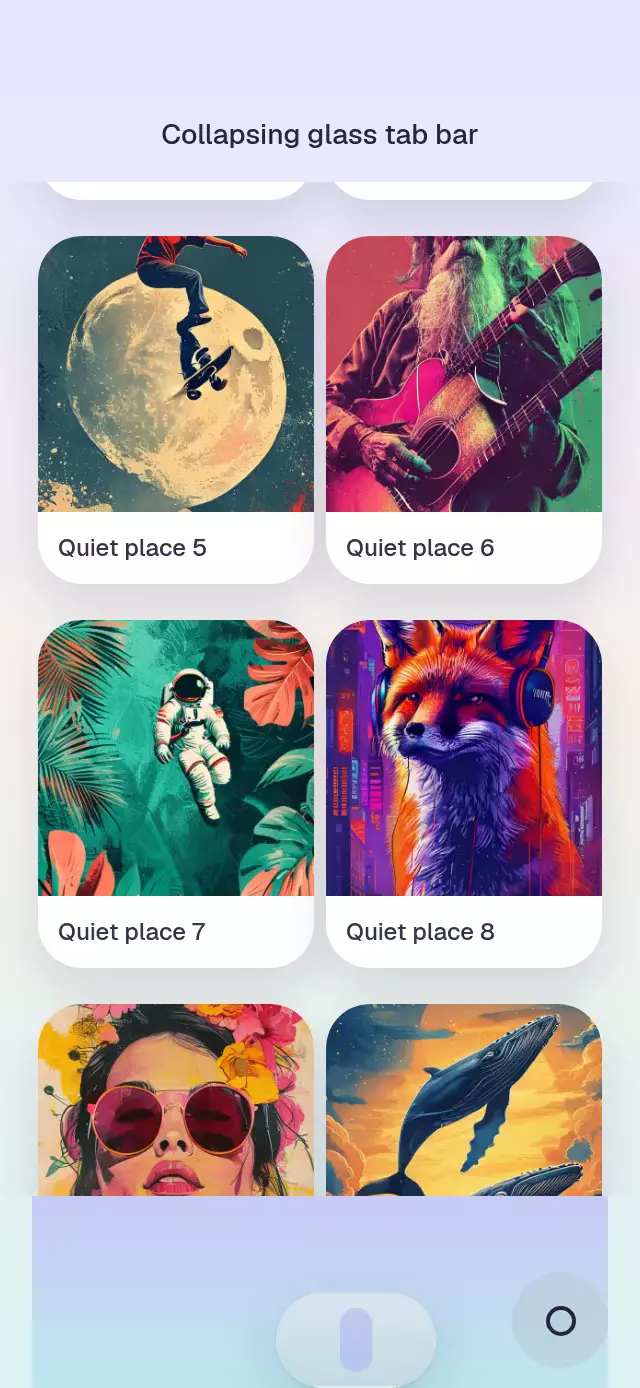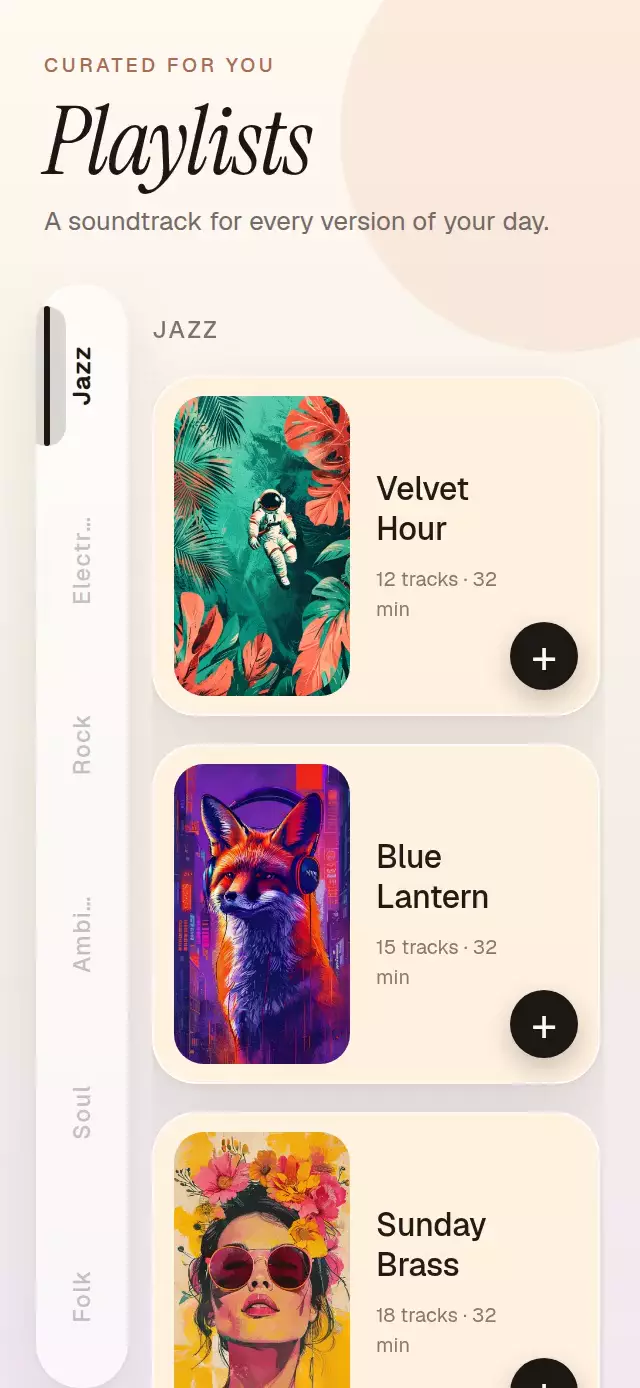
About this animation
A virtualized section list with compact vertical tabs that track scrolling through one continuous, tactile indicator.
How it works
- The component flattens section headers and items into one
Animated.FlatList, with deterministic row geometry for stable rendering. - Every section header reports its actual content position with
onLayout; tab presses wait for and use that measured offset rather than an estimate. - One continuous shared value drives the indicator position, its elastic in-between stretch, and each tab label's color, opacity, and emphasis.
- Pressing a tab selects it immediately, moves the indicator with a spring, and locks scroll synchronization until the programmatic scroll ends. Reaching the bottom explicitly selects the final section even when it cannot align to the top.
- Viewability tracking records each item after its first reveal, so virtualized cells only receive their staggered entrance once.
Why this one
Typical side tabs snap their highlight after a section boundary or let scroll events override the tab a person just pressed. This version targets measured section positions, holds the requested selection throughout programmatic motion, treats the bottom edge correctly, gives every tab at least a 44-point hit area, and keeps its spring indicator continuously connected to manual scrolling.
Install
npx expo install react-native-reanimated react-native-workletsUsage
import SyncedSideTabs from './SyncedSideTabs';

export function Library() {
  return (
    <SyncedSideTabs
      sections={genres}
      itemHeight={72}
      keyExtractor={(track) => track.id}
      renderItem={(track) => <TrackRow track={track} />}
    />
  );
}
Customize the rail and control it externally:
import { useRef } from 'react';
import SyncedSideTabs, { type SyncedSideTabsRef } from './SyncedSideTabs';

export function Library() {
  const tabs = useRef<SyncedSideTabsRef>(null);
  return (
    <SyncedSideTabs
      ref={tabs}
      sections={genres}
      itemHeight={88}
      tabWidth={50}
      accentColor="#6E56FF"
      mutedColor="#9C9DAE"
      fontFamily="Geist_500Medium"
      keyExtractor={(track) => track.id}
      renderItem={(track, index, section) => <TrackRow track={track} />}
      onSectionChange={(index) => analytics.sectionViewed(index)}
    />
  );
}
The forwarded ref exposes scrollToSection(index).
Props
| Prop | Type | Default | Description |
|---|---|---|---|
sections | SideTabSection<T>[] | Required | Ordered section titles and item arrays. |
renderItem | (item, index, section) => ReactNode | Required | Renders an item with local and section indices. |
keyExtractor | (item) => string | Required | Returns a stable item key. |
itemHeight | number | Required | Fixed item height in points, excluding the built-in 14-point gap. |
header | ReactNode | — | Optional content above tabs and list. |
tabWidth | number | 44 | Vertical tab rail width in points. |
accentColor | string | '#111111' | Active labels and indicator. |
mutedColor | string | '#B9BCC4' | Inactive labels. |
fontFamily | string | System font | Section and tab label font. |
onSectionChange | (index) => void | — | Called at a visible-section boundary. |
style | StyleProp<ViewStyle> | — | Outer-container style. |
testID | string | — | Test identifier for the outer container. |
Compatibility
- Expo SDK 57
- React Native 0.86
- Reanimated 4.5 and Worklets 0.10
- iOS: supported, not yet verified on a device
- Android: supported, not yet verified on a device
- Web: supported, verified by the project export
- Works in Expo Go because Reanimated and Worklets are bundled native modules
Accessibility
The rail exposes a tablist, and each labeled tab announces its selected state and remains a touch alternative to scrolling. Reduced Motion preserves direct section changes, replaces item displacement with a short fade, and removes indicator stretch and animated list scrolling.