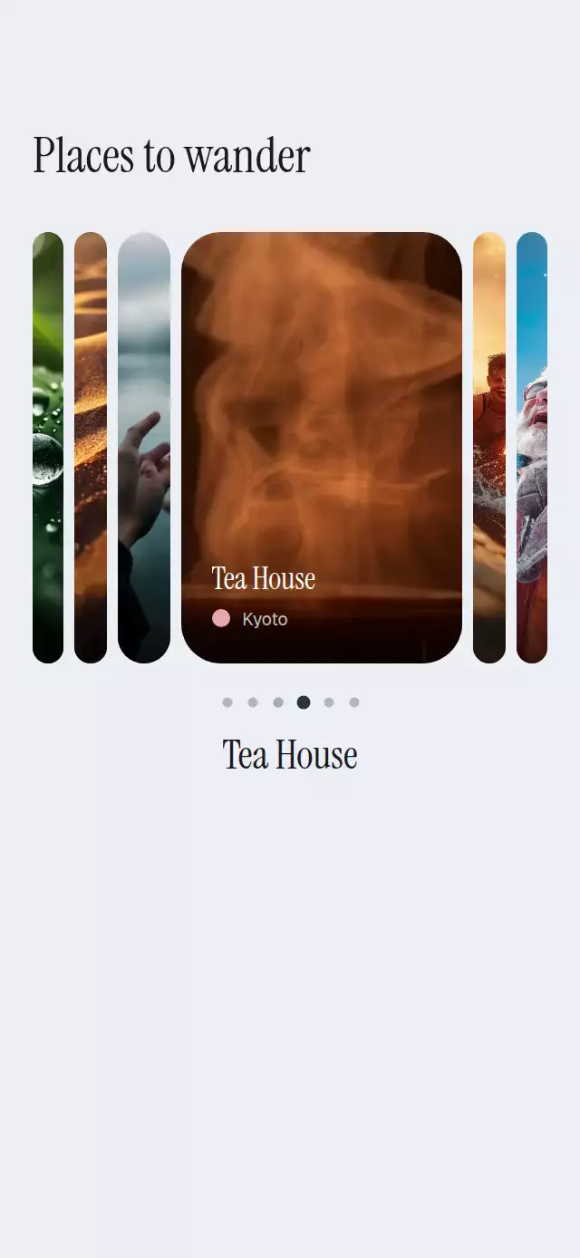
About this animation
A tone-matched portrait wallpaper carousel with credits that travel with the drag and a hold-to-preview lock screen.
How it works
- The component measures its own container and derives the card size, spacing, typography, and preview scale from those dimensions.
- One continuous
positionshared value drives each wallpaper's offset, scale, depth, ambient tone, and credit position. - Dragging updates that position directly; release projects gesture momentum and settles on the nearest wallpaper with an interruptible spring.
- Holding the carousel springs the active image over the full viewport while a date and tabular clock materialize above it.
- A brief light sweep celebrates each newly centered image without obscuring its artwork.
Why this one
Most wallpaper pickers replace credits only after paging. Here, outgoing and incoming credits move continuously with the user's finger, so authorship stays spatially connected to the art. The tone-aware backdrop makes mixed collections feel coherent, while the press-and-hold lock screen answers the practical question of how a wallpaper will look before it is selected.
Install
npx expo install expo-image expo-linear-gradient react-native-gesture-handler react-native-reanimated react-native-workletsUsage
import WallpaperCarousel from './WallpaperCarousel';

export function WallpaperScreen() {
  return (
    <WallpaperCarousel
      items={[
        {
          image: require('./assets/clouds.jpg'),
          author: 'Avery Moss',
          title: 'Open Air',
          tone: '#4A6170',
        },
        {
          image: require('./assets/forest.jpg'),
          author: 'Theo Linden',
          title: 'Forest Signal',
          tone: '#314334',
        },
      ]}
    />
  );
}
Control selection and preview from outside the component:
import { useRef } from 'react';
import WallpaperCarousel, {
  type WallpaperCarouselRef,
} from './WallpaperCarousel';

export function CuratedWallpapers() {
  const carouselRef = useRef<WallpaperCarouselRef>(null);

  return (
    <WallpaperCarousel
      ref={carouselRef}
      items={wallpapers}
      fontFamily="YourSansFont"
      titleFontFamily="YourDisplayFont"
      clockFontFamily="YourLightFont"
      onIndexChange={(index) => trackSelection(index)}
      onPreviewChange={(previewing) => trackPreview(previewing)}
    />
  );
}
The forwarded ref exposes scrollTo(index) and preview(on).
Props
| Prop | Type | Default | Description |
|---|---|---|---|
items | Wallpaper[] | Required | Portrait images, fictional creator credits, titles, and optional average tones. |
fontFamily | string | System font | Font for credits, the date, and controls. |
titleFontFamily | string | System font | Font for wallpaper titles. |
clockFontFamily | string | System font | Font for the lock-screen clock. |
onIndexChange | (index: number) => void | — | Called when the centered wallpaper changes. |
onPreviewChange | (previewing: boolean) => void | — | Called when preview opens or closes. |
style | StyleProp<ViewStyle> | — | Outer-container style. |
testID | string | — | Test identifier for the outer container. |
Wallpaper contains image, author, title, and optional tone. When tone is omitted, the component uses a warm neutral veil.
Compatibility
- Expo SDK 57
- React Native 0.86
- Reanimated 4.5 and Worklets 0.10
- iOS: supported, not yet verified on a device
- Android: supported, not yet verified on a device
- Web: supported, verified by the Expo export and web bundle gate
- Works in Expo Go because its native dependencies are included in the SDK
Accessibility
The carousel exposes adjustable increment and decrement actions, plus an activate action for preview. Every pagination control is a labeled button, and the visible preview control is a touch alternative to holding. Reduced Motion replaces spatial credit travel and springs with short fades and timing transitions.