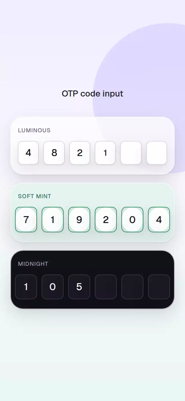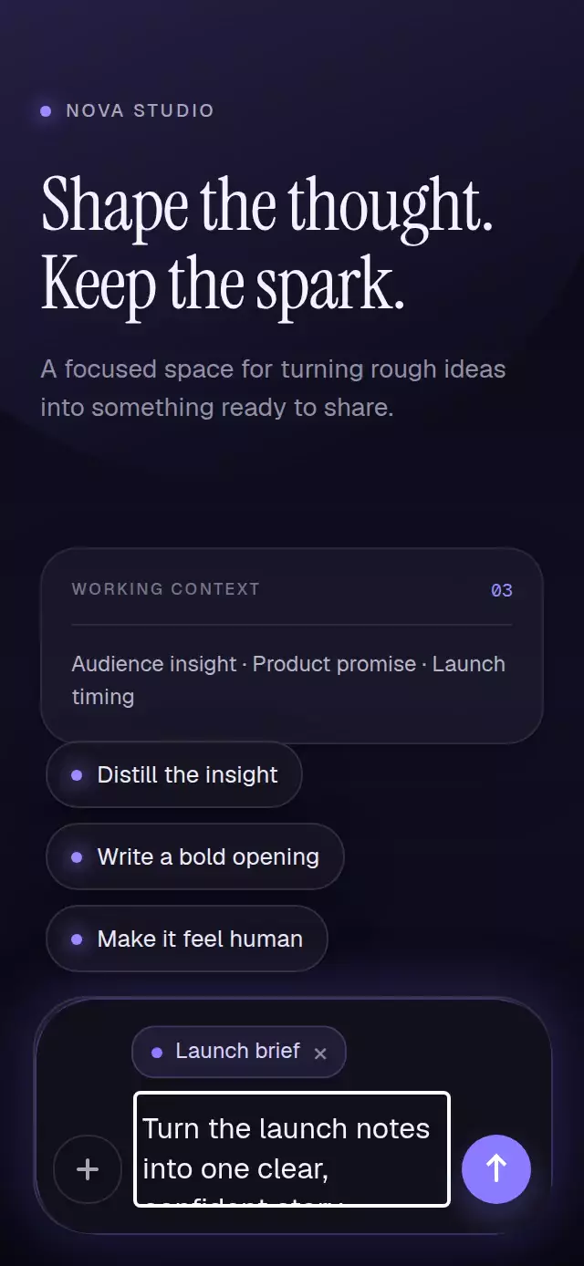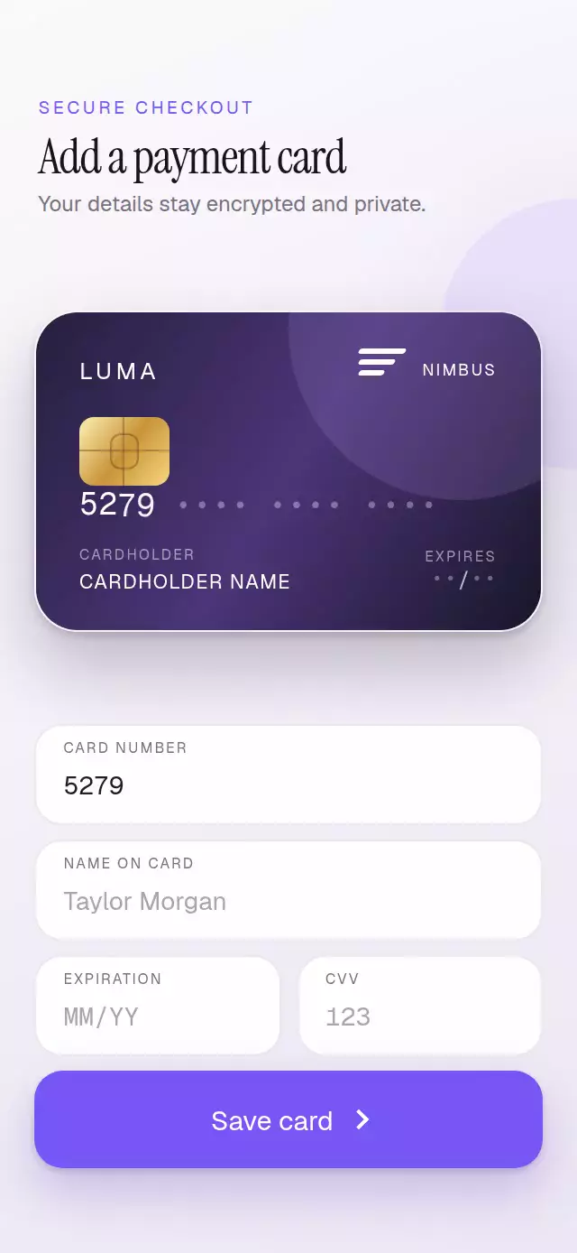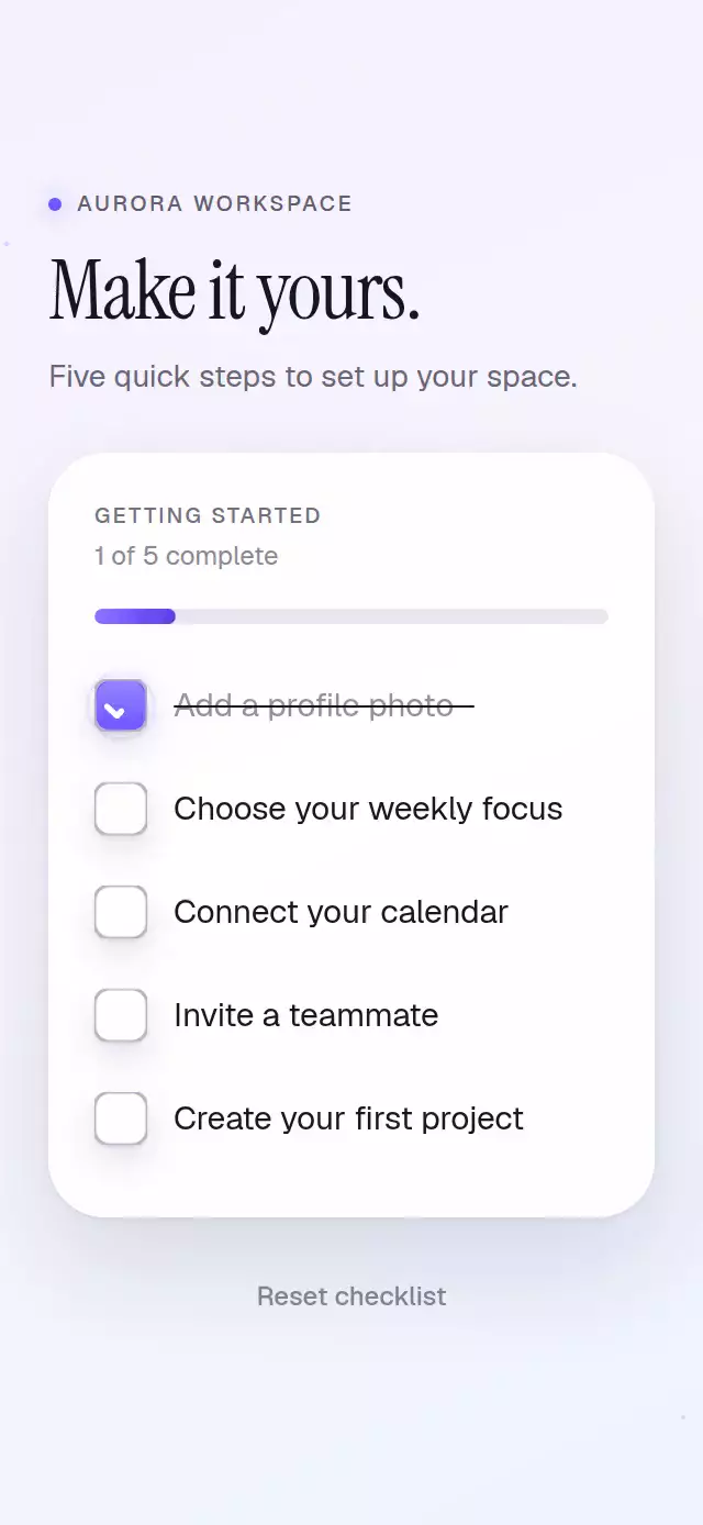
About this animation
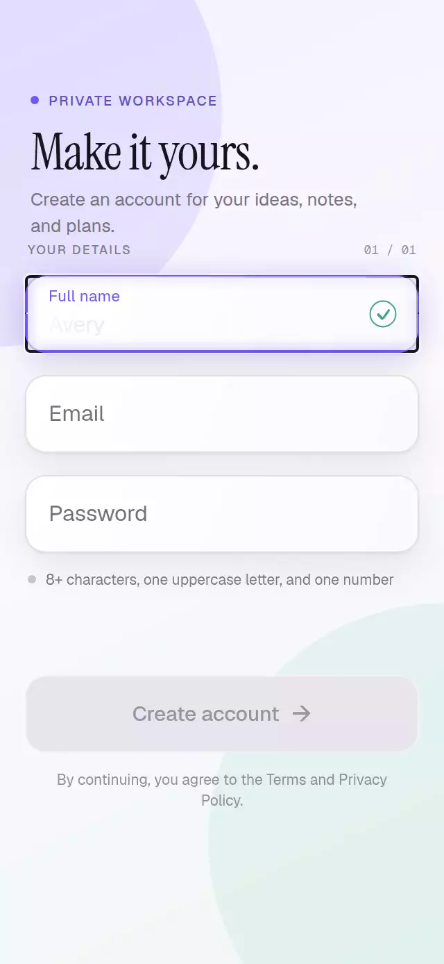
A polished 56-point text field with a spring-driven label, touch-origin focus light, blurred validation feedback, and drawn status icons.
How it works
- Focus and content feed one label progress value; an interruptible spring moves, shrinks, and recolors the label.
onTouchStartrecords the exact contact point. Four thin light segments grow toward the corners so the accent border appears to ignite from that point.- Validation messages reveal their layout while fading, translating, and sharpening from a 4-point blur.
- Valid and invalid states draw a check or alert from timed View strokes, without an icon dependency.
- Controlled and uncontrolled values share the same input path, while an imperative ref exposes focus, blur, and clear.
Why this one
Most floating-label fields only move a label and swap a border color. This version coordinates touch position, spring typography, live feedback, a drawn status glyph, reduced motion, dark mode, and layered surface depth. The result communicates focus and validation immediately without turning a routine form control into decoration.
Install
npx expo install expo-linear-gradient react-native-reanimatedUsage
import { useState } from 'react';
import FloatingLabelInput from './FloatingLabelInput';

export function EmailField() {
  const [email, setEmail] = useState('');
  const valid = /^[^\s@]+@[^\s@]+\.[^\s@]+$/.test(email);

  return (
    <FloatingLabelInput
      label="Email address"
      value={email}
      onChangeText={setEmail}
      error={email.length > 0 && !valid ? 'Enter a complete email address' : undefined}
      helperText={valid ? 'Email is ready' : undefined}
      validationState={email.length === 0 ? 'idle' : valid ? 'valid' : 'invalid'}
      inputProps={{ autoComplete: 'email', keyboardType: 'email-address' }}
    />
  );
}
Personality knobs can restyle the same interaction:
<FloatingLabelInput
  label="Project name"
  accentColor="#3366FF"
  successColor="#148060"
  height={60}
  maxLength={48}
  showCharacterCount
  colorScheme="dark"
/>
Props
| Prop | Type | Default | Description |
|---|---|---|---|
label | string | Required | Text that floats above the value. |
value | string | — | Controlled text value. |
defaultValue | string | '' | Initial uncontrolled value. |
onChangeText | (value: string) => void | — | Called whenever the value changes. |
error | string | — | Invalid-state message; takes precedence over validationState. |
helperText | string | — | Supporting or success message. |
validationState | 'idle' | 'valid' | 'invalid' | 'idle' | Controls the drawn status glyph. |
showCharacterCount | boolean | false | Shows the current length. |
maxLength | number | — | Native length limit and counter target. |
height | number | 56 | Field height in points. |
accentColor | string | '#6E56FF' | Focus label, light, and glow color. |
borderColor | string | Translucent ink | Resting one-point border. |
errorColor | string | '#D94763' | Invalid state color. |
successColor | string | '#168A69' | Valid state color. |
backgroundColor | string | '#FFFFFF' | Surface color. |
textColor | string | '#17151C' | Input value color. |
labelFontFamily | string | System | Label and validation font. |
inputFontFamily | string | System | Input value font. |
colorScheme | 'light' | 'dark' | 'auto' | 'auto' | Surface appearance. |
duration | number | 220 | Base duration for non-spring transitions. |
accessibilityLabel | string | label | Screen-reader label. |
inputProps | TextInputProps | — | Additional native input props. |
style | StyleProp<ViewStyle> | — | Outer container style. |
testID | string | — | Native input test identifier. |
The ref exposes focus(), blur(), and clear().
Compatibility
- Expo SDK 57, React Native 0.86, and Reanimated 4.5
- iOS and Android bundles verified; device behavior is not yet verified
- Web verified
- Works in Expo Go
Accessibility
The native field exposes its label, disabled state, and invalid state. Validation updates use a polite live region, and the optional character count has a descriptive label. Reduced Motion removes springs, drawing sequences, blur, and the touch-origin reveal while preserving every state change.