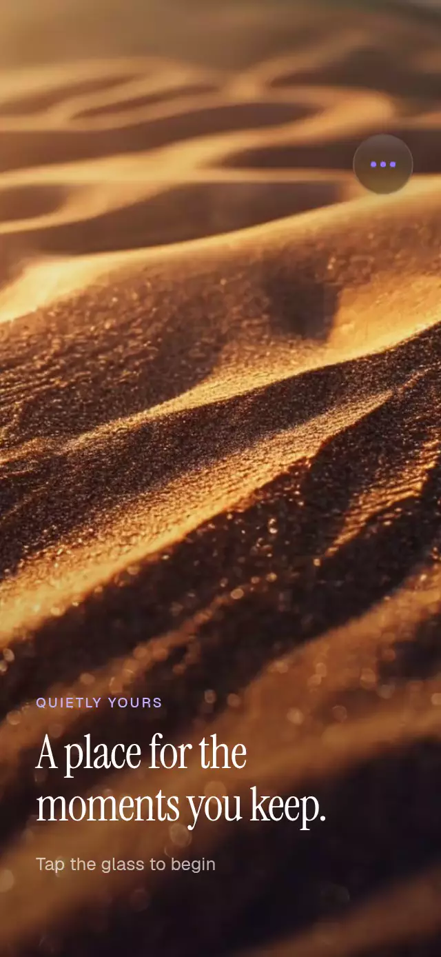
About this animation
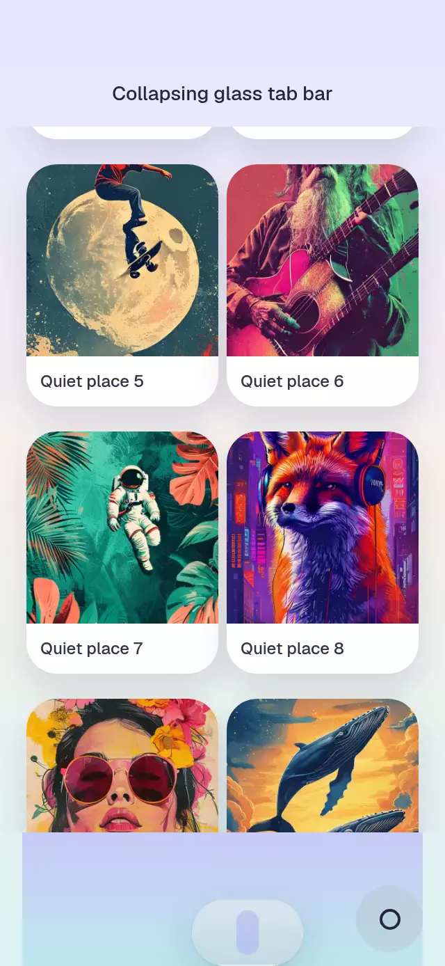
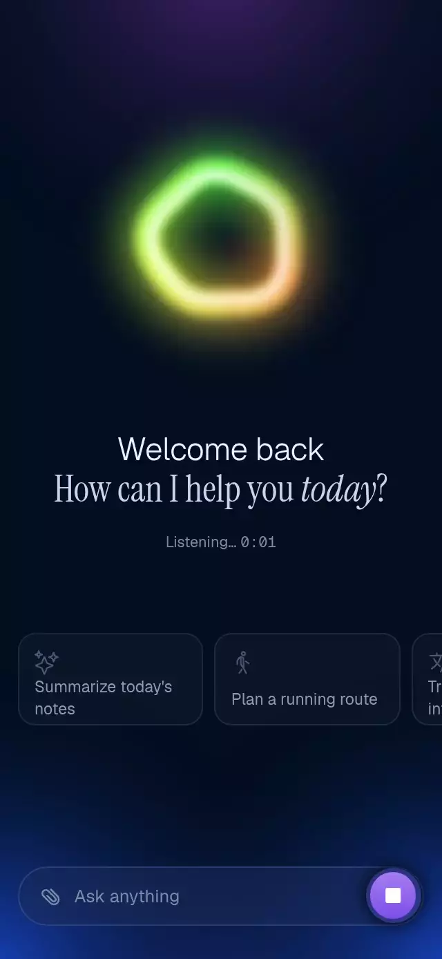
A React Native morphing glass animation can connect an action button, contextual menu, and bottom sheet through one changing surface. This component derives size, position, corner radius, tint, depth, and content reveal from one Reanimated progress value. Springs start at the current position, and a downward Gesture Handler drag follows the same value before settling by release velocity. Expo Blur supplies the translucent material, including an Android blur target. Use it for contextual actions, journal tools, a save-and-share menu, or a focused detail sheet. Choose controlled or uncontrolled state, supply up to four action labels, and customize sheet copy, primary action, blur settings, accent, appearance, font, and background content. Callbacks expose state and action requests, while the ref opens or dismisses the surface.
When to use it
- Expand a button into contextual actions.
- Open a focused detail sheet.
- Group save and share controls.
- Add a glass tool menu to a journal.
A single glass surface that transforms from a compact action button into a contextual menu and a focused bottom sheet.
Why this one
Each state has one clear trigger: the button opens the menu, every menu row opens the sheet, and the backdrop or sheet handle closes one level. Hidden content cannot intercept touches, and the sheet follows a downward drag on the same continuous progress value that drives the entire morph. The glass keeps a generous, continuous silhouette throughout: a fully pill-shaped button, a 28-point menu, and 34-point top corners on the sheet. Content waits until its shape is nearly settled, keeping transitions crisp instead of crossfading through distorted layouts.
How it works
- The component measures its own container and derives button, menu, and sheet geometry from that size.
- One Reanimated progress value drives width, height, position, every corner radius, material tint, background depth, and content reveals.
- Spring animations always start from the current progress, so a new command can interrupt an in-flight morph.
- The sheet pan writes directly to progress and projects release velocity before settling to the sheet or menu.
- A
BlurTargetViewsupplies the scene for native Android blur, while clippedBlurViewcontent provides the changing glass shape.
Install
npx expo install expo-blur expo-linear-gradient react-native-gesture-handler react-native-reanimated react-native-workletsUsage
import MorphingGlassSurface from './MorphingGlassSurface';

export function MemoryScreen() {
  return (
    <MorphingGlassSurface
      actions={['Save', 'Share', 'Add a note', 'Move']}
      onActionPress={(action) => selectAction(action)}
    />
  );
}
Customize the material, content, and state:
import { useRef } from 'react';
import MorphingGlassSurface, {
  type MorphingGlassSurfaceRef,
} from './MorphingGlassSurface';

export function JournalScreen() {
  const surfaceRef = useRef<MorphingGlassSurfaceRef>(null);

  return (
    <MorphingGlassSurface
      ref={surfaceRef}
      accentColor="#6E56FF"
      colorScheme="dark"
      glass={{ intensity: 64, tint: 'systemThinMaterialDark' }}
      sheetTitle="Keep this close"
      primaryLabel="Return to menu"
      onChange={(state) => trackSurfaceState(state)}
    />
  );
}
The forwarded ref exposes showMenu(), showSheet(), and dismiss().
Props
| Prop | Type | Default | Description |
|---|---|---|---|
value | 'button' | 'menu' | 'sheet' | — | Controlled state. |
defaultValue | 'button' | 'menu' | 'sheet' | 'button' | Initial uncontrolled state. |
onChange | (value) => void | — | Called when an interaction requests a state. |
actions | string[] | Four neutral actions | Menu labels; the first four are shown. |
onActionPress | (action, index) => void | — | Called before a menu item opens the sheet. |
sheetTitle | string | 'Make space for what matters' | Sheet heading. |
sheetBody | string | Neutral supporting copy | Sheet description. |
primaryLabel | string | 'Done' | Sheet action label. |
onPrimaryPress | () => void | — | Called before the sheet returns to the menu. |
glass | { intensity?, tint?, highlight? } | Material defaults | Blur and highlight controls. |
accentColor | string | '#6E56FF' | Accent and glow color. |
colorScheme | 'light' | 'dark' | 'auto' | 'auto' | Material and text scheme. |
fontFamily | string | System font | Font for labels and copy. |
background | ReactNode | Ambient gradient | Content rendered behind the glass. |
accessibilityLabel | string | 'Open actions' | Collapsed-button label. |
style | StyleProp<ViewStyle> | — | Outer-container style. |
testID | string | — | Outer-container test identifier. |
Compatibility
- Expo SDK 57
- React Native 0.86, Reanimated 4.5, and Worklets 0.10
- iOS: supported; native bundle verified, device verification pending
- Android: supported; native bundle verified, device verification pending
- Web: supported and export verified
- Works in Expo Go because its native dependencies are included in the SDK
Accessibility
The button, backdrop, menu rows, handle, and primary action expose descriptive button roles and labels. All interactive targets are at least 44 points. Touch controls provide alternatives to the drag gesture, hidden states cannot receive pointer or screen-reader focus, and reduced motion switches directly between geometry and content states without spring travel.
FAQ
- What opens and closes the morphing glass sheet?
- The collapsed button opens the menu and each menu row opens the sheet. The backdrop or sheet handle closes one level; a downward drag can settle back to the menu.
- Can I control the glass menu state from my app?
- Yes. value supports button, menu, and sheet states, with defaultValue for local state and onChange for requests. The ref exposes showMenu, showSheet, and dismiss.
- Does the glass surface require a development build?
- No. Its Expo Blur, Expo Linear Gradient, Gesture Handler, Reanimated, and Worklets dependencies are included in Expo SDK 57. Reduce Motion switches geometry and content directly.