About this animation
A React Native animated photo grid can show a broad creative collection before a welcome action. This component arranges 32 images into four tilted rows, duplicates each row for wrapping, and takes turns moving alternating rows in opposite directions. It waits for image loading or a configurable timeout before revealing the composition, while Reanimated runs row travel and staggered text entrances on the UI thread. Use it for a creative-tool introduction, a photo-collection welcome, an inspiration gallery, or an image-led onboarding screen. Supply your own cards and replace heading segments, supporting copy, and action text. Customize card proportions, gaps, corners, grid rotation and scale, colors, fonts, loading timeout, entrance timing, and row-turn rhythm. Connect the primary action and entrance callbacks, or replay through the ref.
When to use it
- Introduce a creative image collection.
- Welcome users with a tilted photo wall.
- Preview an inspiration gallery.
- Stage an image-led onboarding action.
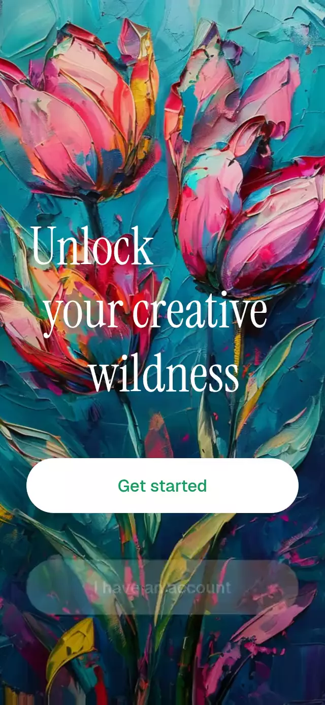
A full-screen onboarding pattern with four tilted photo rows that enter together, then take turns moving through the grid.
How it works
- The component measures its own container with
onLayout, so card and grid sizes stay proportional inside a screen, modal, or tablet layout. - It waits for all 32 card images to load, with a configurable timeout as a fallback, before revealing the composition.
- Each row renders a second copy of its eight cards so it can wrap without exposing an empty edge.
- Reanimated shared values drive the row turns and the staggered copy entrance on the UI thread.
- Alternating rows move in opposite directions, with their turns offset so only one row moves at a time.
Install
npx expo install expo-image expo-linear-gradient react-native-reanimatedUsage
import TiltedGridOnboarding from './TiltedGridOnboarding';

const cards = [
  require('./assets/card-01.jpg'),
  // Add 31 more local or remote image sources.
];

export function WelcomeScreen() {
  return <TiltedGridOnboarding cards={cards} />;
}
Customize the measured look and replay the full entrance when needed:
import { useRef } from 'react';
import TiltedGridOnboarding, {
  type TiltedGridOnboardingRef,
} from './TiltedGridOnboarding';

export function WelcomeScreen() {
  const onboardingRef = useRef<TiltedGridOnboardingRef>(null);

  return (
    <TiltedGridOnboarding
      ref={onboardingRef}
      cards={cards}
      title="Make your"
      highlightedTitle="next idea"
      titleSuffix="feel real"
      subtitle="Turn a short prompt into something worth sharing."
      ctaLabel="Start creating"
      accentColor="#7C3AED"
      gridRotation={-8}
      turnDuration={900}
      titleFontFamily="YourRegularFont"
      highlightedTitleFontFamily="YourBoldFont"
      ctaFontFamily="YourSemiboldFont"
      onCtaPress={() => continueOnboarding()}
      onAnimationStart={() => trackAnimationStart()}
    />
  );
}
The forwarded ref exposes replay().
Props
| Prop | Type | Default | Description |
|---|---|---|---|
cards | ImageSourcePropType[] | Required | The 32 images displayed across four rows. |
title | string | 'Bring your' | Copy before the emphasized title text. |
highlightedTitle | string | 'ideas' | Emphasized copy on the title's second line. |
titleSuffix | string | 'to life' | Copy after the emphasized title text. |
subtitle | string | 'Create something remarkable from a simple prompt.' | Supporting copy below the title. |
ctaLabel | string | 'Get started' | Primary action label. |
ctaAccessibilityLabel | string | ctaLabel | Screen-reader label for the primary action. |
onCtaPress | () => void | — | Called when the primary action is pressed. |
onAnimationStart | () => void | — | Called whenever an entrance sequence begins. |
backgroundColor | string | '#0E0A1F' | Background behind the grid and content. |
accentColor | string | '#7C3AED' | Primary action color. |
cardBackgroundColor | string | '#241B46' | Placeholder color while card images load. |
cardGap | number | 8 | Gap between cards and rows in points. |
cardWidthRatio | number | 0.3 | Card width as a fraction of the component width. |
cardHeightRatio | number | 0.95 | Card height as a fraction of its width. |
gridHeightRatio | number | 0.58 | Grid viewport height as a fraction of the component height. |
gridRotation | number | -8 | Grid rotation in degrees. |
gridScale | number | 1.15 | Scale applied to the complete grid. |
cardBorderRadius | number | 12 | Card corner radius in points. |
imageLoadTimeout | number | 1500 | Maximum image-loading wait before the entrance starts, in milliseconds. |
loopStartDelay | number | 1600 | Delay before the first row turn begins, in milliseconds. |
turnDuration | number | 900 | Duration of each row turn in milliseconds. |
turnPause | number | 600 | Pause included between row turns, in milliseconds. |
entranceDuration | number | 350 | Duration of the copy and action entrances, in milliseconds. |
rowEntranceDuration | number | 450 | Duration of each row entrance, in milliseconds. |
firstRowEntranceDelay | number | 80 | Delay before the first row enters, in milliseconds. |
rowEntranceStagger | number | 140 | Additional delay for each consecutive row, in milliseconds. |
subtitleEntranceDelay | number | 80 | Delay before the subtitle enters, in milliseconds. |
ctaEntranceDelay | number | 200 | Delay before the primary action enters, in milliseconds. |
ctaEntranceScale | number | 0.96 | Initial scale of the primary action entrance. |
ctaPressScale | number | 0.96 | Scale reached halfway through action feedback. |
ctaPressDuration | number | 120 | Duration of each half of action feedback, in milliseconds. |
entryEasing | EasingFunction | Easing.out(Easing.cubic) | Easing used by entrances and action feedback. |
loopEasing | EasingFunction | Easing.bezier(0.65, 0, 0.35, 1) | Easing used by row turns. |
titleFontFamily | string | System font | Font for regular title copy. |
highlightedTitleFontFamily | string | System bold font | Font for emphasized title copy. |
subtitleFontFamily | string | System font | Font for supporting copy. |
ctaFontFamily | string | System semibold font | Font for the primary action label. |
style | StyleProp<ViewStyle> | — | Outer-container style. |
testID | string | — | Test identifier for the outer container. |
Compatibility
- Expo SDK 57
- React Native 0.86
- Reanimated 4.5
- iOS: supported, not yet verified on a device
- Android: supported, not yet verified on a device
- Web: verified
- Works in Expo Go because its native dependencies are included in the SDK
Accessibility
The primary action is exposed as a button and accepts a custom screen-reader label. With reduced motion enabled, the looping card movement stops and the card rows, title, subtitle, and action use a short fade; the button keeps its brief press feedback.
FAQ
- How many images does the tilted photo grid use?
- The documented cards API uses 32 images across four rows. Each row renders a second copy of its eight cards to wrap without exposing an empty edge.
- Can I change the grid proportions and animation rhythm?
- Yes. Configure cardWidthRatio, cardHeightRatio, gridHeightRatio, cardGap, gridRotation, gridScale, turnDuration, turnPause, and the entrance timing props.
- Does the grid wait for images before animating?
- Yes. It waits for all images or imageLoadTimeout, then starts the entrance. Reduce Motion stops looping card travel and replaces the entrances with short fades.