About this animation
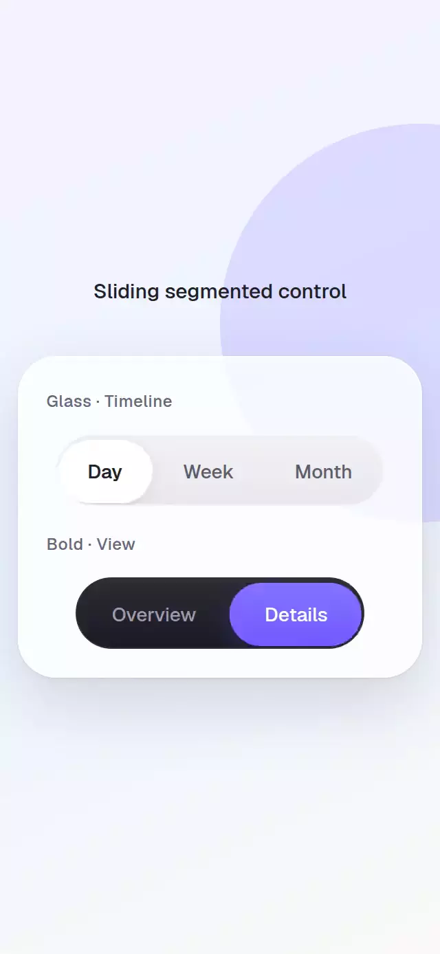
A measured segmented control with a spring indicator, layered light, and a quick selection sweep.
How it works
- Every segment reports its rendered width, allowing labels of different lengths.
- One shared index interpolates the indicator's left edge, width, and stretch.
- Inactive labels stay above the track while a second high-contrast label row is clipped to the moving indicator, so text remains readable during every transition.
- Drag position is mapped between measured segment centers and release velocity biases the destination.
- Presses, gestures, and the imperative API share controlled and uncontrolled state handling.
- Every selection adds a brief indicator pop and light sweep while keeping the spring interruptible.
Install
npx expo install expo-linear-gradient react-native-gesture-handler react-native-reanimated react-native-workletsUsage
<SlidingSegmentedControl segments={['Day', 'This week', 'Month']} />

<SlidingSegmentedControl value={period} onChange={setPeriod} indicatorColor="#24242B" activeColor="#FFFFFF" />

<SlidingSegmentedControl segments={views} colorScheme="dark" glowColor="#6E56FF" />
Props
| Prop | Type | Default | Description |
|---|---|---|---|
segments | readonly string[] | — | Segment labels. |
value | number | — | Controlled selected index. |
defaultValue | number | 0 | Initial uncontrolled index. |
onChange | (index: number) => void | — | Receives requested indexes. |
height | number | 44 | Control height. |
segmentPadding | number | 18 | Horizontal label padding. |
trackColor | string | '#E7E7EC' | Track color. |
indicatorColor | string | '#FFFFFF' | Indicator color. |
activeColor | string | '#202027' | Selected label color. |
inactiveColor | string | '#5B5D6B' | Unselected label color. |
colorScheme | 'light' | 'dark' | 'auto' | 'auto' | Material default appearance. |
glowColor | string | indicatorColor | Indicator glow color. |
fontFamily | string | System font | Label font family. |
springDamping | number | 20 | Indicator damping. |
springStiffness | number | 260 | Indicator stiffness. |
accessibilityLabel | string | 'Segmented control' | Group label. |
style | StyleProp<ViewStyle> | — | Outer style. |
testID | string | — | Test identifier. |
The ref exposes select(index), next(), and previous().
Compatibility
- Expo SDK 57, React Native 0.86, Reanimated 4.5
- iOS and Android supported but not device-verified; web verified by the project gate
- Works in Expo Go
Accessibility
Each segment is an individually labeled tab with selected state. Reduced Motion updates the indicator immediately while retaining drag and press input.
Why this one
Unlike controls that blend label colors while the thumb moves, this component clips a dedicated active-text layer to the indicator. Every letter keeps intentional contrast over both surfaces, including mid-drag positions and both color schemes.