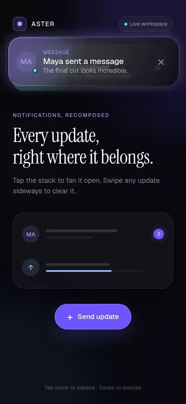
About this animation
A dark glass notification stack that fans open with depth, glows on arrival, and dismisses with physical swipes.
Why this one
Most toast demos repeat one generic alert and flatten every notification into the same card. This stack gives payment, message, upload, error, and undo states distinct content while keeping one coherent material. Three compact cards recede through scale and live blur; tapping reveals the full queue at an exact 8 pt rhythm while the app content springs clear and dims, and velocity-projected swipes make dismissal feel direct rather than scripted.
How it works
ToastProviderowns the queue, timers, expansion progress, and public API.- Every card derives its compact depth, blur, and expanded 8 pt spacing from one shared progress value.
- A pan gesture applies elastic resistance, projects release velocity, and springs the card offscreen or home.
- The same expansion progress dims and moves app content below the readable queue, while
BlurView, a one-point gradient edge, and a short-lived colored glow create the material. - Reduced Motion swaps spatial springs for short fades and keeps every gesture available through buttons.
Install
npx expo install expo-blur expo-linear-gradient react-native-gesture-handler react-native-reanimated react-native-workletsUsage
import { ToastProvider, useToast } from './toast-stack';

function SaveButton() {
  const toast = useToast();

  return (
    <Button
      title="Save"
      onPress={() =>
        toast.show({
          title: 'Payment received',
          message: '$184.00 was added to your balance',
          type: 'success',
        })
      }
    />
  );
}

export default function Screen() {
  return (
    <ToastProvider>
      <SaveButton />
    </ToastProvider>
  );
}
With personality knobs and an action:
<ToastProvider
  duration={7000}
  maxVisible={5}
  fontFamily="Geist_400Regular"
  titleFontFamily="Geist_500Medium"
  hostStyle={{ top: 72 }}
  expandedContentOffset={360}
>
  <AppContent />
</ToastProvider>

toast.show({
  title: 'Export couldn’t finish',
  message: 'Your timeline is safe.',
  type: 'error',
  actionLabel: 'Retry',
  onAction: retryExport,
});
Props
ToastProvider
| Name | Type | Default | Description |
|---|---|---|---|
children | ReactNode | — | App content rendered beneath the toast layer. |
duration | number | 5000 | Default auto-dismiss delay in milliseconds. |
maxVisible | number | 5 | Maximum number of visible toasts. |
fontFamily | string | System | Font for labels and supporting copy. |
titleFontFamily | string | System | Font for titles and actions. |
onDismiss | (id: string) => void | — | Called after a toast is dismissed. |
style | StyleProp<ViewStyle> | — | Outer provider container style. |
hostStyle | StyleProp<ViewStyle> | — | Absolute toast host style. |
expandedContentOffset | number | 344 | Maximum distance app content moves down while the stack is open. |
testID | string | — | Test identifier for the provider. |
ToastInput
| Name | Type | Default | Description |
|---|---|---|---|
title | string | — | Primary notification copy. |
message | string | — | Supporting copy. |
type | success | message | upload | error | undo | info | info | Semantic visual treatment. |
duration | number | Provider value | Per-toast auto-dismiss delay. |
actionLabel | string | — | Short action such as Retry or Undo. |
onAction | () => void | — | Called when the action is pressed. |
progress | number | 0 | Upload progress from 0 to 1. |
avatarLabel | string | A | One or two avatar characters for message toasts. |
ToastProviderRef and useToast() expose show, dismiss, dismissAll, expand, and collapse.
Compatibility
- Expo SDK 57
- React Native 0.86
- Reanimated 4.5 and Worklets 0.10
- iOS: unverified on a physical device
- Android: unverified on a physical device; native blur uses the SDK 31+ renderer and falls back to the translucent surface on older versions
- Web: verified
- Included modules work in Expo Go
Accessibility
Cards announce their title and message, actions and dismiss controls have explicit button labels, and tapping a card is an alternative to the expansion gesture. Reduced Motion replaces entrance and fan movement with short fades while preserving content and controls.
Source code
Free with an account
Sign in with your email to read the full source here, or install it in one command with the CLI.