About this animation
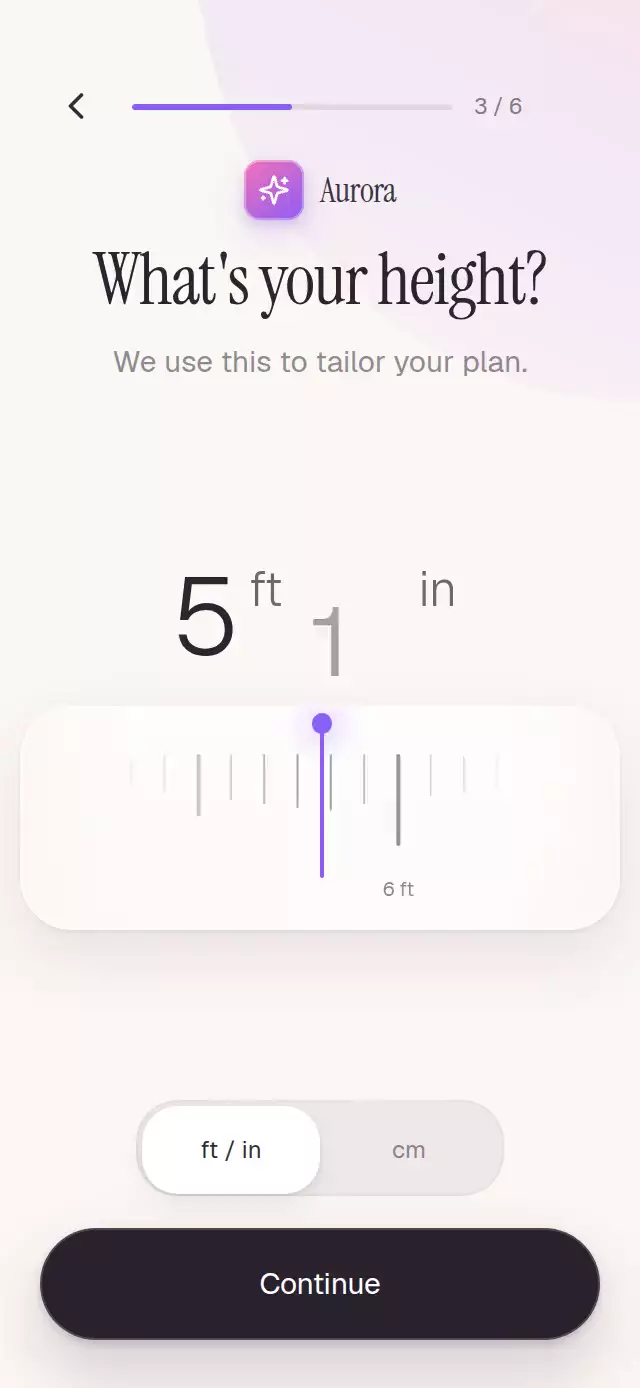
A tactile height picker with an inertial ruler, magnetic snapping, magnified ticks, and a rolling unit-aware value.
Why this one
Most ruler pickers stop at a flat strip of marks. This version turns the pattern into a polished onboarding moment: a three-level scale sits inside a softly lit material track, nearby ticks respond like a lens, both unit systems physically redistribute, and individually clipped number fields roll from the same continuous source. Every control remains interruptible, accessible, and usable by touch without dragging.
How it works
- One continuous shared value stores the selected height in centimeters, keeping drag, inertia, snapping, both rulers, the rolling value, and callbacks synchronized.
- A horizontal pan converts pixels into physical units, hands its release velocity to
withDecay, and then springs to the closest inch or centimeter. - Imperial and metric marks read the same value while a spring-driven unit progress redistributes their spacing and crossfades the two scales.
- Minor, midpoint, and labeled major marks each derive their height and opacity from distance to the center, creating a soft visual lens inside the ruler track.
- Feet, inches, and centimeters roll inside separate one-line clipping windows, so outgoing and incoming values never escape the display.
- The forwarded ref can replay the soft-focus entrance, select a value, or change units without demo-specific props.
Install
npx expo install expo-linear-gradient @shopify/react-native-skia react-native-gesture-handler react-native-reanimated react-native-workletsIcons: Lucide (ISC).
Usage
import MeasureRulerPicker from './MeasureRulerPicker';

export function HeightStep() {
  return (
    <MeasureRulerPicker
      onValueChange={(inches) => saveHeight(inches)}
      onContinue={goToNextStep}
    />
  );
}
Customize its range, typography, and controls:
import { useRef } from 'react';
import MeasureRulerPicker, {
  type MeasureRulerPickerRef,
} from './MeasureRulerPicker';

export function CustomHeightStep() {
  const pickerRef = useRef<MeasureRulerPickerRef>(null);

  return (
    <MeasureRulerPicker
      ref={pickerRef}
      initialValue={67}
      minimumValue={48}
      maximumValue={84}
      accentColor="#7C3AED"
      fontFamily="YourSansFont"
      lightFontFamily="YourLightSansFont"
      titleFontFamily="YourDisplayFont"
      onUnitChange={(unit) => trackUnit(unit)}
      onBack={goBack}
    />
  );
}
The ref exposes replay(), setValue(inches), and setUnit(unit).
Props
| Prop | Type | Default | Description |
|---|---|---|---|
initialValue | number | 69 | Initial height in inches. |
initialUnit | 'imperial' | 'metric' | 'imperial' | Initial unit system. |
minimumValue | number | 48 | Minimum height in inches. |
maximumValue | number | 84 | Maximum height in inches. |
title | string | "What's your height?" | Main question. |
helperText | string | 'We use this to tailor your plan.' | Supporting copy. |
continueLabel | string | 'Continue' | Primary action label. |
accentColor | string | '#8B5CF6' | Progress, ruler, and glow color. |
backgroundColor | string | '#FBF7F4' | Screen background color. |
fontFamily | string | System font | Body and control font. |
lightFontFamily | string | System font | Rolling-value font. |
titleFontFamily | string | System font | Display font for the question. |
accessibilityLabel | string | 'Height' | Screen-reader label for the ruler. |
onValueChange | (inches: number) => void | — | Called at each selected inch. |
onUnitChange | (unit: MeasureUnit) => void | — | Called after a unit change. |
onBack | () => void | — | Called when Back is pressed. |
onContinue | () => void | — | Called when Continue is pressed. |
style | StyleProp<ViewStyle> | — | Outer-container style. |
testID | string | — | Test identifier for the outer container. |
Compatibility
- Expo SDK 57
- React Native 0.86
- Reanimated 4.5 and Worklets 0.10
- Skia 2.6
- iOS: supported, not yet verified on a device
- Android: supported, not yet verified on a device
- Web: supported, not yet visually verified
- Works in Expo Go because its native dependencies are bundled with the SDK
Accessibility
The ruler exposes adjustable increment and decrement actions, announces its value in the active unit, and supports tapping a position as an alternative to dragging. Back, unit, and Continue controls use labeled 44-point-or-larger targets. Reduced Motion removes the entrance travel, blur, inertia, and bounce while preserving the final state and direct manipulation.