About this animation
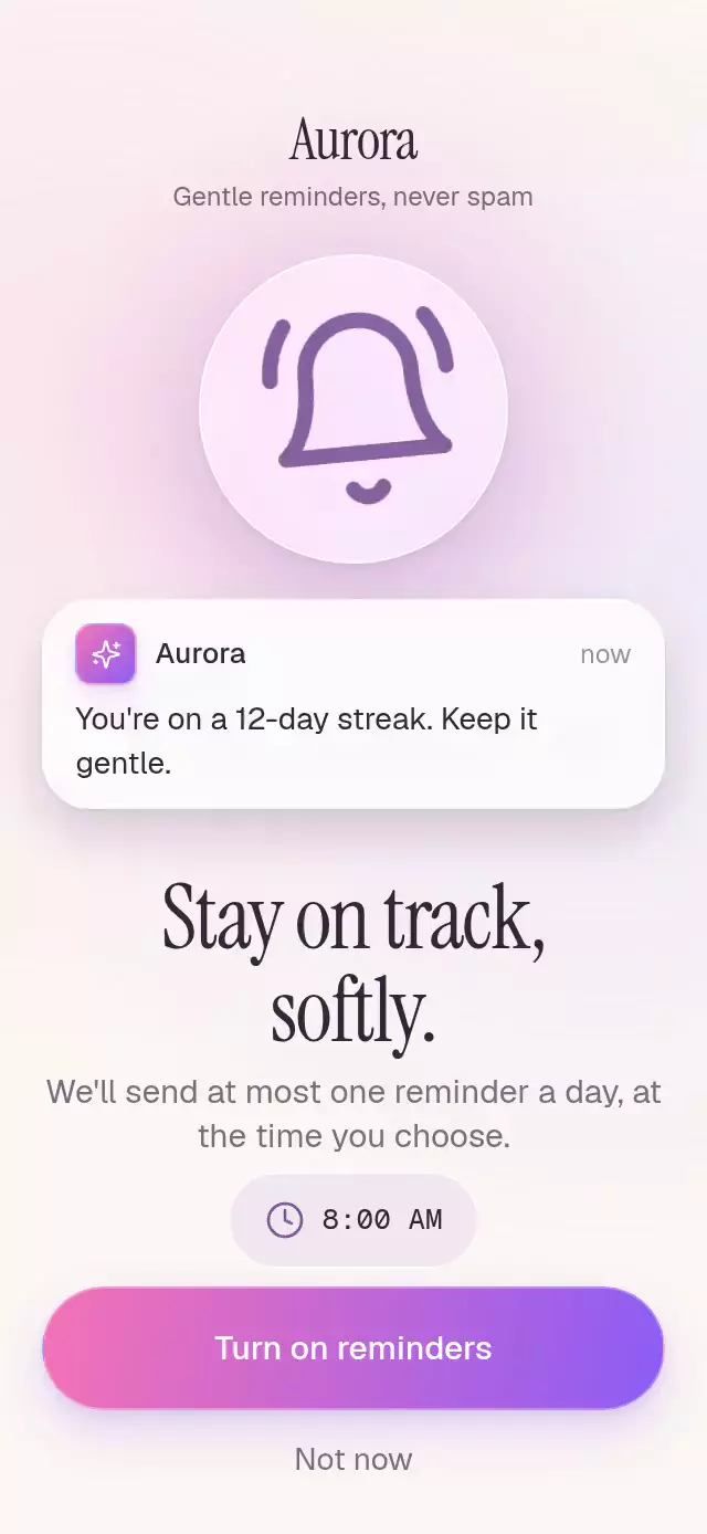
An inviting notification onboarding screen: a ringing bell releases realistic previews before the user chooses a reminder time.
Why this one
The bell demonstrates what a reminder feels like instead of showing a static permission icon. Each swing releases a different preview, and users choose their morning time before agreeing. Activation gathers the previews back into the bell and draws a confirmation check. The Aurora demo uses the shared brand kit, not a third-party app identity.
How it works
- Measure the component with
onLayout; hide the measured composition until its first layout. - Advance one UI-thread introduction timeline from 0 to 3. Three arrivals are spaced 450 ms apart; each card falls from the bell center with a short damped landing and pushes earlier cards down into the stack.
- Derive the bell swing from that timeline with a decaying oscillation around its upper anchor. The default intro settles in 1,350 ms.
- A separate interruptible outcome spring controls collection, bell color, label removal, and the Lucide check's drawn path. Press feedback uses independent springs.
- The time popover grows from the pill and offers three 44-point touch targets. The host owns the system permission call; this component invokes
onRequestPermissionand immediately presents its optimistic success state. - Reduced motion keeps the bell still and fades previews, outcome, and popover without displacement or scale changes.
Install
Copy this folder without demo/ into your project:
npx expo install react-native-reanimated expo-blur expo-linear-gradient @shopify/react-native-skiaValidated package versions: Reanimated 4.5.1, expo-blur ~57.0.3, expo-linear-gradient ~57.0.2, Skia 2.6.2. React and React Native are supplied by the host. Use the SDK-compatible worklets setup in your app.
For web, load CanvasKit before rendering this component, using your app's Skia web loader / deferred boundary. This folder imports Skia; do not register it as an eager catalog import before CanvasKit is ready. The component contains six small canvases at most, below Chromium's context limit.
Usage
import { PermissionPrimer } from './permission-primer';

export function ReminderStep() {
  return (
    <PermissionPrimer
      onRequestPermission={(hour) => configureReminders(hour)}
    />
  );
}
With content and personality controls:
<PermissionPrimer
  appName="Your app"
  messages={[
    'Take a quiet moment.',
    'Your routine is ready.',
    'A new story awaits.',
  ]}
  gradientColors={['#F472B6', '#8B5CF6']}
  initialHour={8}
  staggerMs={450}
  blurIntensity={50}
  colorScheme="light"
  onRequestPermission={(hour) => configureReminders(hour)}
  onDefer={() => continueOnboarding()}
/>
Load fonts in the host and pass their family names. Without font props the component uses system fonts. The demo uses Geist, Instrument Serif, and Geist Mono; the available shared kit weight is Geist Medium for stronger labels.
Props
| Prop | Type | Default | Purpose |
|---|---|---|---|
appName | string | Your app | Wordmark and notification sender |
messages | readonly [string, string, string] | Three neutral reminders | Preview arrival order |
title | string | Stay on track,\nsoftly. | Two-line editorial heading |
description | string | One reminder a day explanation | Frequency and scheduling promise |
promise | string | Gentle reminders, never spam | Onboarding eyebrow |
enableLabel | string | Turn on reminders | Primary action and accessible label |
deferLabel | string | Not now | Secondary action and accessible label |
successLabel | string | Reminders on | Success status prefix |
deferredLabel | string | Your pace, always. | Deferred status |
gradientColors | readonly [string, string] | Pink / violet | App tile, button, filled bell |
initialHour | 7 | 8 | 9 | 8 | Initial morning reminder hour |
onRequestPermission | (hour) => void | — | Host permission integration; no native prompt in demo |
onDefer | () => void | — | Skip integration |
onStateChange | (state) => void | — | presenting, enabled, or deferred |
onHourChange | (hour) => void | — | Selected morning hour |
fontFamily | string | System | Body font |
mediumFontFamily | string | System | Strong label font |
titleFontFamily | string | System | Editorial font |
monoFontFamily | string | System | Tabular time font |
colorScheme | light | dark | auto | auto | Appearance |
timeAccessibilityLabel | string | Choose reminder time | Hour selector label |
staggerMs | number | 450 | Arrival spacing; clamped to at least 250 ms |
blurIntensity | number | 50 | Glass intensity |
style | StyleProp<ViewStyle> | — | Root styling |
testID | string | — | Root identifier |
PermissionPrimerRef exposes reset(), enable(), toggleTime(), and selectHour(7 | 8 | 9). Reset restores presenting and replays the intro while preserving the selected hour. The demo's 5.2-second autoplay loop shows arrivals, opens the time selector, then activates. Terminal states prevent duplicate activation; reset starts another interaction.
Compatibility
Expo SDK 57, React Native 0.86.3, Reanimated 4.5.1, Skia 2.6.2. Uses the SDK 57 BlurTargetView / blurTarget API with dimezisBlurViewSdk31Plus on Android. Older Android versions use its supported fallback. Expo Go includes the installed native modules; a copied host needs SDK-compatible dependencies and worklets configuration.
Typecheck, lint, exports, and native bundle checks are build validation. iOS, Android, and web visual behavior and touch behavior remain unverified until the owner reviews the demo. No Chromium recording was performed.
Accessibility
Buttons announce their purpose and disabled state. The time pill announces its current value and expansion; choices announce selection. Hidden options reject touches and are excluded from the accessibility tree. Results use a polite live region. All controls are at least 44 points tall. There are no gesture-only actions. Reduced motion removes swings, falls, collection movement, scaling, and bounce while retaining short fades.
The full heading and explanation remain in normal flow and can expand with text scaling. The designed phone sizes are 390×844 and 320×694; larger accessibility text or longer custom copy should be reviewed by the host in its container.
Icons: Lucide (ISC), copied from docs/kit/lucide-paths.json. Aurora's demo colors and sparkles tile come from docs/kit/marcas.json.