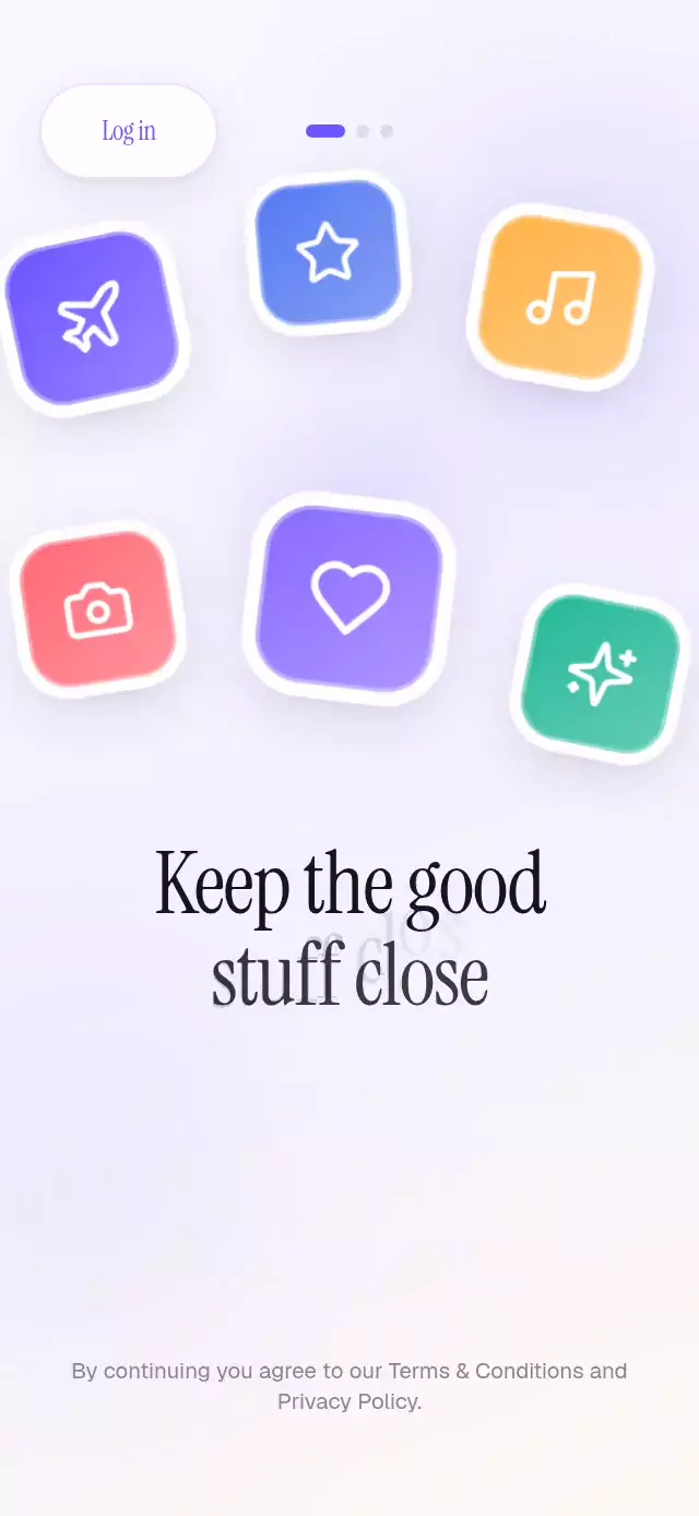
About this animation
A polished multi-page onboarding pattern where tactile die-cut stickers fall, bounce, and invite the user to play.
How it works
- The component measures its own container with
onLayout, then positions every element as a fraction of that width and height so the composition works in full screens, modals, and tablet layouts. - A soft three-stop gradient, two blurred pools of ambient color, and deterministic grain create depth without a heavy image asset.
- Skia draws each sticker with a Lucide icon, a thick white die-cut edge, two shadow passes, an inset highlight, and a restrained color palette. Reanimated gives each one a staggered, weighted fall and spring landing.
- Every sticker has its own interruptible pan gesture. It follows the finger, tilts with horizontal travel, inherits release velocity, and springs home; tapping provides a playful alternative.
- Title letters fly independently, then crossfade into the complete typeset line. That final line uses the font engine's real kerning and glyph metrics, so the settled headline is perfectly readable.
- A page swipe and the main button share the same transition. Imperative
next,goTo, andreplaycontrols make tutorials and automated demos straightforward.
Why this one
Most sticker onboarding screens rely on flat emoji, generic clip-art, or chaotic rainbow motion. This version treats stickers like physical objects: consistent die-cut construction, soft two-layer depth, restrained light, and direct manipulation. The result keeps the energy of the pattern while feeling closer to a designed product surface than a novelty illustration.
Icons: Lucide (ISC).
Install
npx expo install @shopify/react-native-skia expo-linear-gradient react-native-gesture-handler react-native-reanimated react-native-workletsFor web, initialize Skia before rendering the app:
import { LoadSkiaWeb } from '@shopify/react-native-skia/lib/module/web';

await LoadSkiaWeb({
  locateFile: (file) => `/${file}`,
});
Copy canvaskit.wasm from node_modules/canvaskit-wasm/bin/full/ into your web public directory. If your Expo entry already loads Skia for web, no additional setup is needed.
Usage
import StickerBurstOnboarding from './StickerBurstOnboarding';

export function WelcomeScreen() {
  return <StickerBurstOnboarding onFinish={() => openHome()} />;
}
Customize the pages, colors, typography, and external controls:
import { useRef } from 'react';
import StickerBurstOnboarding, {
  type StickerBurstOnboardingRef,
} from './StickerBurstOnboarding';

export function WelcomeScreen() {
  const onboardingRef = useRef<StickerBurstOnboardingRef>(null);

  return (
    <StickerBurstOnboarding
      ref={onboardingRef}
      accentColor="#6D4AFF"
      titleColor="#14112B"
      titleFontFamily="YourDisplayFont"
      fontFamily="YourBodyFont"
      ctaLabel="Next"
      finishLabel="Start exploring"
      onLogin={() => openLogin()}
      onPageChange={(index) => trackPage(index)}
      onFinish={() => openHome()}
    />
  );
}
The forwarded ref exposes next(), goTo(index), and replay().
Props
| Prop | Type | Default | Description |
|---|---|---|---|
pages | OnboardingPage[] | Three generic pages | Two-line titles, subtitles, and normalized sticker layouts. |
ctaLabel | string | 'Continue' | Main action label before the last page. |
finishLabel | string | 'Get started' | Main action label on the last page. |
loginLabel | string | 'Log in' | Top-right action label. |
legalText | string | Terms and privacy sentence | Legal copy along the bottom. |
accentColor | string | '#6E56FF' | Button, active page indicator, and ambient glow. |
titleColor | string | '#17131F' | Color of both title lines. |
titleFontFamily | string | System font | Font family for titles and actions. |
fontFamily | string | System font | Font family for subtitle and legal copy. |
onFinish | () => void | — | Called from the final page action. |
onLogin | () => void | — | Called from the top-right action. |
onPageChange | (index: number) => void | — | Called after a page becomes active. |
style | StyleProp<ViewStyle> | — | Outer-container style. |
testID | string | — | Test identifier for the outer container. |
OnboardingPage.stickers accepts kind, color, x, y, size, and optional rotate. Available kinds are camera, heart, music, plane, sparkles, and star. The x and y values are fractions of the illustration area; size is a fraction of component width.
Compatibility
- Expo SDK 57
- React Native 0.86
- Reanimated 4.5
- React Native Skia 2.6
- iOS: supported, not yet verified on a device
- Android: supported, not yet verified on a device
- Web: verified; requires
LoadSkiaWeband CanvasKit setup - Works in Expo Go because the native dependencies are included in the SDK
Accessibility
The complete title is exposed as one accessibility label while its individual animated letters are hidden from screen readers. Stickers and both actions have button roles and clear labels, and swiping is never the only way to continue. When reduced motion is enabled, stickers and letters fade into place without falling, bouncing, tilting, or emitting confetti.