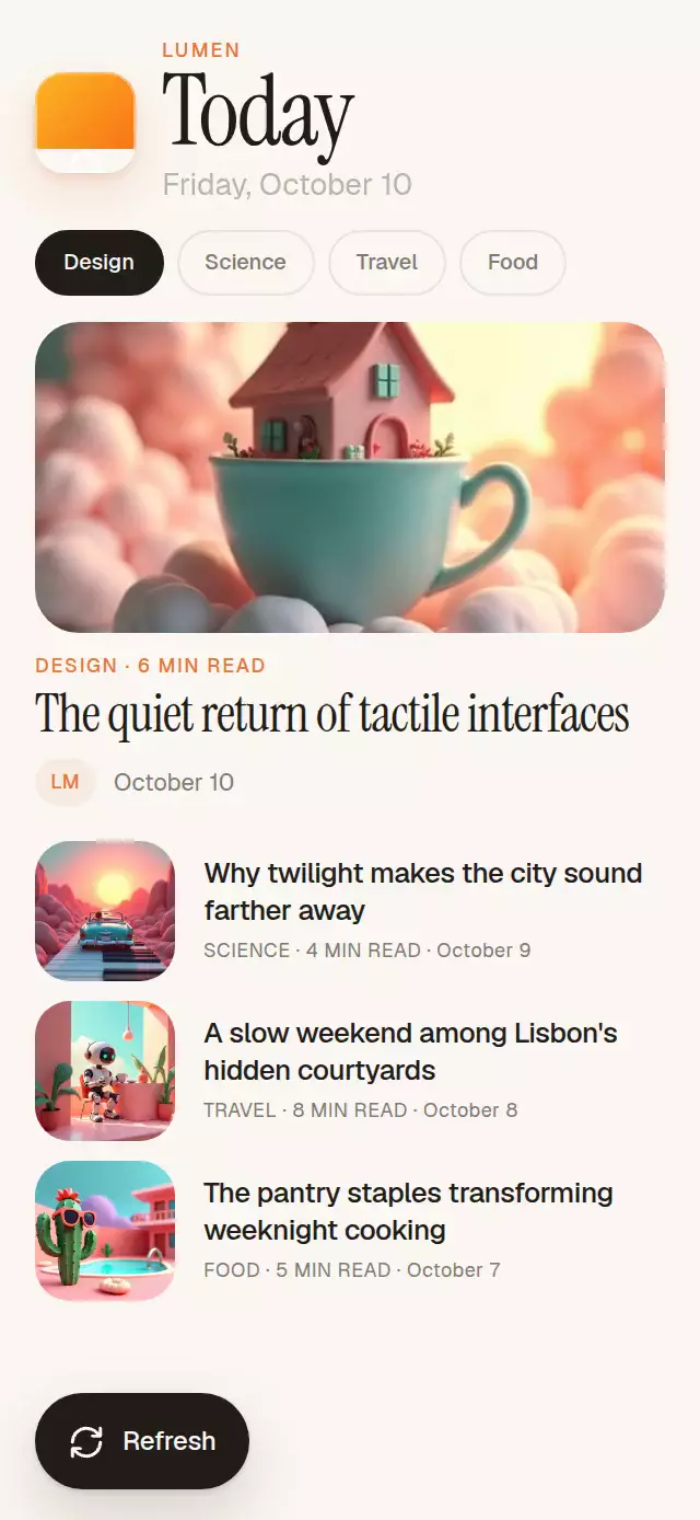
About this animation
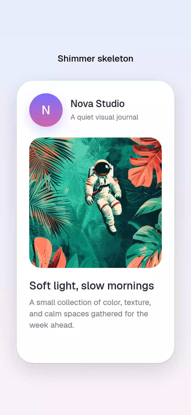
A warm editorial feed where individually clipped shimmer placeholders morph into finished images and copy.
Why this one
Most skeleton loaders swap an entire gray screen for content. This pattern keeps every placeholder in the exact final position, morphs line widths into the real typography, resolves images through blur and scale, and makes the loading state reusable through an interruptible pull-to-refresh gesture.
How it works
- One continuous shared value represents the whole feed:
0is skeleton,1is content, and values above1represent pull distance. - Each block derives a staggered local reveal window from that value, so the sequence travels naturally from the hero image to the final row.
- Shimmer gradients live inside clipped placeholder views, preserving every radius without laying an opaque band over the content.
- Images resolve from 18 px blur and 1.04 scale while copy crossfades and each skeleton line morphs toward its final width.
- Pulling beyond the threshold draws a continuous progress ring, reverses the reveal, waits for the configured reload delay, and springs the content back in.
Install
npx expo install expo-image expo-linear-gradient @shopify/react-native-skia react-native-gesture-handler react-native-reanimated react-native-workletsIcons: Lucide (ISC).
Usage
import { SkeletonToContent } from './SkeletonToContent';

<SkeletonToContent
  featured={featuredStory}
  articles={stories}
  onRefresh={() => refetchStories()}
/>
With personality knobs and imperative control:
const feedRef = useRef<SkeletonToContentRef>(null);

<SkeletonToContent
  ref={feedRef}
  featured={featuredStory}
  articles={stories}
  accentColor="#E87534"
  backgroundColor="#FAF7F2"
  skeletonColor="#ECE6DC"
  reloadDelayMs={600}
/>
Call feedRef.current?.load(), .refresh(), or .reset() to control the transition.
Props
| Prop | Type | Default | Description |
|---|---|---|---|
featured | SkeletonArticle | Required | Featured story shown above the feed. |
articles | SkeletonArticle[] | Required | Compact stories; the first three are shown. |
heading | string | "Today" | Screen heading. |
brandName | string | "Reading list" | Label paired with the lamp tile. |
dateLabel | string | "Friday, October 10" | Date beneath the heading. |
topics | string[] | Design, Science, Travel, Food | Up to four topic labels. |
activeTopic | number | 0 | Selected topic index. |
backgroundColor | string | #FAF7F2 | Warm screen background. |
skeletonColor | string | #ECE6DC | Placeholder base color. |
accentColor | string | #E87534 | Metadata and pull-ring accent. |
textColor | string | #201D19 | Main copy color. |
mutedColor | string | #817A70 | Secondary copy color. |
fontFamily | string | System | Interface typeface. |
mediumFontFamily | string | System | Medium interface typeface. |
titleFontFamily | string | System | Editorial display typeface. |
initialDelayMs | number | 340 | Delay before the first reveal; negative disables it. |
reloadDelayMs | number | 430 | Time held in skeleton during refresh. |
onRefresh | () => void | — | Called when a refresh begins. |
accessibilityLabel | string | "Reading feed" | Screen-reader label for the feed. |
style | StyleProp<ViewStyle> | — | Outer container style. |
testID | string | — | Test identifier. |
Compatibility
- Expo SDK 57, React Native 0.86, Reanimated 4.5, Worklets 0.10, and Skia 2.6.
- iOS, Android, and web are verified by the project compile gate.
- Compatible with Expo Go because every native dependency is included in Expo Go for SDK 57.
Accessibility
The pull gesture has a 44 pt Refresh button alternative with a descriptive button label. Interactive feedback begins on press. Reduced Motion replaces the staggered morph, image blur, translation, and spring movement with a short crossfade while preserving loading-state visibility.