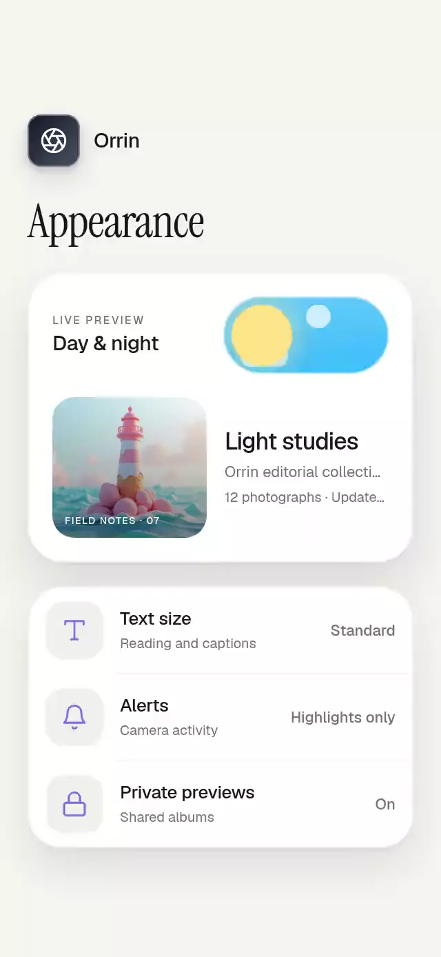
About this animation
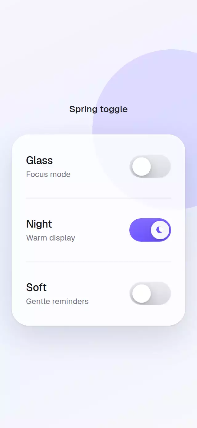
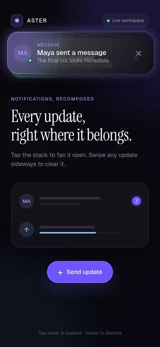
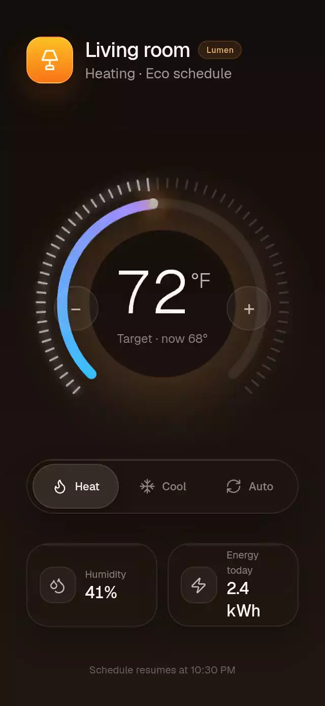
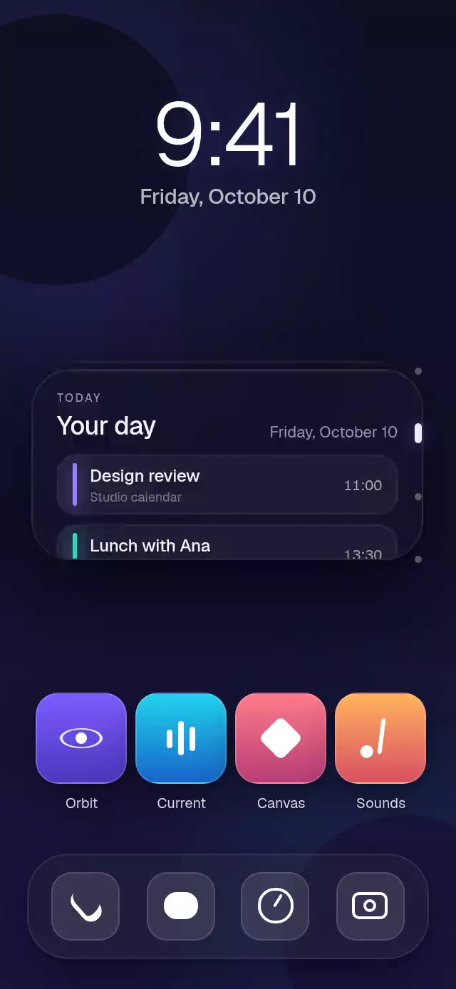
A tactile day-to-night switch that sends a circular theme reveal across a complete appearance screen.
Why this one
Most theme toggles stop at recoloring a small track or fading the page. This version makes the switch the physical source of the change: one continuous progress value moves the thumb, rolls the sun into a crescent moon, clears the clouds, staggers eight stars, and expands the dark surface from the thumb across the whole composition. The surrounding preview and settings make the interaction feel like a real product decision instead of an isolated control.
How it works
- A single Reanimated shared value represents the full light-to-dark range and remains directly draggable.
- Releasing the gesture projects its velocity toward light or dark, then settles with a configurable-feeling spring tuned to damping 16 and stiffness 180.
- Track color, clouds, stars, thumb travel, sun rotation, lunar cutout, craters, and screen materials are derived from that same progress.
- A screen-sized circle is centered on the thumb and scales with progress, producing the signature radial theme wipe without a rectangular overlay.
- A forwarded ref exposes
toggle()andsetDark()for onboarding, previews, and autoplay.
Icons: Lucide (ISC).
Install
npx expo install expo-image expo-linear-gradient @shopify/react-native-skia react-native-gesture-handler react-native-reanimated react-native-workletsUsage
import SunMoonToggle from './SunMoonToggle';

export function AppearanceScreen() {
  return <SunMoonToggle previewImage={require('./photo.jpg')} />;
}
Customize the content and typography:
<SunMoonToggle
  brandName="Northwind"
  previewImage={require('./coast.jpg')}
  previewTitle="Coastal light"
  previewMeta="Travel collection"
  previewDetail="18 photographs · Updated today"
  settings={[
    { icon: 'type', label: 'Text size', value: 'Large' },
    { icon: 'bell', label: 'Alerts', value: 'Highlights only' },
    { icon: 'lock', label: 'Private previews', value: 'On' },
  ]}
  fontFamily="Geist-Regular"
  mediumFontFamily="Geist-Medium"
  titleFontFamily="InstrumentSerif-Regular"
  onValueChange={(dark) => setDark(dark)}
/>
Props
| Prop | Type | Default | Description |
|---|---|---|---|
value | boolean | Uncontrolled | Controlled dark-theme value. |
defaultValue | boolean | false | Initial value when uncontrolled. |
onValueChange | (dark: boolean) => void | — | Called after a press or drag chooses a theme. |
title | string | 'Appearance' | Screen heading. |
brandName | string | 'Studio' | Name beside the aperture tile. |
previewImage | ImageSourcePropType | Gradient fallback | Preview photograph. |
previewTitle | string | 'Quiet geometry' | Preview title. |
previewMeta | string | 'Editorial collection' | First preview detail. |
previewDetail | string | '12 photographs · Updated today' | Second preview detail. |
settings | AppearanceSetting[] | Three defaults | Up to three setting rows using type, bell, or lock. |
lightBackgroundColor | string | '#F6F5F2' | Light screen color. |
darkBackgroundColor | string | '#0B0D14' | Dark reveal color. |
lightTextColor | string | '#18181B' | Light-theme foreground. |
darkTextColor | string | '#F4F4F7' | Dark-theme foreground. |
fontFamily | string | System font | Interface copy family. |
mediumFontFamily | string | System font | Labels and values family. |
titleFontFamily | string | System font | Main heading family. |
accessibilityLabel | string | 'Use dark appearance' | Switch label for screen readers. |
style | StyleProp<ViewStyle> | — | Full-screen container style. |
testID | string | — | Test identifier. |
The forwarded ref exposes toggle() and setDark(dark).
Compatibility
- Expo SDK 57
- React Native 0.86
- Reanimated 4.5 and Worklets 0.10
- Skia 2.6
- iOS: supported, not yet verified on a device
- Android: supported, not yet verified on a device
- Web: supported, pending visual verification
- Works in Expo Go with the SDK-bundled native modules
Accessibility
The switch exposes its checked state, a 120 × 56 point hit area, and a tap alternative to dragging. Screen-reader activation can also reverse the selected appearance. Reduced Motion removes the spring, rolling, cloud travel, star stagger, and radial growth, applying the final theme immediately.