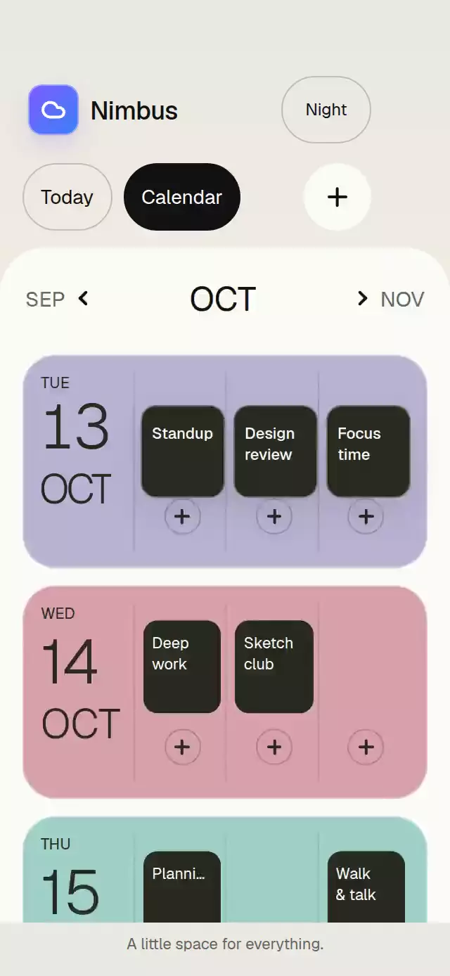
About this animation
A week-to-month calendar with a moving date highlight and configurable events, accent colors, fonts, and empty-state label.
Why this one
Keep your place while changing perspective. Instead of swapping two disconnected grids, the selected week stays in its calendar order as surrounding weeks unfold. One continuous value controls row height, opacity, highlight position, and the agenda's position in layout. Release velocity helps choose the destination, and a new drag can interrupt the spring.
A warm paper palette, an illuminated teal selection, editorial headings, and event rails give the calendar a distinct visual hierarchy. Month changes move the outgoing grid at a slower rate than the incoming grid. The demo includes four varied appointments, attendee initials, light and dark appearances, and a complete first interaction within three seconds.
How it works
- Generate five or six complete Sunday-first weeks using local dates at noon. Date keys never go through UTC, so daylight-saving changes do not move appointments to another day.
- Measure the container with
onLayout. Seven equal columns share its width; rows are at least 44 pt tall. The calendar keeps 16 pt side margins and 41 pt columns at 320 pt width. - Keep the selected week at full height. Other rows derive their height and opacity from a single week-to-month progress value. The agenda follows normal layout instead of an independent translation.
- Race vertical drag, horizontal swipe, and date tap recognizers. Project release velocity, then settle the mode with an interruptible, critically damped spring. Every spring uses an explicit mass of 4 and clamps overshoot, including releases after an interrupted drag. Native date taps stay on Gesture Handler; web dates use accessible buttons.
- Move one gradient highlight beneath the date rows with spring-driven row and column coordinates. Date text contrast follows the highlight position on the UI thread. Commit agenda content before starting the staggered reveal.
- Replace positional animation with short fades for reduced motion. The web icon variant renders the exact local Lucide paths without loading native Skia.
Install
Copy this folder into your project, excluding demo/.
npx expo install expo-linear-gradient react-native-gesture-handler react-native-reanimated react-native-worklets @shopify/react-native-skiaUse a GestureHandlerRootView at the root of your application and the worklets setup recommended for your Expo SDK. No additional font package is required; the component defaults to your system font. The supplied demo uses the catalog's already-loaded fonts.
The native icon renderer uses Skia. The .web.tsx icon renderer uses SVG and requires no CanvasKit setup. Keep both platform variants when copying the folder.
Usage
import { CalendarWeekToMonth } from './calendar-week-to-month';

export default function Schedule() {
  return <CalendarWeekToMonth initialDate="2026-10-14" />;
}
With custom content and personality knobs:
import { useRef } from 'react';
import {
  CalendarWeekToMonth,
  type CalendarWeekToMonthRef,
} from './calendar-week-to-month';

export default function Schedule() {
  const calendar = useRef<CalendarWeekToMonthRef>(null);
  return (
    <CalendarWeekToMonth
      ref={calendar}
      initialDate="2026-10-14"
      today="2026-10-11"
      initialMode="month"
      colorScheme="light"
      accentColors={['#2DD4BF', '#0F766E']}
      springDamping={70}
      springStiffness={300}
      events={[
        {
          id: 'practice',
          date: '2026-10-14',
          title: 'Morning practice',
          time: '9:30 AM – 10:15 AM',
          location: 'Garden room',
          color: '#0F766E',
          attendees: ['AK', 'JS'],
        },
      ]}
    />
  );
}
Provide a bounded height through the parent layout. The component has flex: 1; the agenda fills all remaining height and scrolls in both modes, with 16 pt of trailing space. The demo has no footer covering events; its appearance control sits beside Today. The component owns date and mode state; the initial* props apply on mount. Use the ref to change them afterward.
Props
| Prop | Type | Default | Description |
|---|---|---|---|
initialDate | string | dateKey(new Date()) | Initially selected local date. |
today | string | dateKey(new Date()) | Date highlighted with a ring and used by Today. |
events | readonly CalendarEvent[] | EMPTY_EVENTS | Event data. |
initialMode | 'week' | 'month' | 'week' | Initial presentation. |
accentColors | readonly [ string, string, ] | ['#2DD4BF', '#0F766E'] | Selection gradient. |
fontFamily | string | undefined | Interface typeface; defaults to the system font. |
headingFontFamily | string | undefined | Heading typeface; defaults to the system font. |
monoFontFamily | string | undefined | Numeric typeface; defaults to the system font. |
colorScheme | 'light' | 'dark' | 'auto' | 'auto' | Theme preference. |
springDamping | number | 70 | Spring damping, floored at critical damping for the configured stiffness and explicit mass of 4. |
springStiffness | number | 300 | Spring stiffness. |
onDateChange | ( date: string, ) => void | undefined | Called after date selection, on the JS thread. |
onModeChange | ( mode: 'week' | 'month', ) => void | undefined | Called when a gesture or button requests a mode. |
onEventPress | (event: CalendarEvent) => void | undefined | Optional event action. |
emptyLabel | string | 'A little room to breathe.' | Empty agenda message. |
accessibilityLabel | string | 'Calendar and daily agenda' | Screen-reader label. |
toolbarAccessory | ReactNode | undefined | Optional control beside Today, such as an appearance toggle. |
style | StyleProp<ViewStyle> | undefined | Root container style. |
testID | string | undefined | Root test identifier. |
Each event has id, date, title, time, location, and color; attendees is an optional initials array. Dates use YYYY-MM-DD; the supplied visible copy uses American date and time formatting.
The ref exposes showMonth(), showWeek(), selectDate(date), nextMonth(), and previousMonth(). These remain available during transitions.
Compatibility
Supports iOS, Android, and web.
Built for Expo SDK 58, React Native 0.88.0, Reanimated 4.7.1, Worklets 0.13.0, Gesture Handler 3.3.0, Skia 2.14.0, and Expo Linear Gradient 58.0.3. Exact import-derived dependency versions are in piece.json.
- Expo Go: uses the installed SDK 58 modules; no extra native dependency is added.
Accessibility
Dates expose their complete date, today status, selected state, and event count. Screen-reader activation selects a date. Collapsed rows are hidden from the accessibility tree. Web dates support Enter and Space. Mode, month arrows, and Today have explicit button alternatives to every gesture and hit areas of at least 44 pt in the supplied demo.
useReducedMotion() removes drag-following motion, parallax, and selection springs. Mode changes briefly fade the grid around an immediate height change; agenda content fades without translation. The new agenda date is announced through a polite live region.
Demo timeline
At 0.12 s the demo resets to October 14. At 0.67 s the month unfolds; at 1.57 s October 22 is selected and the four-event agenda changes. At 3.12 s the calendar folds to that date's week. The sequence repeats every 4.7 s. Autoplay lives entirely in demo/; all timers are cleaned up.
Icons: Lucide (ISC). All paths are copied from the supplied kit. Tidewell is the supplied fictional demo brand.
All springs explicitly use mass: 4, with damping floored at 2 * Math.sqrt(springStiffness * 4) (ζ ≥ 1). The default damping is 70 with stiffness 300 (ζ ≈ 1.01). Overshoot clamping prevents gesture release velocity from carrying a transition past its destination. Starting a new vertical drag cancels the active spring and captures its current progress, so either direction can resume without a position reset.