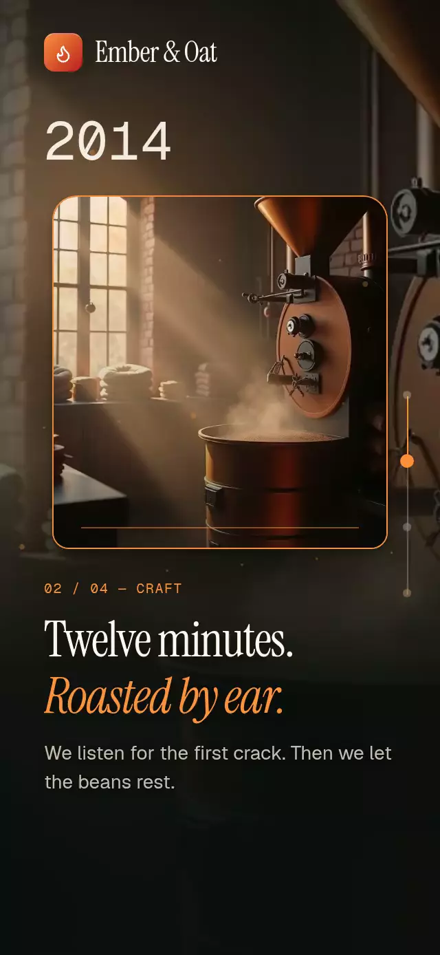
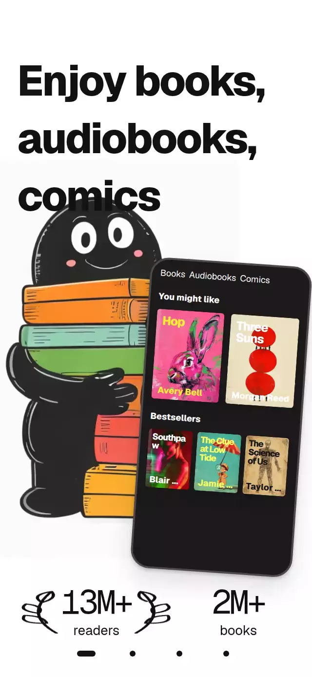
About this animation
A scroll story that reveals photos through ink blooms, with configurable chapter content, paper color, ink color, and fonts.
Why this one
Seven independently growing lobes merge into one organic reveal. Three octaves of noise roughen its edge, a denser pigment rim follows the same distance field across an almost screen-filling bloom, and eight satellite drops dry into faint blue stains. The photograph stays inside a real alpha mask. A fresh seed on mount and replay changes the edge without changing the composition.
How it works
onLayoutmeasures the available canvas. A native animated scroll handler converts its offset into one continuous chapter progress,p = scrollY / height.- Each photograph enters above the previous one. A Skia runtime shader builds a smooth union of seven circles and distorts its boundary with fractal noise.
- The same field renders the alpha mask and pigment rim. The photograph and both veils are first composited in an isolated layer, then a single
dstInpass clips that layer; the veils cannot replace the photograph. The canvas has explicit measured dimensions and a full paper fill. Zoom settles from 1.15 to 1 as the ink opens. Top and bottom veils are inside the photograph mask. - Editorial copy uses separate nonoverlapping entrance and exit windows. Statistics sit in a dark translucent pill.
- Native scroll snapping is optional. Web scrolling remains continuous. Next-page buttons and the final share action live inside the scroll content.
- The demo calls the imperative ref every 2.6 seconds, taking 1.8 seconds to scroll with
(0.77, 0, 0.175, 1). The opening drop falls, flattens, and blooms in 1,400 ms. The final page holds before a black fade resets the story. Touching stops autoplay.
Install
npx expo install @shopify/react-native-skia react-native-reanimated react-native-workletsCopy this folder without demo/ into your project. For web, initialize CanvasKit before mounting the component, using your app's Skia loader or WithSkiaWeb. The demo must be registered through the catalog's withSkia loader; it is intentionally not registered by this implementation.
Icons: Lucide (ISC). The paths used by the component are included in icons.ts.
Usage
import InkBloomChaptersScroll from './ink-bloom-chapters-scroll';

<InkBloomChaptersScroll
  chapters={[
    {
      id: 'winter',
      image: require('./winter.jpg'),
      eyebrow: 'Winter',
      title: 'Winter: 9 books.',
      subtitle: 'Mostly cliffs and storms.',
      stats: '2,760 pages · 46 hours',
    },
  ]}
  summary="9 books."
  summaryDetails="2,760 pages explored."
  onShare={() => openYourShareFlow()}
/>;
With personality controls and external navigation:
const story = useRef<InkBloomChaptersScrollRef>(null);

<InkBloomChaptersScroll
  ref={story}
  chapters={chapters}
  paperColor="#F4EFE6"
  inkColor="#1E3A8A"
  irregularity={0.1}
  snapToChapters={false}
  serifFontFamily="YourEditorialFont"
  italicFontFamily="YourEditorialItalic"
  monoFontFamily="YourMonoFont"
/>;

// Trigger from an event or a timer, never during render.
story.current?.scrollToChapter(1, 1800);
story.current?.reset();
Props
| Prop | Type | Default | Purpose |
|---|---|---|---|
chapters | readonly InkBloomChapter[] | [] | Ordered chapter content. An empty array renders a neutral paper screen. |
brand | ReactNode | undefined | Optional brand element; keep it clear of the top-right viewer controls. |
title | string | 'Your reading year' | Small publication title. |
summary | string | 'A year, well read.' | Summary heading in the final scroll page. |
summaryDetails | string | 'Every page took you somewhere.' | Summary details in the final scroll page. |
actionLabel | string | 'Share your year' | Final action label. |
onShare | () => void | undefined | Action callback; the default opens the native/web share sheet. |
onChapterChange | (index: number) => void | undefined | Called when the nearest chapter changes. |
onInteraction | () => void | undefined | Called as soon as the user touches or drags the story. |
paperColor | string | '#F4EFE6' | Paper background. |
inkColor | string | '#1E3A8A' | Ink edge and action color. |
irregularity | number | 0.08 | Boundary noise amount, clamped to 0–0.16. |
fontFamily | string | undefined | Interface font; defaults to the platform font. |
serifFontFamily | string | undefined | Editorial font; defaults to the platform font. |
italicFontFamily | string | undefined | Italic editorial font; defaults to the platform font. |
monoFontFamily | string | undefined | Statistics font; defaults to the platform font. |
snapToChapters | boolean | true | Enable native chapter snapping; web is always continuous. |
style | StyleProp<ViewStyle> | undefined | Root container style. |
testID | string | undefined | Root test identifier. |
duration | number | 1100 | Scroll hint half-cycle in milliseconds. Spring physics and reduced-motion timing are unchanged. |
Each chapter requires id, image, eyebrow, title, subtitle, and stats. Optional accent defaults to #B9CDF7. Images accept Skia DataSourceParam, including local require() modules.
The ref exposes scrollToChapter(index, duration = 700) and reset(). Index chapters.length opens the summary. Replay changes the ink seed. Keep headlines concise; the demo supports 320×694 and 390×844 layouts through measured type sizes and percentage positions.
Compatibility
Targets Expo SDK 58, React Native 0.88.0, Reanimated 4.7.1, Worklets 0.13.0, and Skia 2.14.0. Designed for iOS, Android, and web, including Expo Go with the bundled versions. No dependencies are added to the host project by this folder.
Accessibility
Each chapter is a header block with its complete title, subtitle, and statistics. The stacked visual copy is hidden from screen readers to avoid reading inactive headlines. Next-page buttons provide a touch alternative to dragging and use at least 48-point targets. The final action has a button role and a configurable label. Reduced motion replaces organic growth with 200 ms photo fades, removes zoom, drop motion, copy translation, chevron motion, and press scaling. No parallax or motion trails are used.