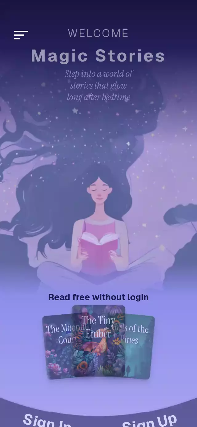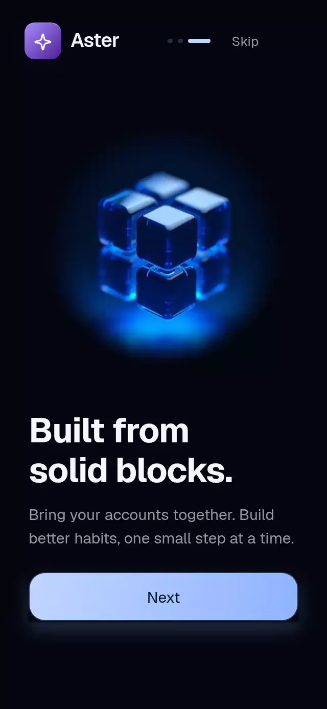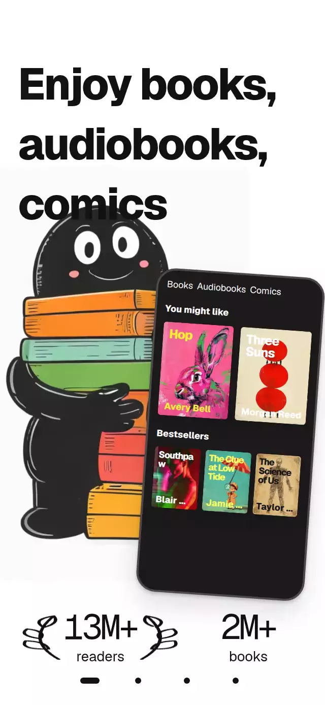
About this animation
A reading onboarding pager with drawn text and drifting book covers, with configurable pages, artwork, colors, and fonts.
How it works
- One continuous
pageshared value drives the pager, background, layer parallax, dots, and final button. - Horizontal pans project their release velocity into a clamped page and settle with an interruptible spring (
damping: 20,stiffness: 200,mass: 1). - Skia clips host-provided italic typography from left to right, then draws an underline. Separate paths draw the opening laurels and final hand.
- The center book column moves down while its neighbors move up. Pager velocity temporarily accelerates their UI-thread loops.
- The player animates progress and elapsed time while playing. Its play/pause control cross-morphs;
onPlayingChangeconnects actual audio in the host. - The recommendation pan owns its own progress. At either outer edge it fails outward drags so the pager can take over. Dots and arrow buttons provide tap alternatives.
Install
Copy this folder without demo/ into your project.
npx expo install react-native-reanimated react-native-worklets react-native-gesture-handler @shopify/react-native-skia expo-image expo-linear-gradientWrap the host in GestureHandlerRootView. Initialize CanvasKit before importing this component on web, following the Skia web setup. Load the font families before rendering and pass a font asset to scriptFont for the animated handwriting. No demo image or theme module is imported by the component.
Usage
import { useRef } from 'react';
import { EditorialOnboardingPager, type EditorialOnboardingPagerHandle } from './editorial-onboarding-pager';

const pager = useRef<EditorialOnboardingPagerHandle>(null);

<EditorialOnboardingPager
  ref={pager}
  pages={pages}
  books={books}
  stats={[{ value: 13, suffix: 'M+', label: 'readers' }]}
  illustration={illustration}
  player={player}
  picks={picks}
  scriptFont={italicFontAsset}
  bottomInset={insets.bottom}
  onGetStarted={finishOnboarding}
/>;
For a quieter embedded treatment, use motion="reduced", style={{ height: 400 }}, and override colors, fontFamily, titleFontFamily, and serifFontFamily. Pass four localized pages to change the poster copy and backgrounds. Provide square player art and portrait book art at three times their displayed dimensions.
Props
| Prop | Type | Default | Description |
|---|---|---|---|
pages | Four EditorialPage records | Required | headline, optional script, scriptColor, and background. |
books | EditorialBook[] | Required | id, title, optional author, cover, and titleColor. |
illustration | ImageSource | — | Opening character artwork. |
stats | { value, label, suffix? }[] | [] | First two opening counters. |
player | EditorialPlayer | Required | Square cover, optional title, remaining, chapter, elapsed, and left. |
picks | EditorialPick[] | Required | Book fields plus synopsis and card color. |
labels | Partial<EditorialLabels> | English interface labels | CTA, navigation, categories, and player labels. |
colors | Partial<EditorialColors> | White/ink/amber palette | Ink, gap, player, text, muted text, track, accent, CTA, card text, and spine. |
colorScheme | 'light' | 'dark' | 'auto' | 'light' | Dark changes page surfaces and primary ink; explicit colors take precedence. |
fontFamily | string | System | Body family. |
titleFontFamily | string | System | Poster and button family. |
monoFontFamily | string | Heading family | Counter family. |
serifFontFamily | string | System | Recommendation titles. |
scriptFont | Skia DataSourceParam | — | Italic font asset; a plain italic fallback is shown while unavailable. |
initialPage | number | 0 | Starting page, 0–3. |
motion | 'system' | 'reduced' | 'system' | Reduced motion also respects the OS setting at mount. |
bottomInset | number | 0 | Host safe area for dots and CTA. |
onPageChange | (index) => void | — | Settled page. |
onPickChange | (index) => void | — | Settled recommendation. |
onGetStarted, onSkip | () => void | — | Completion and optional skip. |
onPlayingChange | (playing) => void | — | Connect host-owned audio. |
onInteraction | () => void | — | Stop host autoplay on user input. |
autoplay | boolean | false | Host-driven autoplay marker; the component owns no timers. |
accessibilityLabel | string | Reading introduction | Root description. |
testID | string | editorial-onboarding-pager | Stable root/control prefix. |
style | StyleProp<ViewStyle> | — | Bounded flex container. |
The ref exposes goTo(i), next(), prev(), togglePlay(), and goToPick(i).
Compatibility
Designed for Expo SDK 58, React Native 0.88, Reanimated 4.7, Gesture Handler 3.3, and Skia 2.14 on iOS, Android, and web. Uses the modules bundled with Expo Go. The host handles CanvasKit initialization on web and font loading on every platform. The simulated player emits playback state; it does not load or produce audio by itself.
The layout measures its container and caps the reading surface at 430 logical pixels on tablets and landscape displays. Short containers use smaller player artwork and omit decorative player chrome. This is a full-screen composition when used in the demo: supply the real bottom inset and apply any top safe area in the screen host.
Accessibility
The pager is adjustable with increment/decrement accessibility actions. Page dots, recommendation arrows, and play/pause have named button roles and 48-point targets. Hidden pages are removed from the accessibility tree. Reduced motion keeps final counters and handwriting, stops ambient movement and column loops, and replaces pager travel with a 220 ms crossfade. System motion is read at mount; use the motion prop for live host preference changes.
Why this one
It turns a typographic reading campaign into an interactive introduction. The handwritten mask, book spines, velocity-sensitive columns, and nested carousel add motion while preserving the editorial hierarchy. The demo uses original artwork and host-provided fonts, with no logos or reference assets shipped in the component.