About this animation
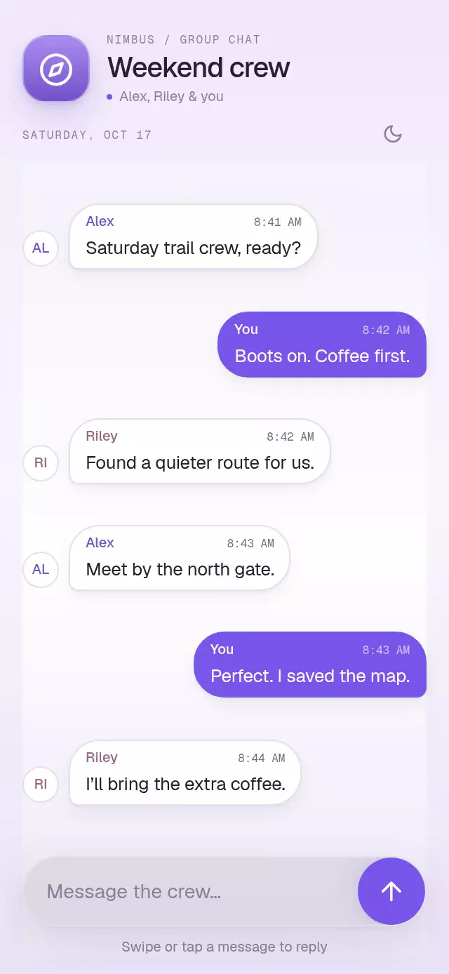
A swipe-to-reply message list with a quote-to-composer transition, with configurable messages, composer content, palette, and fonts.
How it works
- Each message is wrapped in a Gesture Handler race between a horizontal pan and an accessible tap action.
- A single Reanimated progress value drives the resistant offset, reply icon, border glow, and armed state.
- Crossing the threshold pulses the reply icon and calls
onThresholdonce per crossing. Releasing commits the reply and callsonReplyon the JS thread. - After the quote mounts, window-coordinate measurements connect its source bubble to the quote above the composer. The 420 ms flight carries the author and message text, followed by a crossfade into the anchored quote.
- Cancel restores the valid idle state without scrolling or changing message order.
The quote remains attached to the conversation's meaning while the conversation stays in place. The pattern fits chat, support inboxes, activity threads, and team updates.
Install
This component uses packages already present in an Expo SDK 58 app:
npx expo install @expo/vector-icons expo-blur expo-linear-gradient react-native-gesture-handler react-native-reanimated react-native-workletsUsage
<SwipeReplyAnchor
  messages={messages}
  renderComposer={({ reply, clearReply }) => (
    <ReplyComposer quote={reply} onCancel={clearReply} />
  )}
/>
Useful knobs include threshold, palette, colorScheme, motion, and the three font-family props. Use
replyTo, swipeToReply, cancelReply, and reset through the ref. replyTo selects immediately;
swipeToReply(id) reveals the reply arrow with a rightward swipe (mirrored in RTL), then transfers the quote as the bubble springs back. Reduced Motion selects immediately. A real pan interrupts the preview.
The full-screen demo has six or seven timestamped messages, author avatars, light/dark themes, a working message input, and a 48-point composer. Autoplay starts at 420 ms and repeats every 4.4 seconds; the quote lands within the first 1.3 seconds. Empty quote space is never reserved. Below 620 points tall, the demo uses one outer scroll view with its indicator hidden; larger frames have no scroll container. The component itself applies no safe-area insets; the host owns them and keyboard avoidance.
Supply time and color on each message to customize timestamps and author rails. onThreshold lets the host trigger a native haptic without a component dependency on a haptics library. The demo uses an 8 ms Android vibration; iOS haptic feedback requires the host to provide its own implementation. Android SDK 31+ uses BlurTargetView and the supported native blur method; older Android versions retain a translucent fallback.
Props
| Prop | Type | Default | Description |
|---|---|---|---|
messages | readonly SwipeReplyMessage[] | Required | Stable message records with id, author, text, direction, and optional time/color; duplicate or empty IDs are ignored. |
onThreshold | () => void | undefined | Fires when the gesture crosses the armed threshold. |
replyTargetId | string | null | undefined | Controlled active reply ID; takes precedence over internal selection. |
defaultReplyTargetId | string | null | null | Initial uncontrolled reply ID. |
onReply | (id: string) => void | undefined | Fires once when a reply is committed. |
onCancelReply | () => void | undefined | Fires when an active reply is canceled or cleared. |
renderComposer | (context: SwipeReplyComposerContext) => ReactNode | Required | Renders the composer receiving { reply, clearReply }. |
labels | Partial<SwipeReplyLabels> | Built-in neutral English copy | Control and accessibility strings. |
threshold | number | 64 | Reply distance, clamped to 48–88 points. |
colorScheme | 'light' | 'dark' | 'auto' | 'auto' | Theme selection. |
palette | Partial<Palette> | Paper/Night palette | Semantic color overrides. |
motion | { durationScale?: number; glowOpacity?: number } | undefined | Duration scale defaults to 1 (clamped to 0.5–2); glow opacity defaults to 0.25. |
fontFamily | string | undefined | Interface font family. |
titleFontFamily | string | undefined | Prominent label font family; falls back to fontFamily when omitted. |
monoFontFamily | string | undefined | Changing-value font family. |
style | StyleProp<ViewStyle> | undefined | Outer component style. |
testID | string | 'swipe-reply-anchor' | Root ID; message and cancel controls append stable suffixes. |
accessibilityLabel | string | 'Conversation' | Accessible label for the conversation. |
The ref exposes replyTo(id), swipeToReply(id), cancelReply(), and reset(). replyTo selects immediately; swipeToReply previews the gesture. The host owns haptics, safe-area insets, and keyboard avoidance.
Compatibility
Expo SDK 58, React Native 0.88.0, Reanimated 4.7.1, Worklets 0.13.0, and Gesture Handler 3.3. The source is universal and is intended for iOS, Android, and web.
Accessibility
The conversation has list semantics, messages expose stable test ids, and Reply/Cancel controls meet the minimum touch target. Tapping a message is the non-pan alternative. Reduced Motion removes the flight and springs while keeping the reply state and cancellation available. All visible copy is supplied by props.
Icons: Feather, the Lucide-compatible icon family included by Expo Vector Icons. No external art or remote assets.