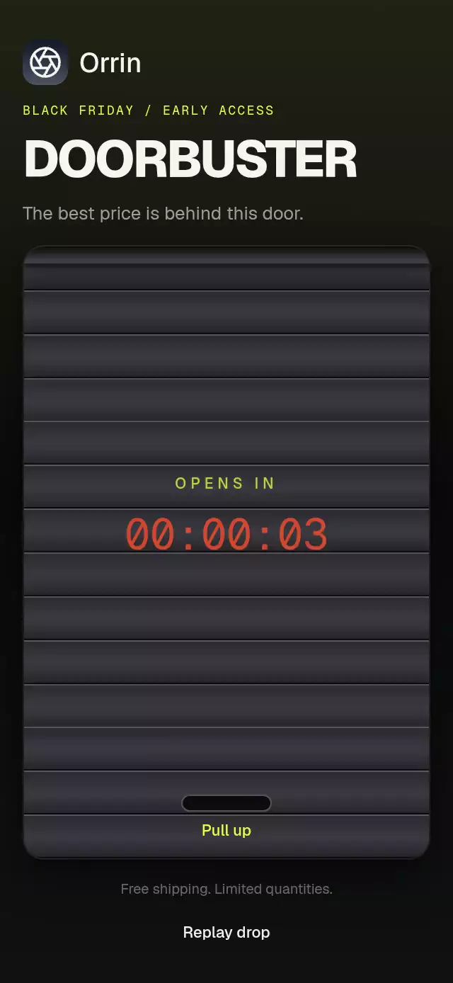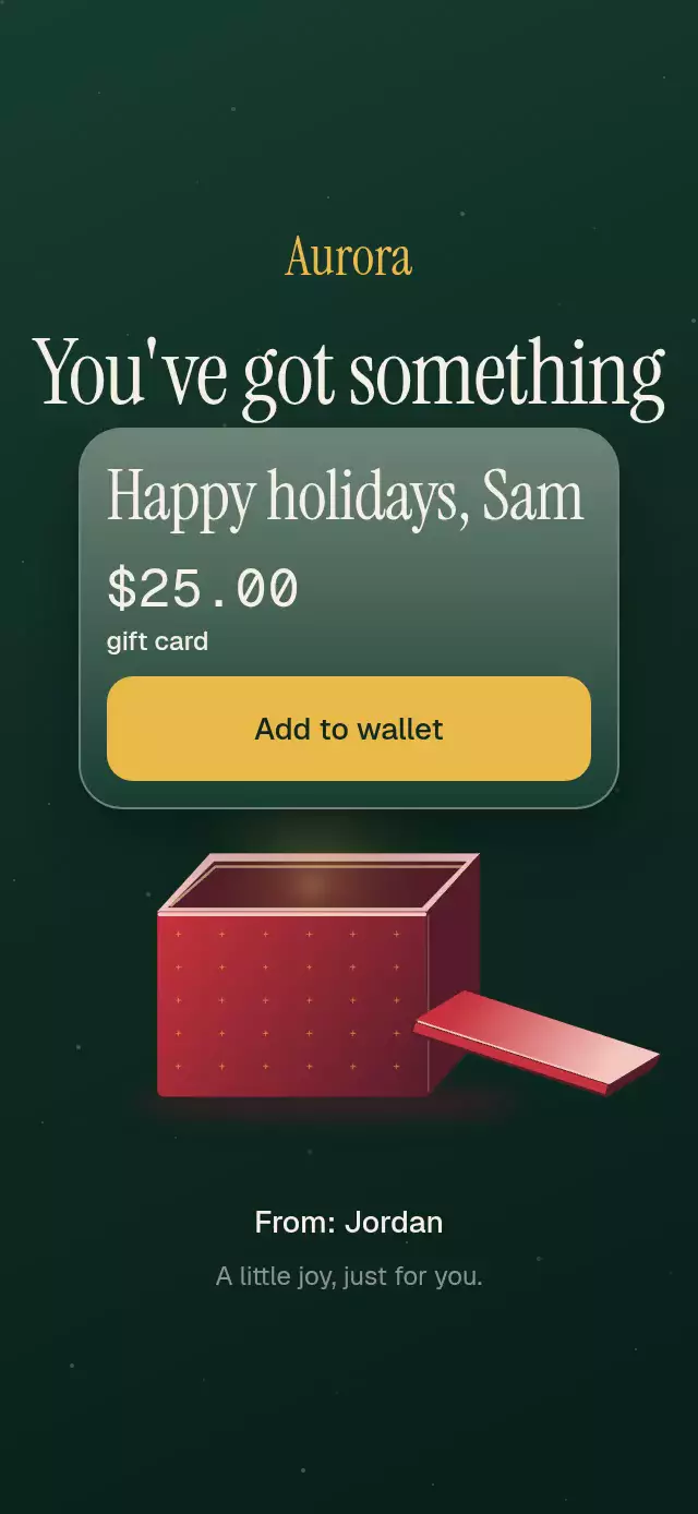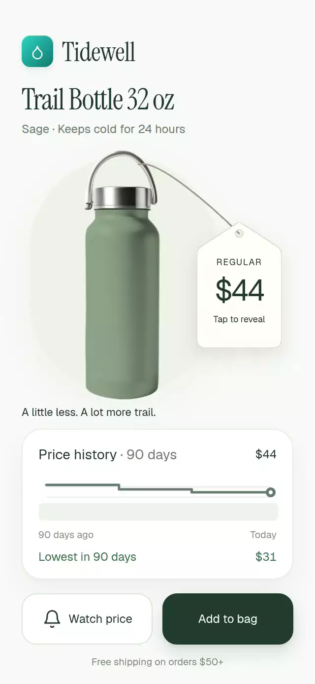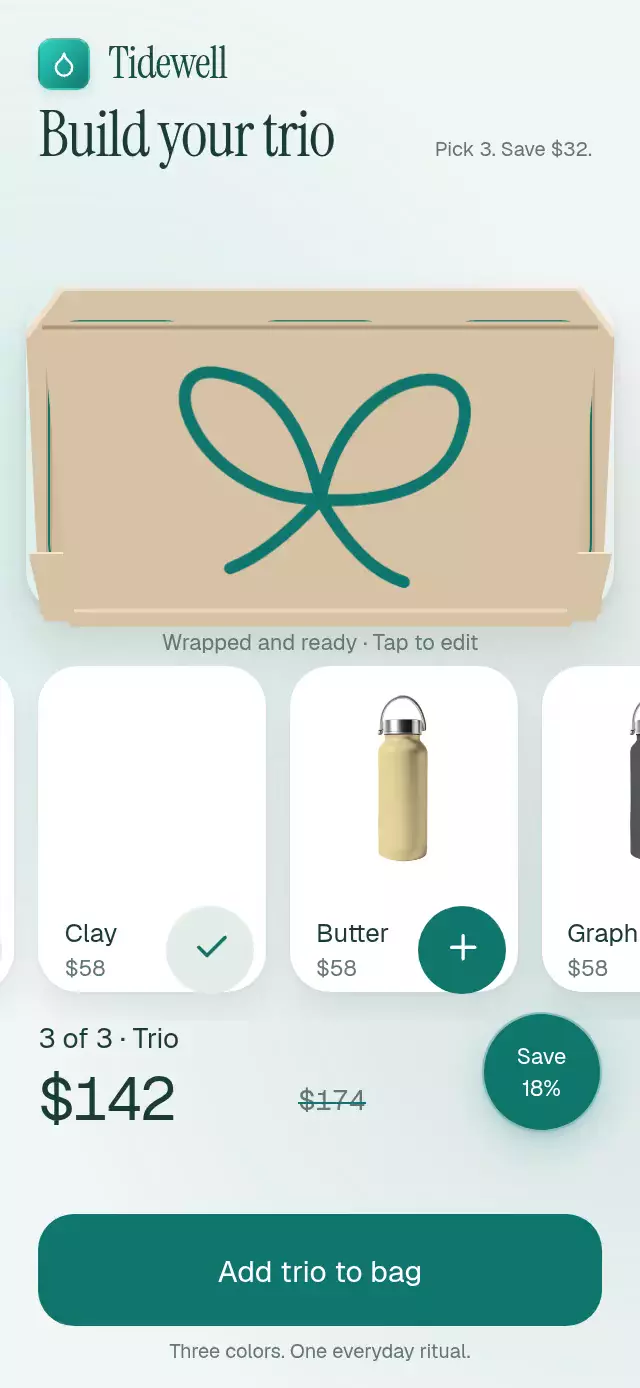
About this animation
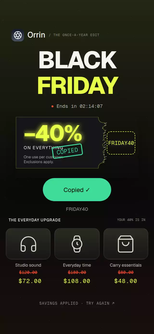
A tear-open coupon with a falling stub and copy confirmation, with configurable promo code, labels, colors, and fonts.
Why this one
The code starts hidden. A resistant drag develops a seeded, irregular tear from top to bottom, then releases the stub into a gravity-driven fall with ten paper confetti pieces. Staggered code printing and a spring-loaded confirmation make both reveal and copy easy to recognize. The demo applies the savings to three rolling product prices.
How it works
onLayoutmeasures the container. The coupon defaults to 86% of that width and a height of 42% of its width, with a 96-point minimum height.- A single
tearshared value drives the paper edge, fibers, dotted seam, and stub rotation around the bottom of the seam. Geometry uses fixed sine-based offsets, so reversing a drag does not regenerate the paper. - Gesture Handler arbitrates the drag and tap alternative. Below 60%, release returns with an explicit-mass spring. Crossing 60% finishes the tear automatically, then runs a 1.1-second gravity fall.
- Ten deterministic confetti pieces share the fall clock. Each code character prints with a 30 ms offset and a 6-point drop.
- The host's
onCopy(code)performs clipboard work. Confirmation waits for it to resolve; a rejected promise leaves the action retryable. Thephasespring drives the stamp, two-point shake, and button width. Pressure has separate shared values. reset()cancels motion and invalidates pending copy confirmations. Unmount also cancels animation work. The demo stops its autoplay timers on touch.
Install
npx expo install @shopify/react-native-skia react-native-gesture-handler react-native-reanimated react-native-workletsPlace the component beneath a GestureHandlerRootView. Configure Reanimated and Worklets for your Expo SDK. On web, initialize CanvasKit before importing the component, using Skia's web loading boundary. All geometry and icons are local; no images or network requests are needed. Lucide icon paths use the ISC license.
Usage
import { CouponTearReveal } from './coupon-tear-reveal';

// Supply your application's actual clipboard implementation.
<CouponTearReveal onCopy={copyToClipboard} />;
A different campaign, with external control:
import { useRef } from 'react';
import {
  CouponTearReveal,
  type CouponTearRevealRef,
} from './coupon-tear-reveal';

function SummerOffer() {
  const coupon = useRef<CouponTearRevealRef>(null);
  return (
    <CouponTearReveal
      ref={coupon}
      code="SUMMER25"
      headline="−25%"
      subline="YOUR NEXT ORDER"
      terms="One use. Select items only."
      colors={{ accent: '#85D6FF', border: '#477A91' }}
      labels={{ tear: 'PULL', copy: 'Use code' }}
      onCopy={copyToClipboard}
      onReveal={trackReveal}
      width={300}
      fontFamily="YourSans"
      headlineFontFamily="YourDisplay"
      monoFontFamily="YourMono"
    />
  );
}
copyToClipboard and trackReveal above are host functions. The ref exposes tearOff(), reset(), and asynchronous copyCode().
Clipboard contract
This component does not install or import a clipboard package. Supply onCopy(code) to copy through your existing integration, such as Clipboard.setStringAsync if your application already uses expo-clipboard. Do not resolve until copying succeeds. Throw or reject on failure. Copy controls remain disabled without a handler. onReveal fires once per completed tear, and reset() starts a new cycle.
The bundled demo's handler applies the discount to the displayed prices; it does not write to the operating system clipboard.
Props
| Prop | Type | Default | Purpose |
|---|---|---|---|
code | string | FRIDAY40 | Hidden promo code; font size adapts to its length. |
headline | string | −40% | Large offer display. |
subline | string | ON EVERYTHING | Offer description. |
terms | string | One use per customer.\nExclusions apply. | Small print. |
onReveal | (code: string) => void | — | Completed-tear callback. |
onCopy | (code: string) => void | Promise<void> | — | Host clipboard action; completion confirms success. |
colors | Partial<Colors> | Volt theme | Overrides surface, accent, urgency, success, text, muted, border, fiber, and ink. |
labels | Partial<Labels> | English labels | Overrides tear, copy, copied, stamp, reveal, hint, announcement, and error. |
width | number | 86% of container | Width in points, clamped to container. |
aspectRatio | number | 0.42 | Height relative to width; minimum 96 points. |
fontFamily | string | System | Interface typeface. |
headlineFontFamily | string | Interface font | Heavy headline typeface. |
monoFontFamily | string | System | Code and stamp typeface. |
tearDuration | number | 420 | Programmatic tear time in ms. |
fallDuration | number | 1100 | Falling stub time in ms. |
onInteraction | () => void | — | Stops host autoplay on direct input. |
style | StyleProp<ViewStyle> | — | Root container style. |
testID | string | — | Root ID; controls use -tear, -code, and -copy. |
Theme defaults: paper #161618, volt #E8FF47, urgency #FF4D2E, success #3DDC97, text #F5F5F2, muted rgba(245,245,242,0.6), border rgba(232,255,71,0.35), fibers #C9C7B9, button ink #0A0A0B.
Compatibility
Targets Expo SDK 58, React Native 0.88.0, Reanimated 4.7.1, Worklets 0.13.0, Gesture Handler 3.3, and Skia 2.14.0. Uses modules bundled with this SDK's Expo Go. Supports iOS, Android, and web. No clipboard dependency is needed by the component.
Accessibility
The stub is a labeled button with a tap and accessibility-activate alternative to dragging. Revealing announces the code. Copy controls are at least 48 points high and expose disabled/busy states. The stub leaves the accessibility tree once revealed. Customize all accessible labels through labels. Reduced motion replaces tearing/falling with 200 ms fades, removes confetti and shake, and prints characters without translation. The code remains accessible after the reveal; the stamp is decorative.