About this animation
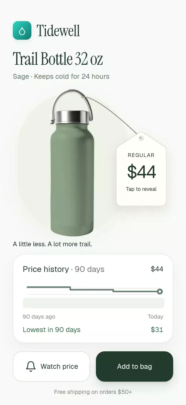
A flipping discount tag with an animated price-history chart, with configurable product image, history, accent color, and fonts.
Why this one
A crossed-out price gives little context. This piece connects the discount to a 90-day history: the last step drops into a highlighted minimum, and the tag turns over on a flexible cord. The pendulum and minimum band make the change tangible and explain why it matters.
How it works
onLayoutmeasures the component and its flexible product stage, so the composition adapts to its container.- A single shared
progressdrives the red strike, two-sided Y rotation, final chart step, minimum-band color, and point label. Prices crossfade without rolling digits. - The tag uses two real faces with hidden backs. Its Skia silhouette has an even-odd hole; a separate cubic Bézier cord follows a damped pendulum.
- Gesture Handler composes a pan and tap. A drag cancels the current swing and transfers release velocity into the pendulum; a tap changes the price. Pressure has its own shared value.
- Watch and bag actions show meaningful toasts; the bell has an independent physical swing. Callbacks run on the React Native thread.
- The demo drops the price at 1 second, restores it at 4 seconds, and repeats every 5 seconds. Any touch permanently stops that autoplay session.
Install
npx expo install @shopify/react-native-skia expo-image react-native-gesture-handler react-native-reanimated react-native-workletsWrap your app with GestureHandlerRootView. Use the Reanimated/worklets configuration appropriate to your Expo SDK. On web, initialize CanvasKit before importing the component, using Skia's WithSkiaWeb or your host's lazy Skia loader. The host must provide a finite height and load any custom fonts.
Icons: Lucide (ISC). The copied paths live in icons.ts; the demo brand comes from the Native Animation kit.
Usage
import { PriceDropTag } from './price-drop-tag';

<PriceDropTag image={require('./assets/bottle.png')} />;
import { useRef } from 'react';
import { PriceDropTag, type PriceDropTagRef } from './price-drop-tag';
function Product() {
const tag = useRef<PriceDropTagRef>(null);
return (
<PriceDropTag
ref={tag}
image={require('./assets/bottle.png')}
title="Trail bottle"
originalPrice={44}
salePrice={31}
history={[49, 49, 46, 46, 44]}
discountLabel="−30%"
accentColor="#DC2626"
lowestColor="#16A34A"
onWatchPrice={() => enablePriceAlert(30)}
onAddToBag={() => addProductToBag()}
/>
);
}Replace the example callback functions with your own integrations. ref.drop(), ref.reset(), and ref.toggle() trigger interruptible transitions. Demo artwork remains outside the reusable component.
Props
| Prop | Type | Default | Description |
|---|---|---|---|
image | ImageSourcePropType | Required | Product image, bundled locally by the host. |
title | string | 'Everyday bottle' | Product name. |
subtitle | string | 'Sage · Stainless steel' | Product detail line. |
originalPrice | number | 44 | Original price in US dollars. |
salePrice | number | 31 | Discounted price in US dollars. |
history | readonly number[] | [49, 49, 46, 46, 44] | Earlier price samples, ordered oldest first. |
discountLabel | string | '−30%' | Discount badge copy; configurable for rounded retail discounts. |
watchThreshold | number | 30 | Price alert threshold in US dollars. |
accentColor | string | '#DC2626' | Sale accent. |
lowestColor | string | '#16A34A' | Lowest-price accent. |
backgroundColor | string | '#F8FAF7' | Canvas background. |
fontFamily | string | undefined | Body font; defaults to the system font. |
titleFontFamily | string | undefined | Display font; defaults to the system font. |
monoFontFamily | string | undefined | Numeric font; defaults to the system font. |
header | ReactNode | undefined | Optional brand or navigation content; its right edge is reserved. |
tagAccessibilityLabel | string | 'Price tag. Tap to change price, or drag to swing.' | Screen reader label for the tag. |
onPriceChange | (price: number) => void | undefined | Called when the target price changes, once per transition. |
onWatchPrice | () => void | undefined | Called when price watching is enabled. |
onAddToBag | () => void | undefined | Called when the product is added to the bag. |
onInteraction | () => void | undefined | Called on any touch so the host can stop autoplay. |
style | StyleProp<ViewStyle> | undefined | Outer container style. |
testID | string | undefined | Outer container test identifier. |
The sale price should be the minimum of the supplied history. Dollar values should fit the tag (the demo uses two-digit whole dollars). The composition is designed for phone-sized portrait containers, with a flexible hero and bounded history card.
Compatibility
Built against Expo SDK 58, React Native 0.88.0, Reanimated 4.7.1, worklets 0.13.0, Gesture Handler 3.3, Skia 2.14.0, and expo-image 58.0.17. The demo additionally uses expo-linear-gradient 58.0.3.
Supports iOS, Android, and web. Web requires CanvasKit initialization.
The installed modules are compatible with this project's Expo Go setup. No new native dependencies were added. The component must be registered with the host's Skia loader before a catalog demo can run.
Accessibility
The tag and both actions have button roles and labels; the tag exposes an activate accessibility action as an alternative to dragging. Target price changes and both toast messages are announced. All controls exceed 44 pt.
With useReducedMotion(), the two prices and tag faces crossfade over 200 ms, the chart changes without a spring, the tag and cord stay still, and the bell and toast do not travel. Decorative canvases are hidden from screen readers. The top-right corner is reserved for the host viewer's close button.
Customization notes
Movement follows gestures, scroll position, or interruptible spring physics. A global duration is not exposed; reduced-motion fades retain their short fixed timing.