About this animation
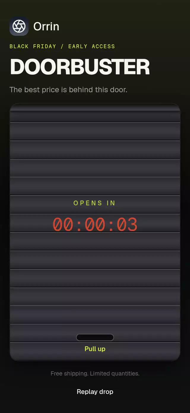
A scheduled offer reveal with a rolling shutter and countdown, with configurable offer content, labels, colors, and fonts.
Why this one
The countdown belongs to the shutter: every slat clips its own slice of the lettering and folds toward the growing roller. Opening feels like a store coming to life, with a light sweep and twelve floating dust motes.
How it works
- The container measures its own bounds with
onLayout; slats use fractions of that box. - A single
openshared value drives travel, perspective folding, roller growth, the light beam, and particles. A separate tick value adds the countdown vibration. - The wall-clock countdown updates only its displayed seconds. The final ten seconds use the urgency color.
- At zero, a 120 ms downward anticipation precedes a 900 ms opening. The content settles from 0.94 scale with an explicit mass-one spring.
- After the deadline, the handle accepts upward drags or a tap. Release projects velocity to the nearest endpoint and settles with a spring.
close()plays two small floor rebounds. - Children become interactive and accessible only when opening finishes. Reduced motion replaces movement with a 200 ms crossfade.
Install
npx expo install expo-linear-gradient @shopify/react-native-skia react-native-gesture-handler react-native-reanimated react-native-workletsCopy this folder except demo/. Wrap your app in GestureHandlerRootView. On web, initialize CanvasKit before importing the component (for example, the host's LoadSkiaWeb/lazy-loading setup) and serve canvaskit.wasm. The demo additionally uses expo-image for a bundled transparent camera photo, passed to the offer as a local source prop. The photo sits above a volt pedestal and a faded reflection; the shutter supplies the opening zoom and light sweep. The 720 px asset supports the capped 240 pt display width at 3× resolution.
Usage
import { useRef } from 'react';
import { Text, View } from 'react-native';
import { ShutterDealReveal, type ShutterDealRevealRef } from './shutter-deal-reveal';

function Offer({ launchAt }: { launchAt: number }) {
  const shutter = useRef<ShutterDealRevealRef>(null);
  return (
    <View style={{ width: 300, height: 400 }}>
      <ShutterDealReveal ref={shutter} opensAt={launchAt}>
        <Text>Your offer</Text>
      </ShutterDealReveal>
    </View>
  );
}
Custom material and copy:
<ShutterDealReveal
  opensAt={launchAt}
  slatCount={18}
  duration={760}
  timerSizeRatio={0.1}
  colors={{ label: '#6EE7FF', light: '#6EE7FF', urgency: '#FF916E' }}
  labels={{ heading: 'AVAILABLE IN', pull: 'Lift to reveal', open: 'Open offer', opened: 'Your offer is ready' }}
  onOpen={() => setOfferVisible(true)}
>
  <OfferCard />
</ShutterDealReveal>
Keep opensAt stable across renders. Changing it schedules another automatic opening; closing alone does not restart or retrigger the expired countdown. This is presentation, not server-side sale authorization. The host controls eligibility and price validation.
Props
| Prop | Type | Default | Purpose |
|---|---|---|---|
opensAt | Date | number | Required | Deadline, as a Date or Unix milliseconds. |
onOpen | () => void | — | Fires at full opening, once per opening. |
allowManualOpen | boolean | true | Handle tap and drag after the deadline. |
slatCount | number | 14 | Individually folding slats, clamped to 4–32. |
colors | Partial<ShutterDealRevealColors> | Dark volt | Metal, highlight, shadow, seam, label, light, urgency, handle, background. |
labels | { heading?, pull?, open?, opened? } | OPENS IN / Pull up / Open deal / The deal is now open | Visible copy and accessible announcements. |
children | ReactNode | — | Offer content; no embedded demo branding. |
fontFamily | string | Geist_500Medium | Host-loaded interface font. |
monoFontFamily | string | GeistMono_400Regular | Host-loaded countdown font. |
timerSizeRatio | number | 0.105 | Countdown size relative to width, clamped to 12–64 pt. |
duration | number | 900 | Opening travel in milliseconds. |
style | StyleProp<ViewStyle> | — | Container layout; root has flex 1. |
testID | string | shutter-deal-reveal | Root identifier; handle adds -handle. |
Ref: open() bypasses the schedule; close() lowers the shutter without restarting the timer. Colors can be overridden independently or supplied as a complete light palette. Supply contrasting seam, handle, label, and background colors together when changing material brightness.
Compatibility
Targets Expo SDK 58, React Native 0.88.0, Reanimated 4.7.1, Worklets 0.13.0, Gesture Handler 3.3, and Skia 2.14.0. Uses Expo Go's installed modules; no new native dependency is added. Supports iOS, Android, and web.
The host owns safe areas and font loading. The component fits its assigned box and applies no screen insets. Children are responsible for their own responsive content and font scaling. The included demo switches to a compact header for small containers and a side-by-side layout in landscape.
Accessibility
The countdown exposes the timer role without announcing every tick. The handle has a 120 × 58 pt button area, a configurable accessible name, an activation action, and a tap alternative to the drag. Opening announces labels.opened; concealed content is excluded from accessibility until fully revealed. Reduced motion removes travel, rotation, dust, vibration, scale, and rebounds in favor of 200 ms opacity changes.