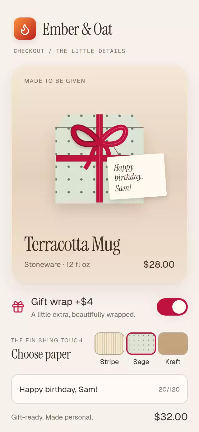
About this animation
A gift-wrap toggle with folding paper and a tied ribbon, with configurable product image, product copy, fonts, and accent color.
Why this one
A checkbox sells a service. This control shows the gift taking shape. The tied bow and live handwritten tag make the upgrade feel personal before checkout.
How it works
onLayoutmeasures the available product stage. Skia draws the package in a normalized 300-point coordinate system.- One interruptible shared progress drives the side folds, perspective skew, fold shadows, descending lid, ribbon strokes, bow loops, and one small settling bounce.
- The normalized timeline is side folds 0–0.43, lid 0.35–0.58, cross ribbon 0.53–0.76, tied bow 0.74–0.94, and settling 0.90–1. The default spring has a 1300 ms duration; the duration prop is capped at 1400 ms.
- A horizontal pan controls the same progress directly. Release projects velocity toward the wrapped or unwrapped state; tapping the product or switch also changes state. Reversing unwraps in the opposite order.
- Paper changes reveal the next patterned material through a diagonal clip. Message edits update React only when text changes; shared values reveal the hanging tag.
- The demo owns its timers, wraps after 500 ms, changes papers, types a birthday message, and unwraps. Any touch or input focus stops the loop.
Install
npx expo install @shopify/react-native-skia expo-image expo-linear-gradient react-native-gesture-handler react-native-reanimated react-native-workletsWrap your app in GestureHandlerRootView. For web, initialize CanvasKit before importing this component using Skia's WithSkiaWeb or your existing lazy Skia loader. The demo expects the host to load its fonts.
Usage
import GiftWrapToggle from './gift-wrap-toggle';

export function GiftOptions() {
  return (
    <GiftWrapToggle
      source={require('./assets/mug.png')}
      productName="Ceramic mug"
      onWrappedChange={(wrapped) => updateOrder({ giftWrap: wrapped })}
    />
  );
}
Customize the presentation and control it externally:
const giftRef = useRef<GiftWrapToggleRef>(null);

<GiftWrapToggle
  ref={giftRef}
  source={productImage}
  accentColor="#9E2345"
  duration={1200}
  colorScheme="light"
  fontFamily="YourInterfaceFont"
  titleFontFamily="YourDisplayFont"
  noteFontFamily="YourItalicFont"
  onPaperChange={savePaper}
  onMessageChange={saveMessage}
/>;

// Invoke from an event handler.
giftRef.current?.setWrapped(true);
giftRef.current?.setPaper('dots');
giftRef.current?.setMessage('Happy birthday!');
The ref exposes setWrapped(boolean), setPaper('stripe' | 'dots' | 'kraft'), setMessage(string), and reset().
Props
| Prop | Type | Default | Description |
|---|---|---|---|
source | ImageProps['source'] | — | Product image; local assets are recommended. |
productName | string | Ceramic mug | Product title. |
productDetail | string | Hand-finished stoneware | Product subtitle. |
price | number | 28 | Product price in dollars. |
wrapPrice | number | 4 | Gift wrap surcharge in dollars. |
accentColor | string | #BE123C | Ribbon and active control color. |
duration | number | 1300 | Spring timeline duration, clamped to 300–1400 ms. |
fontFamily | string | System | Interface font. |
titleFontFamily | string | System | Product title font. |
noteFontFamily | string | System | Gift tag font. |
colorScheme | 'light' | 'dark' | 'auto' | auto | Color treatment. |
accessibilityLabel | string | Gift wrap | Switch label. |
onWrappedChange | (wrapped: boolean) => void | — | Requested wrap state callback. |
onPaperChange | (paper: Paper) => void | — | Paper selection callback. |
onMessageChange | (message: string) => void | — | Message callback, capped at 120 characters. |
onInteraction | () => void | — | Touch or input focus callback. |
style | StyleProp<ViewStyle> | — | Root container style. |
testID | string | — | Root test identifier. |
Compatibility
Expo SDK 58, React Native 0.88.0, Reanimated 4.7.1, Worklets 0.13.0, Skia 2.14.0.
Accessibility
The switch exposes its checked state; paper controls are labeled radios with selection state. The product has an accessible activation action as an alternative to swiping. Switch and paper changes announce their requested state, and the order total and gift status use polite live regions. The message field has a label and a 120-character limit. All touch controls are at least 44 points tall. Reduced motion replaces wrapping and paper changes with 200 ms fades and removes perspective, bounce, bow swing, and press scaling. No rolling numbers, particles, or blur are used.
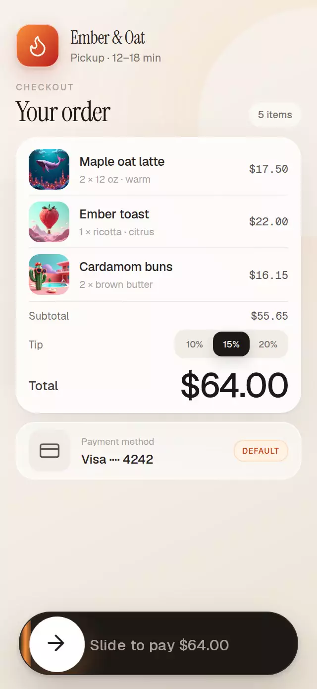
Icons: Lucide (ISC). The demo uses the Ember & Oat brand tile and supplied local product artwork from the project kit.