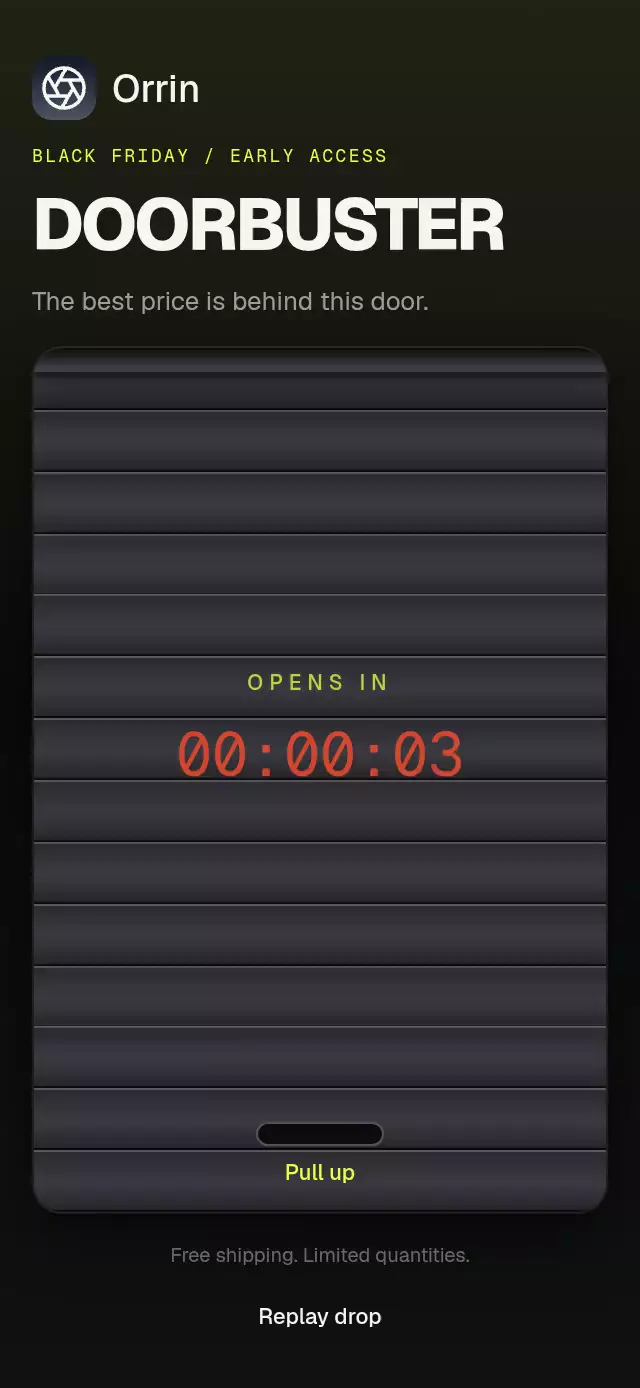
About this animation
A sale paywall with touch-controlled holographic material and a rolling countdown, with configurable artwork, copy, colors, and fonts.
How it works
The headline, ribbon, discount badge, plan outline, and purchase button share screen-space light. They respond together instead of behaving like unrelated animated gradients. The cosmic skin uses the same light with a softer, reflection-free gradient.
- A single two-coordinate shared value drives rainbow displacement, a ±12° light angle, the narrow reflection, and inverse paper parallax. Two octaves of value noise soften the pastel bands.
- Skia paints the material inside glyphs and vector shapes. Each text line compensates for its local origin and horizontal fit so it samples the same sheet as the other surfaces.
- Pan gestures update that light on the UI thread. A spring (
damping: 18,stiffness: 120,mass: 1) hands control back to a 7/11-second Lissajous orbit after release. - The intro waits for the display font and background image. Lines rise with a 60 ms stagger, the ribbon opens from its center, and a 700 ms reflection crosses the foil. The button has its own pressure spring and a 3.2-second reflection cycle.
- The countdown compares
endsAtwith the current wall clock once per second. Each changed digit commits its new text before its 280 ms reel starts; unchanged digits stay still. Cosmic shows total remaining hours. - A subscription tap calls the host callback and pulses the plan border. No billing SDK or navigation is included.
Install
npx expo install @shopify/react-native-skia@2.14.0 expo-blur@~58.0.5 expo-image@~58.0.17 react-native-gesture-handler@~3.3.0 react-native-reanimated@4.7.1 react-native-worklets@0.13.0Wrap the host app in GestureHandlerRootView. Configure Reanimated/worklets for your Expo SDK. On web, initialize CanvasKit before importing this module, using the host's Skia loading boundary. Supply an appropriately licensed local TTF as titleFont; load body font families in the host. No font, image, catalog, or theme imports are required by the component.
Usage
import { HoloSalePaywall } from './holo-sale-paywall';

<HoloSalePaywall
  titleFont={require('./assets/Display-Bold.ttf')}
  backgroundImage={require('./assets/dark-foil.webp')}
  planName="Unlimited plan"
  endsAt="2026-11-28T23:59:59-05:00"
  onSubscribe={() => openCheckout()}
  onClose={() => closeOffer()}
/>;
Customize the material and control it externally:
const paywall = useRef<HoloSalePaywallRef>(null);

<HoloSalePaywall
  ref={paywall}
  variant="cosmic"
  titleFont={displayFontAsset}
  headline={['75%', 'OFF']}
  colors={{ accent: '#B1A6FF', background: '#050507' }}
  ctaLabel="Continue"
  endsAt={campaignEnd}
  onRestore={restorePurchases}
  onTerms={openTerms}
/>;

paywall.current?.setLight(0.6, -0.4);
paywall.current?.sweep();
setLight holds external control until a user pan releases it. Both methods respect reduced motion. Use onInteractionStart to cancel external autoplay when the user touches the screen.
Props
| Prop | Type | Default / purpose |
|---|---|---|
variant | 'foil' | 'cosmic' | 'foil' |
backgroundImage | Expo Image ImageSource | Optional; host-owned foil texture |
titleFont | Skia DataSourceParam | Required local display font |
headline | string[] | Two lines: BLACK / FRIDAY or 75% / OFF; first two lines used |
ribbon, badge | string | SPECIAL OFFER, SAVE 50% |
planName | string | Unlimited plan / Unlimited access |
description | string | Annual plan copy / There's no better deal |
oldPrice | string | $29.99/year; foil only |
price, priceLead | string | $14.99/year and ONLY; cosmic includes monthly equivalent |
footnote | string | First-year disclosure / regular monthly price |
ctaLabel | string | Subscribe Now / Continue |
endsAt | Date | string | number | Required absolute date; invalid or expired dates show zero |
labels | Partial<HoloSaleLabels> | Expires, four unit labels, restore, terms, close label |
colors | Partial<HoloSaleColors> | Six foil stops, three cosmic stops, accent, background, text, muted, ink, surface, strike |
fontFamily, boldFontFamily, displayFontFamily, monoFontFamily | string | Host-loaded body, bold, heavy ribbon, and countdown families |
duration | number | 520 ms entrance; intro stagger adds up to 420 ms |
onSubscribe, onClose, onRestore, onTerms | () => void | Host actions |
onInteractionStart | () => void | Stops demo/external choreography |
style, testID | Container style / string | Root customization; default ID holo-sale-paywall |
Compatibility
This is a full-screen composition. The host applies safe-area insets when needed; the component does not apply them a second time. It includes a decorative home indicator. Content width is capped at 520 pt on tablets. A hidden-indicator outer scroll view preserves content in landscape, short embedded containers, and enlarged text. In scroll mode, vertical scrolling takes precedence over light dragging; the light continues its idle orbit and remains externally controllable.
Spacing follows a 4 pt grid on an 844 pt design canvas, scaled with the available height. Foil reference bands are approximately 12–24% for the headline, 24.5–30% for the ribbon, 34–42% for the countdown, 48.5–78.5% for the card, and 83.5–91% for the action. The card keeps at least 20 pt of padding on every side; its badge straddles the top border. Internal gaps are explicit 4/8/16 pt steps rather than evenly distributed free space. Countdown groups have equal fixed widths. Cosmic keeps its staggered headline at 15% and 32% of the width, with contour paths routed around the lettering and offer copy. Short portrait layouts compress spacing and typography together while preserving a 48 pt primary action.
The demo reserves a separate 48 pt row for its glass Foil / Cosmic selector, so it never covers purchase, restore, or terms controls. It crossfades skins, moves the light in a four-second figure eight, sweeps every three seconds, and switches skins every eight seconds. Any touch stops autoplay. Demo action messages are feedback only, not a completed purchase or restore.
Targets Expo SDK 58, React Native 0.88.0, Reanimated 4.7.1, worklets 0.13.0, and Skia 2.14.0. Supports iOS, Android, and web with Expo Go-compatible native dependencies; web needs the CanvasKit setup above. Android 12+ glass uses BlurTargetView and dimezisBlurViewSdk31Plus; older Android versions use the native tint fallback.
The supplied demo texture is 768 × 1344. It is kept as provided and does not meet a full-screen @3x image budget; supply higher-resolution artwork for a production @3x screen.
Accessibility
Reduced motion fixes the light at its midpoint, removes parallax, reels, spring entrances, and reflection sweeps, and uses a 200 ms intro fade. Controls have roles, labels, stable test IDs, and accessibility activation handlers. The headline is announced separately from its decorative Skia glyphs. The countdown exposes a single readable duration and does not announce every tick as a live region. Touch targets are at least 48 pt. Body text retains system font scaling; the display headline is decorative poster type.