About this animation
A text diff with animated accept-or-keep decisions and configurable revision segments, labels, palette, and fonts.
How it works
Each edit has a stable change ID and full-size actions. Deletions and insertions remain linked, the original stays available, and the screen reader receives one complete paragraph instead of both visual versions. Mixed decisions resolve in source order; this is revision review, with no typewriter or generated suggestions.
- Supply ordered
same,delete, andinsertsegments. Give both sides of a replacement the samechangeId. - Undecided changes show coral deletions and amber underlined insertions. The accessible paragraph previews the proposed text.
- Text renders immediately in normal flow, without waiting for layout events. Insertion underlines stretch across each word's container and trace in 240 ms. No glyph travels across lines.
- A decision fades the outgoing paragraph for 120 ms, replaces it while invisible, and reveals the final layout over 240 ms. Measured paragraph height settles with an explicit-mass spring. A 160 ms border light follows.
- Accept keeps inserts and removes deletes; reject does the inverse. After all changes are decided,
onCompletereceives exact source-order text. Whitespace belongs to the supplied segments.
Install
npx expo install react-native-reanimated react-native-workletsThe component uses React Native and Reanimated only. Its optional demo additionally uses expo-linear-gradient and @shopify/react-native-skia for the kit's Lumen lamp. The host loads fonts; the component has no catalog dependency. Icons: Lucide (ISC), copied from the internal kit into icons.ts.
Usage
const labels: RevisionLabels = {
  title: 'Review draft',
  draft: 'Suggested revision',
  original: 'Original draft',
  showOriginal: 'Show original',
  showChanges: 'Show changes',
  reset: 'Reset draft',
  accept: 'Accept change',
  reject: 'Keep original',
  pending: 'Review change',
  accepted: 'Accepted',
  rejected: 'Original kept',
  complete: 'Draft refined',
  empty: 'No text to review.',
  invalid: 'Invalid draft.',
  unknownChange: 'This change is unavailable.',
  resetAnnouncement: 'Draft reset.',
  decisionAnnouncement: 'Change {change}: {decision}.',
};

<RevisionDiffText
  segments={[
    { id: 'a', kind: 'same', text: 'Ship ' },
    { id: 'b', kind: 'delete', text: 'soon', changeId: 'date' },
    { id: 'c', kind: 'insert', text: 'Friday', changeId: 'date' },
    { id: 'd', kind: 'same', text: '.' },
  ]}
  labels={labels}
  accessibilityLabel="Announcement draft"
  onComplete={saveDraft}
/>;
Controlled state and appearance:
const draft = useRef<RevisionDiffTextRef>(null);
const [decisions, setDecisions] = useState<Record<string, RevisionDecision>>(
  {},
);

<RevisionDiffText
  ref={draft}
  segments={segments}
  decisions={decisions}
  onDecision={(id, decision) =>
    setDecisions((previous) => ({ ...previous, [id]: decision }))
  }
  onReset={() => setDecisions({})}
  labels={labels}
  colorScheme="dark"
  palette={{ accent: '#FBBF24' }}
  fontFamily="YourBodyFont"
  titleFontFamily="YourDisplayFont"
  monoFontFamily="YourNumberFont"
  accessibilityLabel="Announcement draft"
  style={{ flex: 1 }}
/>;
// Event handlers may call draft.current?.accept('date'), reject('date'), or reset().
Demo timeline
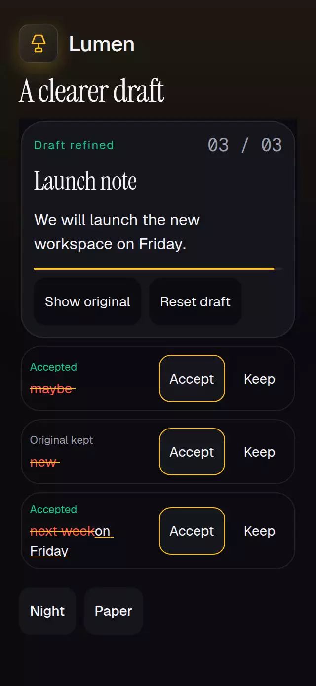
The demo owns all timers: rest 0–600 ms; accept the clarity change at 600 ms, keep the original wording for brevity at 1050 ms, and accept the timing change at 1550 ms. The final paragraph, "We will launch the new workspace on Friday.", converges by 1910 ms and its border settles before 3000 ms; reset at 4300 ms; next cycle at 5000 ms. Touch or pointer interaction cancels timers, and unmount clears them. Paper and Night controls sit below the draft. No autoplay exists in the component.
Props
| Prop | Default | Purpose |
|---|---|---|
segments: readonly RevisionSegment[] | Required | Source-order diff; text and whitespace are preserved. |
labels: RevisionLabels | Required | Complete localized copy, listed below. |
accessibilityLabel: string | Required | Description before the accessible paragraph. |
decisions: Record<string, 'accept' | 'reject'> | Internal | Controlled decisions take precedence; ref methods request callbacks. |
onDecision(id, decision) | Optional | One callback per distinct decision request. |
onComplete(finalText) | Optional | One callback per completed snapshot; preview toggles do not complete again. |
onReset() | Optional | Host clears controlled decisions. Internal reset clears local state. |
colorScheme: 'light' | 'dark' | 'auto' | auto | Entire theme, including controls. |
palette: Partial<RevisionPalette> | Theme | Background, surface, text, muted, border, accent, success, error. |
fontFamily, titleFontFamily, monoFontFamily | System | Body, heading, and counter families. |
style: StyleProp<ViewStyle> | flex: 1 | Host-sized root; no safe-area padding. |
testID: string | revision-diff-text | Root and stable control prefix. |
labels includes title, draft, original, showOriginal, showChanges, reset, accept, reject, pending, accepted, rejected, complete, empty, invalid, unknownChange, resetAnnouncement, and decisionAnnouncement. original names the original version; decisionAnnouncement replaces {change} with the one-based change number and {decision} with the localized status. No animation timing depends on text length.
Ref: accept(changeId), reject(changeId), reset(). Controlled refs never mutate host data. Supply onReset for controlled reset. resolveRevisionText(segments, decisions, original?) is exported for plain-text serialization. Unknown change IDs announce unknownChange and cause no mutation. Repeating the same decision causes no duplicate callback. Empty input shows empty. Duplicate/missing segment IDs, unsupported kinds, missing change IDs, and invalid text show invalid; no decisions are applied. No numeric tuning props exist, so nonfinite numeric IDs are invalid input rather than animation parameters. Segment IDs should remain stable across renders; reset before loading a different draft.
Control IDs: -original, -reset, -accept-<changeId>, -reject-<changeId>. Show original changes only the view and retains all decisions.
Compatibility
Targets Expo SDK 58, React Native 0.88.0, and Reanimated 4.7.1 with Worklets 0.13.0. Supports iOS, Android, and web with Expo Go-compatible native dependencies.
Catalog bundles alone do not establish runtime coverage of this component.
The implementation uses intrinsic word containers, normal flow, wrapping controls, and host-owned scrolling for those cases; this is design intent, not a measured visual claim.
Accessibility
Every action is at least 48 points and has a button role, label, and selected state where applicable. Native text keeps font scaling enabled. The component uses normal flow without an internal scroll viewport; the host owns scrolling for long drafts or large accessibility text. Below 400 points of measured component width, review cards use tighter spacing and each change places its preview beside the decision buttons. Text still wraps without clipping. Override the root with style={{ flex: 0, flexGrow: 0, flexShrink: 0, flexBasis: 'auto' }} for intrinsic height, as the demo does. Paragraph onLayout only refines subsequent height transitions. The host provides insets. The top-right corner of the demo remains clear of actions.
The demo removes secondary copy and uses shorter Accept/Keep labels while preserving all three changes and the original decision timeline. At heights of 694 points and above it uses a plain View. Shorter screens use one full-screen outer ScrollView with its vertical indicator hidden; the draft and theme controls share that single document.
Reduced motion replaces transitions with sequential 100 ms fades (200 ms total), uses opacity for underlines, and removes scale response, height springs, and border glow. Announcements report decisions, reset, completion, and unknown IDs. The paragraph's accessible label excludes duplicated insert/delete layers. Color is reinforced with strike-through, underlining, status labels, and explicit buttons.