About this animation
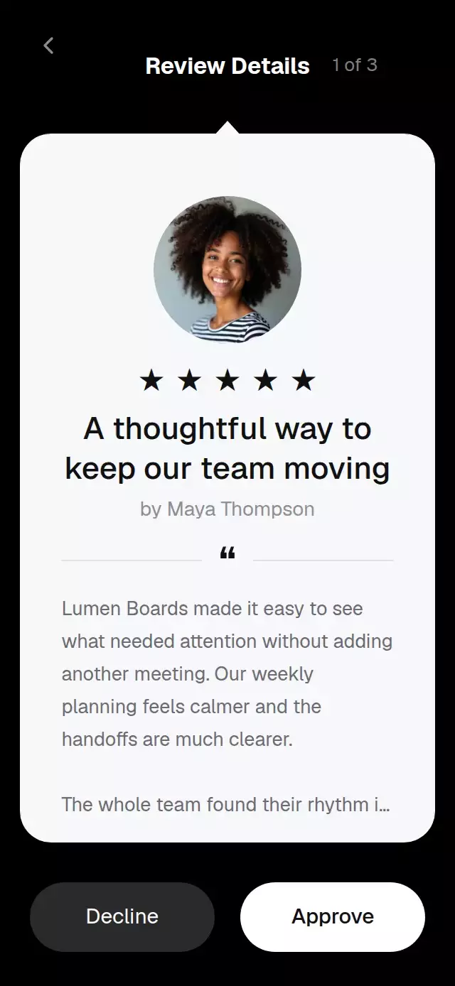
A moderation queue with swipe-to-approve or decline feedback, with configurable reviews, labels, colors, and fonts.
How it works
- A single horizontal shared value drives card travel, tilt, stamp visibility, and button emphasis.
- A pan gesture follows the finger and springs back when released before the decision threshold.
- A decisive swipe or tap sends the card away and advances the queue.
- The last decision reveals an accessible empty state with a reset action.
Install
npx expo install expo-image react-native-gesture-handler react-native-reanimated react-native-workletsUsage
const ref = useRef<ReviewApprovalCardRef>(null);
<ReviewApprovalCard ref={ref} reviews={reviews} onApprove={(id) => save(id)} />
Props
| Prop | Type | Default | Description |
|---|---|---|---|
reviews | ReviewApprovalItem[] | required | Ordered moderation queue. |
title | string | Review Details | Header title. |
labels | Partial<ReviewApprovalCardLabels> | English defaults | Button, stamp, author, and empty state copy. |
colors | Partial<ReviewApprovalCardColors> | Reference palette | Screen and card palette. |
fontFamily | string | system | Regular text face. |
mediumFontFamily | string | system | Medium text face. |
boldFontFamily | string | system | Bold text face. |
onApprove | (id: string) => void | — | Called after approval. |
onDecline | (id: string) => void | — | Called after decline. |
onBack | () => void | — | Back action. |
style | StyleProp<ViewStyle> | — | Root container style. |
testID | string | review-approval-card | Stable test identifier. |
The ref exposes approve(), decline(), and reset().
Compatibility
Expo SDK 58, React Native 0.88, and Reanimated 4.7.1. Supports iOS, Android, and web. Expo Go supports the included modules.
Accessibility
Action controls expose button roles and labels. Reduced motion removes rotation and the long card flight in favor of a short fade and displacement. The buttons provide a tap alternative to swiping.
Why this one
The card keeps the familiar, editorial review detail layout while making each decision visible before release. Gesture and button decisions share the same moderation flow.
Icons: Lucide (ISC). Demo portraits are generated fictional people and are not part of the component files.