About this animation
A layered hero card that tilts beyond its frame and becomes a stats card, with configurable artwork, stats, palette, and fonts.
Why this one
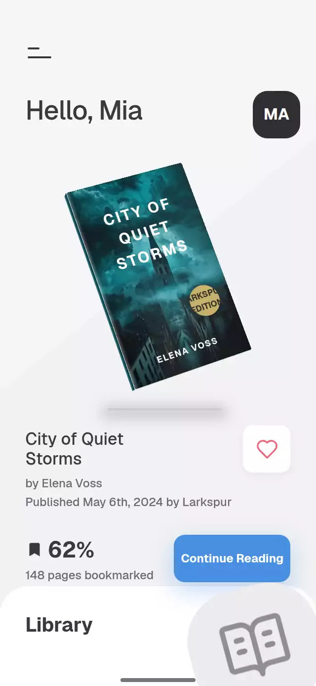
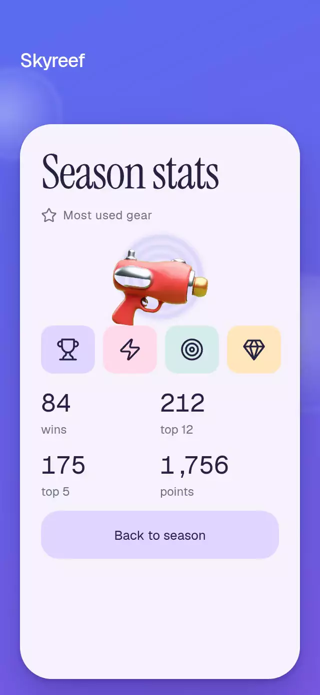
The hero is an independent transparent image, rather than a flattened card illustration. Finger tilt moves it 1.8 times as far as the card, with a subtle 1.04 foreground scale. The same card surface brightens into a gear showcase with rolling statistics, preserving continuity between the two screens.
How it works
onLayoutmeasures the host. Card width is capped; a scrolling layout keeps the controls reachable in small containers and landscape.- A horizontal-first Gesture Handler pan feeds one shared tilt vector. Perspective stays at 1,000, rotation is capped at ±10°, and an explicit mass-1, critically damped spring returns to rest.
- A separate hero viewport extends above and to the right of the card while clipping the image's lower edge. The hero and its shadow share a three-second floating phase.
start()andback()animate one reversible transition progress. It drives card color, cover opacity, hero flight, and stats entry. Counting uses a separate shared value so the state transition stays quick.- Each decimal column rolls only at its own carry. Separators remain in normal flow with narrower widths; all columns finish exactly on their integer digit.
- The demo owns the timers: tilt right at 350 ms, left at 1,200 ms, settle at 2,150 ms, start at 2,900 ms, hold stats for three seconds after the transition, and return at 6,500 ms. Any touch cancels the loop.
The primary action is a clean 60 pt pill with a 30 pt corner radius and a soft 3 pt shadow derived from the accent colors. Its independent press shared value moves it down 2 pt and scales it to 0.97, then springs back. A subtle mass-1 scale spring plays on cover entry; reduced motion disables both scale and displacement feedback. The button contour never deforms.
Install
npx expo install react-native-reanimated react-native-worklets react-native-gesture-handler expo-image expo-linear-gradient @shopify/react-native-skiaWrap the host application in GestureHandlerRootView and configure Reanimated/worklets for your Expo SDK. On web, initialize Skia/CanvasKit before importing/rendering the component, using your application's existing Skia loading boundary. Vertical strokes scroll the layout; begin a tilt with a horizontal or diagonal drag. Fonts are supplied by the host; the component does not load fonts or import any demo assets.
Icons: Lucide (ISC); the copied paths live in icons.ts.
Usage
import { useRef } from 'react';
import { PopoutHeroCard, type PopoutHeroCardRef } from './popout-hero-card';

const scenes = [
  { source: require('./scene-a.jpg'), label: 'Floating island' },
  { source: require('./scene-b.jpg'), label: 'Underwater village' },
  { source: require('./scene-c.jpg'), label: 'Ocean race' },
  { source: require('./scene-d.jpg'), label: 'Cloud harbor' },
];

export function SeasonScreen() {
  const card = useRef<PopoutHeroCardRef>(null);
  return (
    <PopoutHeroCard
      ref={card}
      hero={require('./hero.webp')}
      gear={require('./gear.webp')}
      scenes={scenes}
      stats={[
        { id: 'wins', value: 84, label: 'wins' },
        { id: 'points', value: 1756, label: 'points' },
      ]}
      seasonLabel="SEASON 04"
    />
  );
}
A softer pose and a custom theme:
<PopoutHeroCard
  hero={hero}
  gear={gear}
  scenes={scenes}
  stats={stats}
  tiltDegrees={7}
  parallax={1.5}
  duration={500}
  palette={{
    background: ['#25354D', '#39475B'],
    card: '#304B72',
    statsCard: '#EDF3F8',
    ink: '#142C42',
    muted: '#526A7D',
    accent: '#86DDD0',
    accentInk: '#173E39',
    ring: '#C1DBDA',
  }}
  fontFamily="YourBodyFont"
  headingFontFamily="YourBoldFont"
  serifFontFamily="YourEditorialFont"
  monoFontFamily="YourNumberFont"
/>
Props
| Prop | Type | Default | Purpose |
|---|---|---|---|
hero, gear | ImageSourcePropType | Required | Transparent character and gear artwork |
scenes | readonly HeroScene[] | Required | Up to four images with description labels |
stats | readonly SeasonStat[] | Required | Up to four nonnegative integer metrics |
seasonLabel | string | SEASON 01 | Background season identifier |
brandLabel | string | Empty | Optional upper-left wordmark; no logo |
title | string | Ready to explore? | Cover heading |
startLabel | string | PRESS TO START | Primary action |
statsTitle | string | Season stats | Editorial heading and entry announcement |
gearLabel | string | Most used gear | Featured item caption |
playLabel | string | View season stats | Hero/play accessibility label |
backLabel | string | Back to season | Return action |
heroAccessibilityLabel | string | Season hero | Image description |
gearAccessibilityLabel | string | Featured gear | Image description |
palette | Partial<PopoutHeroPalette> | Blue/violet, pink accent, light stats surface | Every surface, text, border, ring, shadow, and tile color |
fontFamily, headingFontFamily, serifFontFamily, monoFontFamily | string | System | Host-loaded fonts; provide a bold heading font |
tiltDegrees | number | 10 | Maximum rotation, limited to 0–10° |
parallax | number | 1.8 | Foreground movement multiplier, limited to 0–3 |
duration | number | 580 | Cover/stats transition in milliseconds |
maxWidth | number | 360 | Card width cap |
formatStat | (value: number) => string | US grouping | Integer formatting with ASCII digits and separators |
onStart, onBack | () => void | — | State transition callbacks on the JS thread |
onInteraction | () => void | — | Stops host autoplay when touched |
style, testID | StyleProp<ViewStyle>, string | Root flex 1, popout-hero-card | Embedding and stable test IDs |
Ref methods: start(), back(), and tilt(x, y) (normalized −1…1). They are reversible and do not disable interaction during animation.
Compatibility
Designed for Expo SDK 58, React Native 0.88.0, Reanimated 4.7.1, worklets 0.13.0, Gesture Handler 3.3, and Skia 2.14.0. Dependencies are generated from the imports in piece.json. The installed stack is compatible with Expo Go; no new native modules are introduced.
The component uses no safe-area insets: its host screen owns them. Content can scroll in a 300×400 region or landscape. Card art is limited to a 320 pt hero (332.8 pt at its peak scale), keeping the supplied 1,024 px artwork above 3×; scene thumbnails are smaller than 160 pt.
Accessibility
All actions have button roles, configurable labels, an activate accessibility action, and stable -start, -play, -hero, and -back test IDs. Play, tapping the hero, and the primary action provide alternatives to dragging. Hidden screen content is excluded from accessibility traversal. State changes announce the configured heading or season identifier; metrics expose their final values as single accessible labels.
Reduced motion removes tilt, floating, foreground scaling, flight, and gear rotation. The two states crossfade over 200 ms and metrics show their final digits without rolling. Touch targets are at least 48×48 pt, and press feedback has its own shared value. No real game branding or reference artwork is included.