About this component
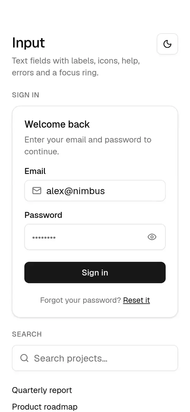
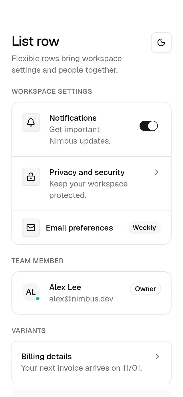
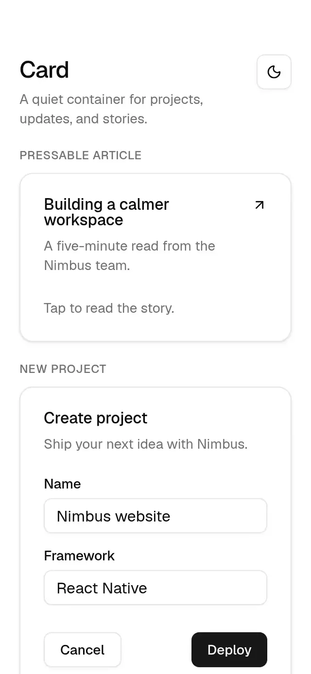
A composable card with optional press feedback and configurable content and theme.
How it works
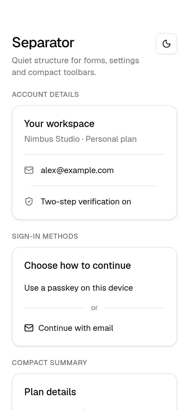
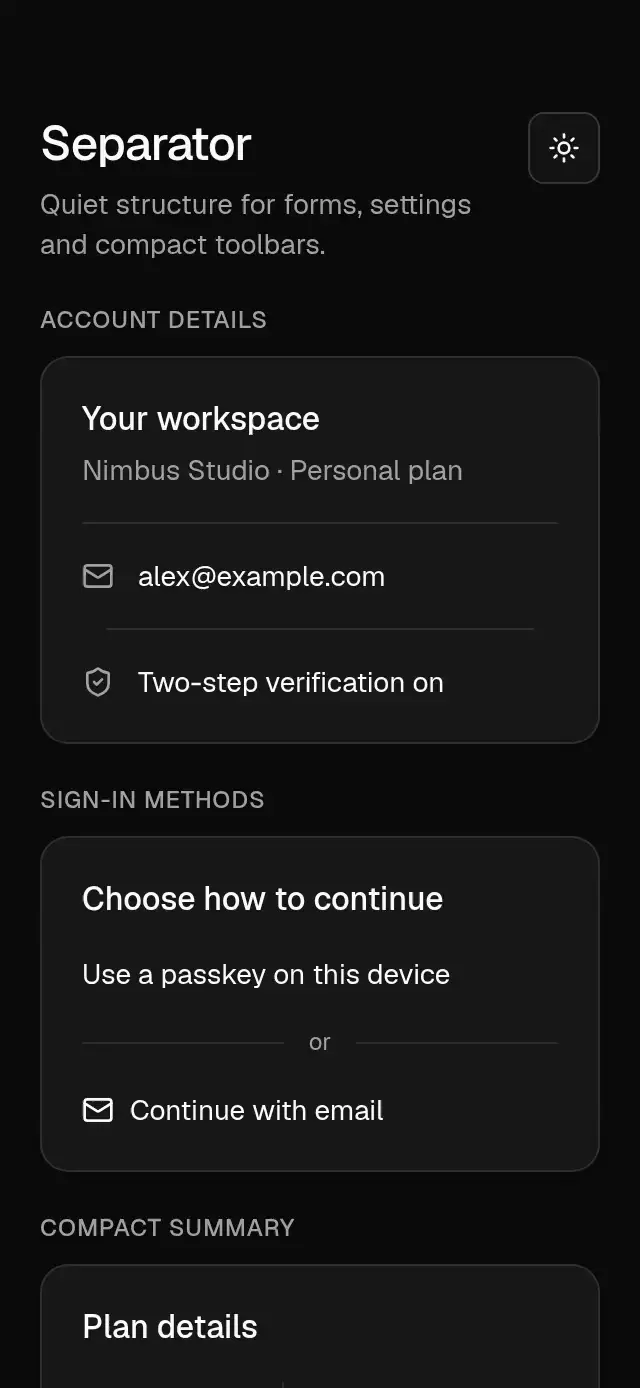
- The card uses the shared card surface, xl radius, border, and small shadow, with 24 pt vertical padding and gaps.
- Header and content parts provide consistent 24 pt horizontal insets. A direct
BaseCardActionchild is laid out beside the title and description. - With
onPress, a Gesture Handler tap compresses the card to the theme choice scale (0.985) and returns it using the press spring (550/30, mass 1). Pressure has its own shared value.
Install
npx nativeanimation add base-cardThe CLI also copies base-theme. Dependencies, if you copy by hand:
npx expo install react-native-gesture-handler react-native-reanimated react-native-workletsLoad the Geist regular and medium fonts used by the theme once in your app, or supply your own font names in a custom theme. Interactive pieces need a GestureHandlerRootView at the app root. The usage examples with buttons or switches assume those Base pieces are installed separately.
Usage
import { BaseCard, BaseCardHeader, BaseCardTitle, BaseCardDescription,
  BaseCardContent, BaseCardFooter } from './base-card';
import { BaseButton } from './base-button';

<BaseCard>
  <BaseCardHeader>
    <BaseCardTitle>Create project</BaseCardTitle>
    <BaseCardDescription>Ship your next idea with Nimbus.</BaseCardDescription>
  </BaseCardHeader>
  <BaseCardContent>{/* Your form fields */}</BaseCardContent>
  <BaseCardFooter>
    <BaseButton variant="outline">Cancel</BaseButton>
    <BaseButton onPress={deploy}>Deploy</BaseButton>
  </BaseCardFooter>
</BaseCard>
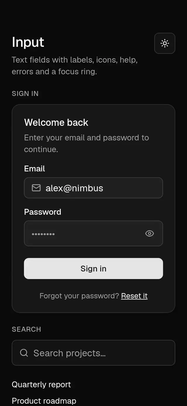
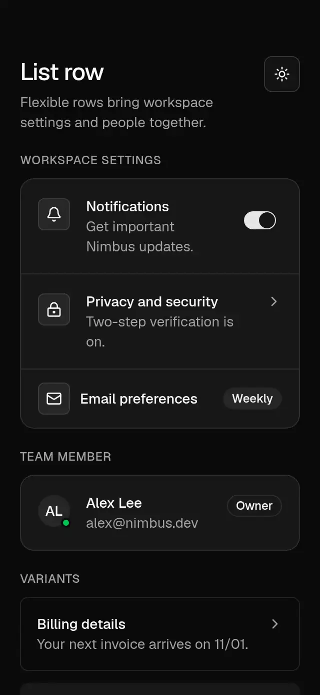
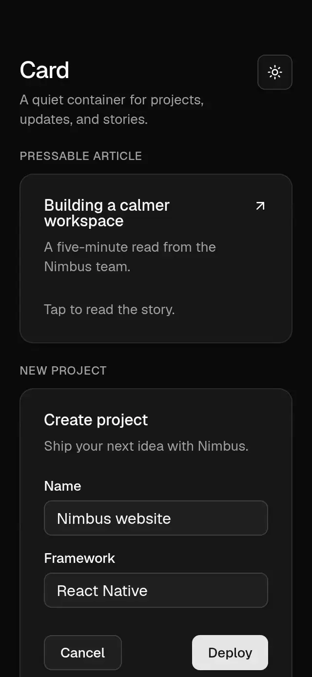
Wrap your app in BaseThemeProvider (from base-theme) to choose light/dark and an accent; without it, pieces use the light neutral theme. Every piece also takes a theme prop that wins over the provider.
Props
| Prop | Type | Default | Description |
|---|---|---|---|
BaseCard: children | ReactNode | — | Card contents, usually composed from the exported parts. |
onPress | () => void | — | Makes the card a button. Use a clear accessibilityLabel; keep interactive controls outside a pressable card. |
theme | BaseTheme | provider | Theme override, inherited by card parts and nested Base components. |
style | StyleProp<ViewStyle> | — | Root layout and visual overrides; also supported by each part. |
testID | string | — | Identifier on the card root. |
accessibilityLabel | string | — | Accessible name for a pressable card. |
BaseCardHeader / BaseCardAction | ViewProps & { theme?: BaseTheme } | — | Place Action directly inside Header to put it at the top right. |
BaseCardTitle / BaseCardDescription | TextProps & { theme?: BaseTheme } | — | Title and supporting copy; accept text styles and native text props. |
BaseCardContent / BaseCardFooter | ViewProps & { theme?: BaseTheme } | — | Content region and horizontal action row. |
Compatibility
Expo SDK 58 · React Native 0.88 · Reanimated 4.7 · react-native-worklets 0.13. Targets iOS, Android, and web, including Expo Go and development builds. Part of Native Animation Base, a free family sharing one theme; the CLI installs its family dependencies automatically.
Accessibility
A static card preserves the accessibility of its children. A pressable card is announced as a button and supports accessibility activation and Enter/Space on web. It reserves at least 44 pt in each dimension; the host must provide 48 dp on Android. Keep nested buttons and inputs in static cards. With Reduce Motion on, the pressure scale stays at 1.
Touch targets
Pressable cards reserve a 44×44 minimum on every platform. On Android, the host must give the card at least 48×48 dp. Keep at least 44×44 pt on iOS and 44 px on web. Do not shrink cards below those dimensions or overlap their targets with negative margins. Put nested buttons and inputs in static cards.
Part of a shared foundation
Use it in a screen
Compose Base Card with other Base components and a single shared theme. Ask your agent to read each API, then connect real navigation, state, and callbacks.
Go further.
Base covers the everyday. Choose a more expressive interaction when your app calls for it.
Stacked Category Cards ↗
A category stack whose tabs unfold into detail cards, with configurable categories, title, colors, and fonts.
Another way to solve this task · $9Review Approval Card ↗
A moderation queue with swipe-to-approve or decline feedback, with configurable reviews, labels, colors, and fonts.
Source code
Loading public source…