About this component
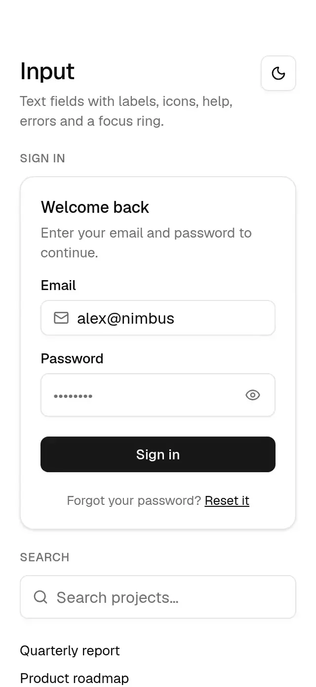
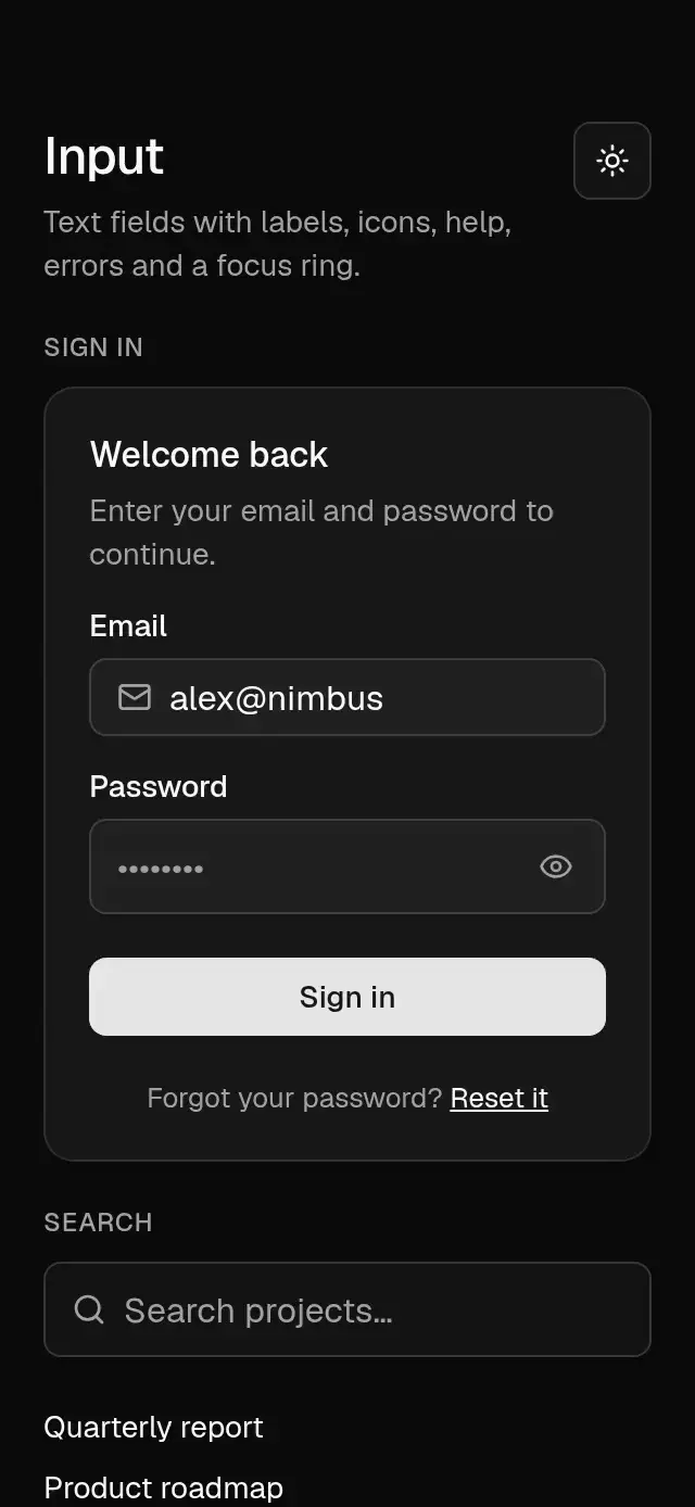
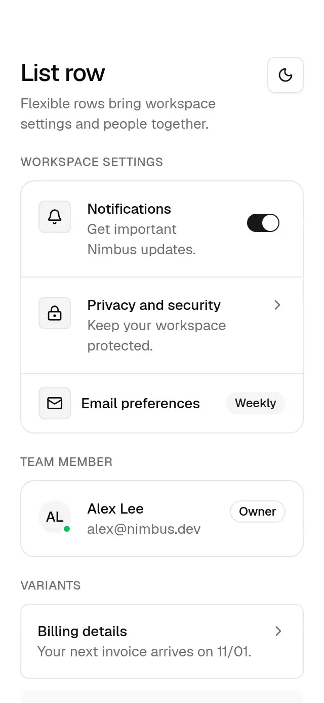
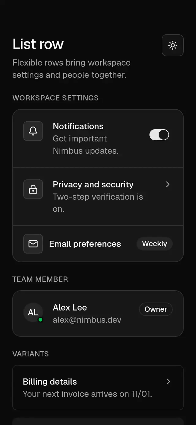
The shared theme of Native Animation Base: a neutral palette in light and dark, six named accents, radii, shadows and the motion tokens (springs, curves and durations) every Base piece animates with.
How it works
createBaseTheme({ scheme, accent })returns plain tokens: colors (background, foreground, card, primary, muted, border, input, ring…), radius (--radius0.625rem → 6/8/10/14), shadows and fonts.- Accents replace only
primary,primaryForeground,ring, and the derivedringSoft; all surfaces stay neutral. - Motion tokens hold named springs (always with
mass: 1), cubic-bezier curves and durations;spring()andtiming()turn them into Reanimated configs. BaseThemeProvidershares one theme with every Base piece;useBaseTheme()reads it.
Install
npx nativeanimation add base-themeEvery Base piece installs it automatically.
Usage
import { BaseThemeProvider } from './base-theme';

export default function App() {
  const scheme = useColorScheme() ?? 'light';
  return (
    <BaseThemeProvider scheme={scheme} accent="bloom">
      <Root />
    </BaseThemeProvider>
  );
}
Your own palette:
const brand = createBaseTheme({ scheme: 'light' });
brand.colors.primary = '#e11d48';
<BaseThemeProvider theme={brand}>…</BaseThemeProvider>
The fonts are Geist (Geist_400Regular, Geist_500Medium) loaded with @expo-google-fonts/geist; replace
theme.fonts to use your own.
Props (BaseThemeProvider)
| Prop | Type | Default | Description |
|---|---|---|---|
scheme | 'light' | 'dark' | 'light' | Color scheme. |
accent | BaseAccent (keys and aliases below) | 'neutral' | Primary, primary foreground, and focus ring colors. |
theme | BaseTheme | — | A fully custom theme; wins over scheme and accent. |
Accents
| Name | Key | Legacy alias |
|---|---|---|
| Quill | quill | neutral (default) |
| Tide | tide | blue |
| Grove | grove | green |
| Bloom | bloom | violet |
| Cove | cove | — |
| Kiln | kiln | — |
BaseAccent accepts all six keys and all four legacy aliases. Aliases resolve to the same colors as their named
accent; theme.accent keeps the value you passed. Quill preserves the original neutral colors, including its ring.
The other legacy aliases use the new palette, so existing blue, green, and violet themes change appearance.
The default stays neutral in both createBaseTheme() and BaseThemeProvider.
Use the exported baseAccents list to build selectors in this order, with visible names instead of raw keys:
import { baseAccents, createBaseTheme } from './base-theme';

const options = baseAccents.map(({ key, name }) => ({
  value: key,
  label: name,
  color: createBaseTheme({ scheme: 'light', accent: key }).colors.primary,
}));
BaseAccentName is the union of the six named keys. BaseAccent now includes ten keys; exhaustive switches and
Record<BaseAccent, ...> maps must handle the six new keys as well as the legacy aliases.
Compatibility
Expo SDK 58 · React Native 0.88 · Reanimated 4.7 · react-native-worklets 0.13. Runs on iOS, Android and web, in Expo Go
and in development builds. Part of Native Animation Base, a free family that shares one theme: install
base-theme once (the CLI does it for you) and every Base piece picks it up.
Accessibility
The nine text pairs in contrast.test.mjs meet 4.5:1 for all six accents and four aliases in light and dark
(20 key/scheme combinations). This includes primary text on its fill and muted text on the muted surface.
This is not a complete AA audit. Quill keeps the original focus ring, whose 50% composite falls below 3:1 on
neutral surfaces; focus contrast is outside this text-contrast test. Custom palettes need their own contrast checks.
useBaseReducedMotion() reads the initial system preference and subscribes to changes while the app is open
(AccessibilityInfo on native, plus prefers-reduced-motion on web). Base pieces skip or shorten motion immediately.
Native starts with reduced motion until the initial asynchronous preference query resolves.
Design tokens adapted from shadcn/ui (MIT). See NOTICE.md.
Part of a shared foundation
Use it in a screen
Compose Native Animation Base Theme with other Base components and a single shared theme. Ask your agent to read each API, then connect real navigation, state, and callbacks.
Go further.
Base covers the everyday. Choose a more expressive interaction when your app calls for it.
Stacked Category Cards ↗
A category stack whose tabs unfold into detail cards, with configurable categories, title, colors, and fonts.
Another way to solve this task · $9Review Approval Card ↗
A moderation queue with swipe-to-approve or decline feedback, with configurable reviews, labels, colors, and fonts.
Source code
Loading public source…