About this animation
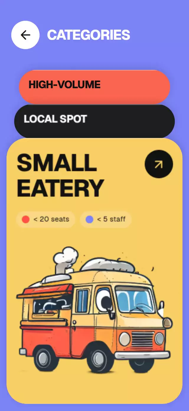
A category stack whose tabs unfold into detail cards, with configurable categories, title, colors, and fonts.
How it works
- A single spring-driven array holds each persistent card’s expansion weight. Position, type scale, folding, and stacking derive from those weights; jumping across categories does not briefly open the category between them.
- Tapping a tab springs it forward while the open card folds back into the stack.
- Pulling the open card down folds it away and advances to the next category.
- Chips enter in staggered stages. A supplied image rolls in and settles, the built-in map draws its route and drops its pin, and bar charts rise with a UI-thread numeric counter.
- Static print grain, an upper edge highlight, and moving shadows separate the layers. The arrow compresses on touch, exits diagonally, and returns.
- All cards remain mounted with stable IDs. No outgoing offset resets before React commits, and no recycled front card fades in over a placeholder.
Install
npx expo install @shopify/react-native-skia expo-image react-native-gesture-handler react-native-reanimated react-native-workletsWrap the host in GestureHandlerRootView. On web, initialize CanvasKit before importing the component with Skia’s LoadSkiaWeb or WithSkiaWeb, and serve the matching canvaskit.wasm. The catalog demo initializes CanvasKit in a web-only entry. Native platforms require no CanvasKit bootstrap. The host supplies safe-area insets.
Usage
const ref = useRef<StackedCategoryCardsRef>(null);
<StackedCategoryCards ref={ref} categories={categories} initialIndex={0} />
ref.current?.open(1);
Props
| Prop | Type | Default | Description |
|---|---|---|---|
title | string | CATEGORIES | Header title. |
categories | StackedCategory[] | required | Card labels, colors, chips, and optional media or stat. |
initialIndex | number | last category | Initially expanded card. |
colors | StackedCategoryColors | periwinkle and white | Screen and header colors. |
fontFamily | string | system | UI typeface. |
displayFontFamily | string | fontFamily | Typeface used for the header and category titles. |
monoFontFamily | string | fontFamily | Typeface for the live count. |
onInteraction | () => void | — | Direct input notification; the demo stops autoplay here. |
onOpen | (id: string) => void | — | Called by the card arrow. |
onChange | (index: number) => void | — | Called when the expanded card changes. |
onBack | () => void | — | Called by the back control. |
style | StyleProp<ViewStyle> | — | Root container style. |
testID | string | stacked-category-cards | Root test identifier. |
Category records retain id, label, lines, color, ink, chips, image, and stat. Optional additions:
| Field | Type | Default | Description |
|---|---|---|---|
illustration | 'bars' | 'map' | bars | Supporting scene when no image is supplied. |
statValue | number | — | Counter target, formatted as a US integer. |
bars | number[] | seven normalized values | Relative bar heights from 0 to 1. |
mapColors | { paper, fold, road, park } | warm paper and sage | Map illustration palette. Each field is a color string. |
openLabel | string | Open <label> | Spoken label for the arrow. |
The surrounding colors palette additionally accepts control and controlInk for the back button. Each card’s ink also colors its arrow surface; the card fill colors the arrow. Images override built-in scenes. Keep local image density at least 3× its rendered size; the demo caps the 804 px truck at 268 pt.
Compatibility
Expo SDK 58, React Native 0.88, and Reanimated 4.7.1. Uses Skia 2.14.0, Expo Image, and Gesture Handler. No development build is required when the app already includes these dependencies.
Accessibility
The back and open controls expose button roles and labels. Reduced Motion snaps the card geometry and fades supporting content over 200 ms, without the fold, truck travel, pin drop, or arrow flight. The tab stack is selectable by touch as an alternative to dragging.
Why this one
Categories behave like separate physical folders: each one carries its own data and can be pulled forward or tucked back into the stack.
Icons: Feather, the Lucide predecessor, via Expo Vector Icons.