About this component
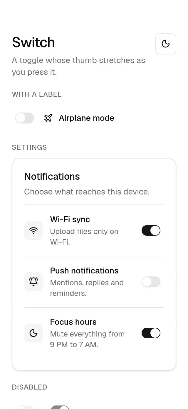
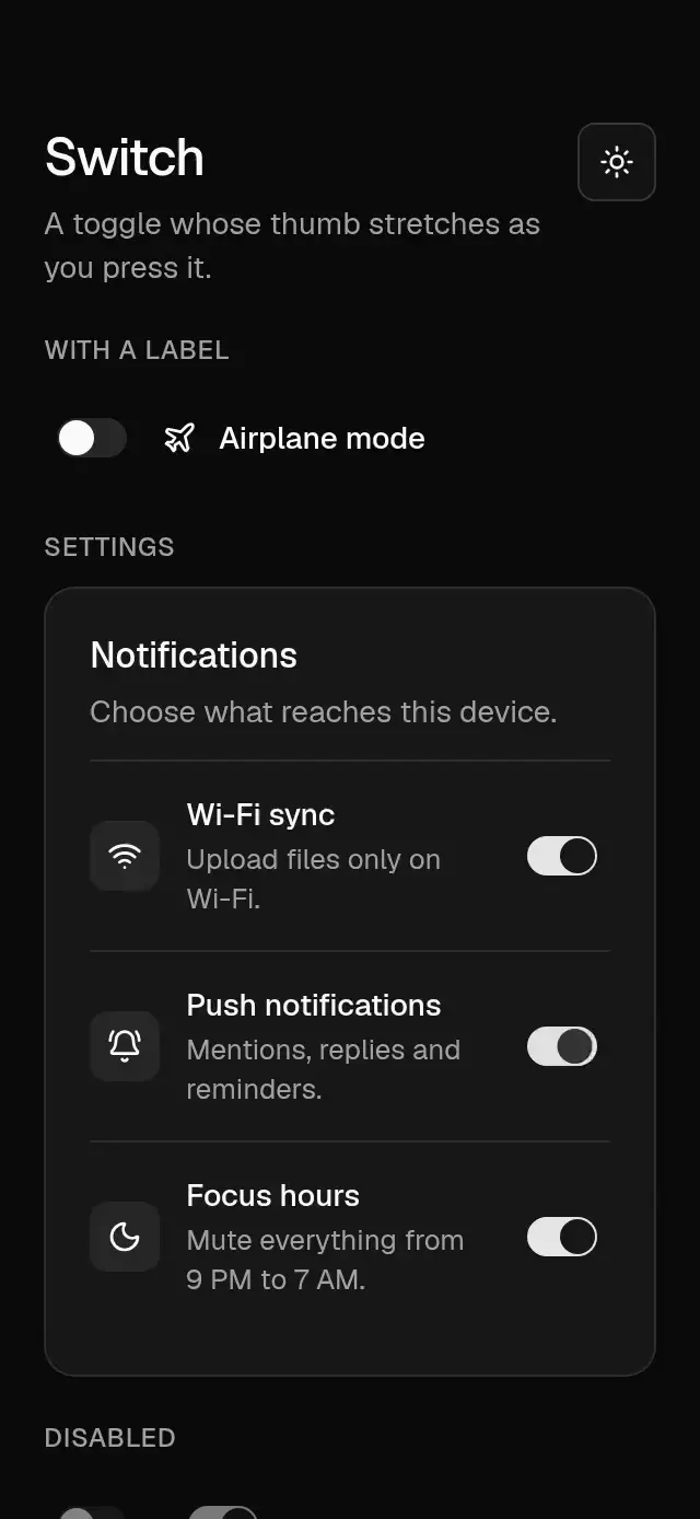
A switch with a stretching, spring-driven thumb that takes its colors and radius from a configurable theme.
How it works
- The track is 32 × 18.4 pt with a 16 pt thumb.
- On touch-down the thumb stretches to 19/16 of its width, anchored so it grows toward the side it will move to.
- On release it springs across (stiffness 300, damping 25, mass 1) and shrinks back; track and thumb colors fade in 200 ms.
- A layout wrapper reserves a 48 dp Android or 44 pt iOS/web touch target around the unchanged track.
Install
npx nativeanimation add base-switchThe CLI also copies base-theme. Dependencies, if you copy by hand:
npx expo install react-native-gesture-handler react-native-reanimated react-native-workletsUsage
import { BaseSwitch } from './base-switch';

<BaseSwitch value={enabled} onValueChange={setEnabled} accessibilityLabel="Push notifications" />
Uncontrolled and disabled:
<BaseSwitch defaultValue accessibilityLabel="Wi-Fi sync" />
<BaseSwitch disabled accessibilityLabel="Locked setting" />
Wrap your app in BaseThemeProvider (from base-theme) to choose light/dark and an accent; without it, pieces use the light neutral theme. Every piece also takes a theme prop that wins over the provider.
Props
| Prop | Type | Default | Description |
|---|---|---|---|
value | boolean | — | On or off (controlled). |
defaultValue | boolean | false | Initial state (uncontrolled). |
onValueChange | (value: boolean) => void | — | Called when toggled. |
disabled | boolean | false | Dims and blocks toggling. |
accessibilityLabel | string | — | What the switch controls. |
theme | BaseTheme | provider | Overrides the theme from BaseThemeProvider. |
testID | string | — | Test identifier on the root view. |
Compatibility
Expo SDK 58 · React Native 0.88 · Reanimated 4.7 · react-native-worklets 0.13. Runs on iOS, Android and web, in Expo Go
and in development builds. Part of Native Animation Base, a free family that shares one theme: install
base-theme once (the CLI does it for you) and every Base piece picks it up.
Accessibility
Announced as a switch with synchronized checked and disabled states. Supports screen-reader activation and Enter/Space on web. With Reduce Motion on, the thumb moves without the spring or the stretch.
Part of a shared foundation
Use it in a screen
Compose Base Switch with other Base components and a single shared theme. Ask your agent to read each API, then connect real navigation, state, and callbacks.
Go further.
Base covers the everyday. Choose a more expressive interaction when your app calls for it.
Stacked Category Cards ↗
A category stack whose tabs unfold into detail cards, with configurable categories, title, colors, and fonts.
Another way to solve this task · $9Review Approval Card ↗
A moderation queue with swipe-to-approve or decline feedback, with configurable reviews, labels, colors, and fonts.
Source code
Loading public source…