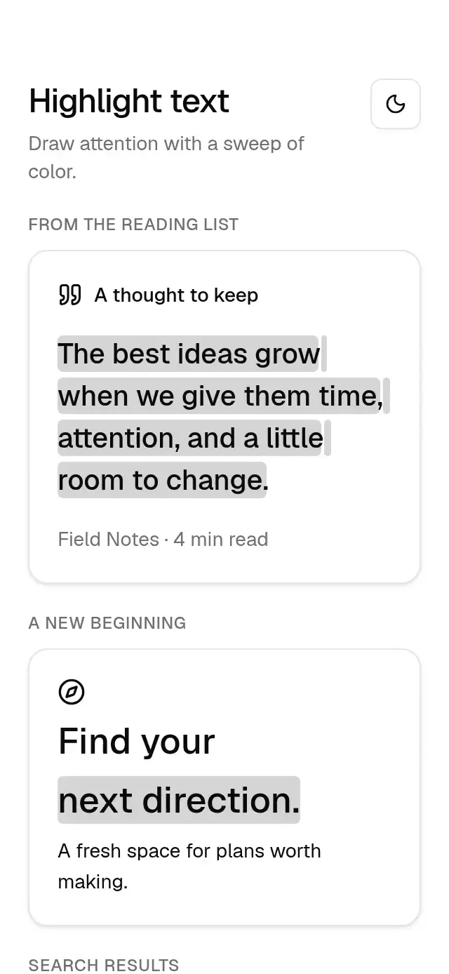
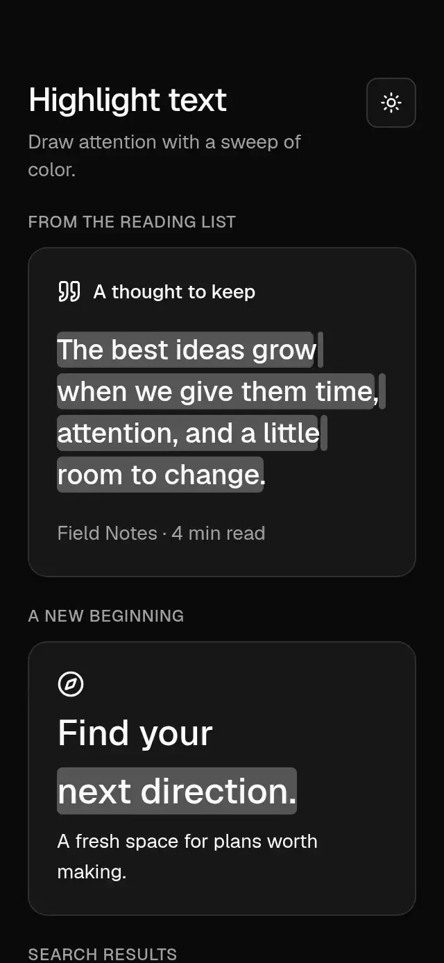
About this component
A left-to-right highlight sweep behind each wrapped text line, with configurable text, highlight color, duration, delay, trigger, typography, and theme.
How it works
- Native text reports line rectangles through
onTextLayout. A web-only range observer measures the actual line wrapping and remeasures when fonts or width change. - Each measured line gets a separate rounded background, painted behind the text without clipping descenders.
- One shared value expands every line's background from 0% to 100% with
Easing.inOut(Easing.ease)overdurationmilliseconds. - Set
triggertofalseto reset, thentruewhen your viewport observer reports that the text is visible. Viewport detection belongs to the host app.
For a fuller editorial treatment, explore marker-highlight-quote.
Install
npx nativeanimation add base-highlight-textThe CLI also copies base-theme. Dependencies, if you copy by hand:
npx expo install react-native-reanimated react-native-workletsFree forever. MIT.
Usage
import { BaseHighlightText } from './base-highlight-text';

<BaseHighlightText
  text="Give your best ideas room to grow."
  duration={2000}
  trigger={isVisible}
  style={{ fontSize: 24, lineHeight: 34 }}
/>
Wrap your app in BaseThemeProvider (from base-theme) to choose light/dark and an accent; without it, pieces use the light neutral theme. The theme prop overrides the provider. style customizes the text. Set layout spacing on the parent; use this as a standalone text block rather than nesting it inside another Text.
Props
| Prop | Type | Default | Description |
|---|---|---|---|
text | string | — | Text to highlight. |
highlightColor | string | primary at 18% light / 30% dark | Background color behind the text. |
duration | number | 2000 | Sweep duration in milliseconds. |
delay | number | 0 | Delay before the sweep in milliseconds. |
trigger | boolean | true | Starts on true, resets on false. |
style | StyleProp<TextStyle> | — | Font, color, line height, and alignment. |
theme | BaseTheme | provider | Theme override. |
testID | string | — | Identifier on the container. |
Compatibility
Expo SDK 58 · React Native 0.88 · Reanimated 4.7 · react-native-worklets 0.13. Targets iOS, Android, and web, in Expo Go and development builds. Part of Native Animation Base, a free family sharing one theme. Web measurement lives in a .web.ts file and never enters the native bundle. No safe-area padding is applied. All lines sweep together; the component does not scroll or observe the viewport itself.
Accessibility
The full text remains selectable by assistive technology through one accessible text element; backgrounds are decorative and ignore touches. Reduce Motion paints the complete highlight immediately, without a sweep or delay. Keep custom foreground and highlight colors at an accessible contrast ratio.
Part of a shared foundation
Use it in a screen
Compose Base Highlight Text with other Base components and a single shared theme. Ask your agent to read each API, then connect real navigation, state, and callbacks.
Go further.
Base covers the everyday. Choose a more expressive interaction when your app calls for it.
Bubble Sale Banner ↗
A sale banner with jumping balloon letters and a printing receipt, with configurable copy, character artwork, fonts, and colors.
Another way to solve this task · $9Year Digits Rollover ↗
An interactive year reveal with alternating bands on changing digits, with configurable start year, end year, colors, and numeral font asset.
Source code
Loading public source…