About this animation
Related guides
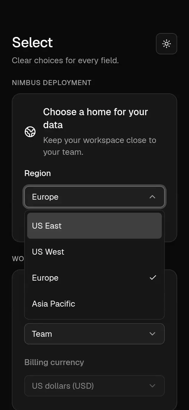
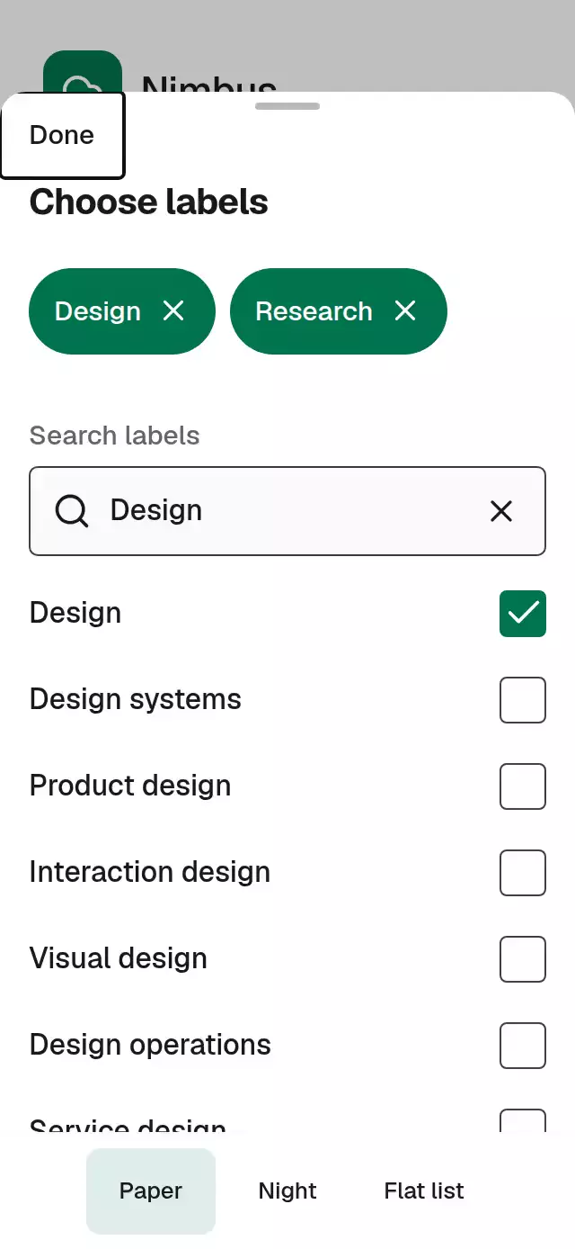
A searchable selection sheet with persistent removable chips, with configurable options, labels, palette, and fonts.
How it works
- The host supplies stable IDs and labels. Selection, query, and visibility each support controlled and uncontrolled operation.
- Local search normalizes case and diacritics. A controlled query defaults to remote search, so server results are not silently filtered again.
- Selected labels are retained separately from the current result page. Chips stay available when a remote page omits their options.
- One UI shared value moves the sheet and scrim. A separate selection clock coordinates the changed checkbox and new chip opacity; chip layout transitions and exit fades use the same 180/160 ms targets. React updates only on discrete changes.
- Only the handle owns a pan gesture. The result list and chip viewport own their scroll, and native press controls remain outside the pan detector.
- The host is measured with
onLayout. The sheet caps its width at 620 points, keeps chips in a two-row viewport, and reserves space for results. Under severe keyboard/font constraints, the upper block, including search, scrolls beneath the persistent Done control.
Install
Copy this folder, excluding demo/, into your app. Keep both keyboard helper files: Metro selects the .web.ts implementation for the browser.
npx expo install expo-image react-native-gesture-handler react-native-reanimated react-native-workletsMount your app inside GestureHandlerRootView and follow the Reanimated setup for your Expo SDK. The component uses platform fonts by default and has no catalog, theme, provider, or demo dependency. The demo alone uses the host's loaded Geist fonts and safe-area context.
Usage
import { useRef } from 'react';
import { Button, View } from 'react-native';
import {
  SearchableSelectSheet,
  type SearchableSelectSheetHandle,
} from './searchable-select-sheet';

const options = [
  { id: 'design', label: 'Design' },
  { id: 'research', label: 'Research' },
  { id: 'delivery', label: 'Delivery' },
];

export function WorkspaceLabels() {
  const sheet = useRef<SearchableSelectSheetHandle>(null);
  return (
    <View style={{ flex: 1 }}>
      <Button title="Choose labels" onPress={() => sheet.current?.open()} />
      <SearchableSelectSheet
        ref={sheet}
        options={options}
        defaultSelectedIds={['design']}
        labels={{ title: 'Choose labels', search: 'Search labels' }}
        style={{ position: 'absolute', top: 0, bottom: 0, left: 0, right: 0 }}
      />
    </View>
  );
}
The component fills its measured parent; place it after host content to draw above it. It does not create a native Modal or add safe-area padding. The host owns safe areas once, and should hide its underlying content from screen readers while the sheet is open. Use onOpenChange for this integration.
Controlled local search and theme knobs:
<SearchableSelectSheet
  options={options}
  selectedIds={selectedIds}
  onSelectionChange={(next) => setSelectedIds(next)}
  query={query}
  onQueryChange={setQuery}
  searchMode="local"
  maxSelected={5}
  colorScheme="dark"
  palette={{ accent: '#00744F', focus: '#6FB6F8' }}
  motion={{ durationScale: 0.85 }}
  onRestoreFocus={() => triggerRef.current?.focus()}
/>
For remote search, omit searchMode="local", supply the current server page through options, and drive query, loading, and error from your data layer. The host owns request cancellation and stale response handling. Passing filterOption explicitly always uses that matcher, including in remote mode.
Props
| Prop | Type | Default | Behavior |
|---|---|---|---|
options | ReadonlyArray<SelectOption> | Required | {id, label, groupId?, disabled?} |
groups | ReadonlyArray<SelectGroup> | Omitted | Optional section headings; no groups in the primary design |
selectedIds / defaultSelectedIds | readonly string[] | [] | Controlled selection or initial selection |
onSelectionChange | (ids, {id, action}) => void | Omitted | One request per valid add/remove; no close-time commit |
query / defaultQuery | string | '' | Controlled query or initial query |
onQueryChange | (query: string) => void | Omitted | Query change requests, including clear/reset |
open / defaultOpen | boolean | false | Controlled visibility or initial visibility |
onOpenChange | (open: boolean) => void | Omitted | Open/close requests |
selectionMode | 'single' | 'multiple' | 'multiple' | Single replaces the known selection; tapping it again removes it |
maxSelected | number | Unlimited | Finite values are floored and must be nonnegative; zero permits removal only |
filterOption | (option, query) => boolean | Normalized substring | Explicit matcher overrides automatic filtering |
searchMode | 'local' | 'remote' | Query-dependent | Local for internal query; remote for controlled query |
loading | boolean | false | Busy results state; retains selection and query |
error | string | boolean | Omitted | Error text, or true for labels.error |
onRetry | () => void | Omitted | Retry action; does not reset data |
disabled | boolean | false | Blocks gestures, controls, and handles except reset |
labels | Partial<SelectLabels> | Neutral English | Every visible string and announcement can be replaced |
onDataIssue | (issue: DataIssue) => void | Omitted | Reports invalid/duplicate options and unknown selection |
onRestoreFocus | () => void | Omitted | Host trigger focus restoration on close |
colorScheme | 'light' | 'dark' | 'auto' | 'auto' | Paper, derived Night, or system |
palette | Partial<Palette> | Theme palette | Complete semantic token overrides |
fontFamily | string | System | Body and chips |
titleFontFamily | string | System | Heading and group labels |
monoFontFamily | string | Body font | Result count |
motion | {durationScale?, glowOpacity?} | {durationScale: 1} | Duration scale clamps to 0.5–2; glow is reserved and intentionally absent |
style | StyleProp<ViewStyle> | flex: 1 | Applied last to the measured root |
testID | string | 'searchable-select-sheet' | Stable root/control prefix |
accessibilityLabel | string | Title | Accessible sheet name |
ref | Ref<SearchableSelectSheetHandle> | Omitted | React 19 public actions |
labels includes title, selected, search, empty, loading, close, retry, clear, and error; formatters remove(label), selectionLimit(limit), resultCount(count), and announcement(label, action). selected names the chip region without adding another visible heading.
Palette exposes background, surface, elevated, text, muted, border, accent, onAccent, accentSoft, glow, success, error, scrim, track, and focus. PAPER and NIGHT are exported. Reserved common tokens do not imply ornamental effects in this pattern.
Handle
open()/close()request visibility. Closing retains query and selection.focusSearch()focuses only while open and enabled; this can open the real system keyboard.setQuery(text)/clearQuery()use the query callback contract.toggleOption(id)uses exactly the same validation and selection callback as a row or chip.reset()restores mount-time defaults, cancels the current visual transition, and invalidates queued gesture callbacks. It works while disabled. Reset reports each changed ID once with the final selection; query/visibility callbacks run only when those values differ. Controlled props still prevail.
Methods request changes in controlled mode; the host must accept them through props. An ignored visibility request returns the dragged sheet to the controlled state. No deferred confirmation contract is mixed into immediate selection.
Data fallbacks
Duplicate option IDs use the first occurrence. Invalid option records are skipped. Duplicate or empty selection IDs are removed. Nonfinite/negative maxSelected means unlimited, and a nonfinite duration scale falls back to 1. Empty arrays produce the empty state.
Unknown selected IDs are retained and displayed as raw ID chips, and reported through onDataIssue with code unknown-selection. Attach this callback when loading selected records asynchronously. Previously seen labels are cached across remote pages. Unknown IDs are never silently deleted, including when single mode replaces known selections; they count toward the limit until removed explicitly. Disabled known options cannot be removed by chip or handle. A failed/retried request preserves the current query and IDs.
Control suffixes: -search, -clear, -close, -scrim, -results, -retry, -option-<id>, and -remove-<id>. Data IDs, rather than mutable row indexes, identify controls.
Compatibility
Designed for Expo SDK 58, React 19.2, React Native 0.88.0, Reanimated 4.7.1, Worklets 0.13.0, and Gesture Handler 3.3 on the New Architecture. Uses React Native components for iOS, Android, and web and the modules bundled in Expo Go. Icons render exact Lucide kit paths as SVG images through expo-image. No blur or raster images are required.
The component manages its own keyboard avoidance. Do not wrap it in an additional keyboard-avoidance layer. The host owns window insets and Android resize configuration. Embedded and unusually short keyboard layouts use the scrolling upper-block fallback. Compilation alone does not establish native frame rate, keyboard behavior, or touch accuracy; those require a host integration and hardware measurements. No FPS or refresh-rate claim is made.
Accessibility
Rows expose checkbox/radio roles, checked/disabled state, and full option labels. Chips expose localized remove actions with 48-point targets. The Done control stays outside upper-content scroll and provides an alternative to handle dragging. Error, busy, empty, and limit states retain text; selection also has a checkmark.
Reduced motion is observed live and replaces sheet movement and selection animation with a 200 ms fade; decorative loops are absent. Web supports Tab/Shift+Tab containment, Enter/Space activation, Escape, and Up/Down result navigation. Android Back and accessibility escape request dismissal. Focus moves to Done on open; use onRestoreFocus to return to your trigger. The host must hide background siblings from native accessibility while open.
Text uses native scaling and wraps without line truncation. Logical insets and row layout follow RTL. Supply localized copy and contrast-safe palette overrides for your host.
Why this one
Search, multi-selection, and removable chips share one durable data contract. A long result list stays virtualized, while selection remains available across filters and remote pages. The demo supplies 200 stable options, two themes, optional Teams/Projects grouping, and twelve matches for “Design.” Its autoplay calls public methods, stops on real touch/background/unmount, and never draws or impersonates a native keyboard.
The primary visual direction preserves a white sheet, flowing green chips, a gray search field, and flat rows with right-side checkboxes. Forty-eight-point targets, a left-side Done action, tablet width limits, and compact scrolling are deliberate production adaptations. Night is extrapolated from neutral colors on a different screen; it is not a measured dark rendition of this sheet. Grouping, empty/error/loading states, and all timings are original extensions of a static reference flow. No source branding or assets are included.
Icons: Lucide (ISC). Demo fonts: Geist and Geist Mono (SIL Open Font License), loaded by the host. Raster assets: N/A.