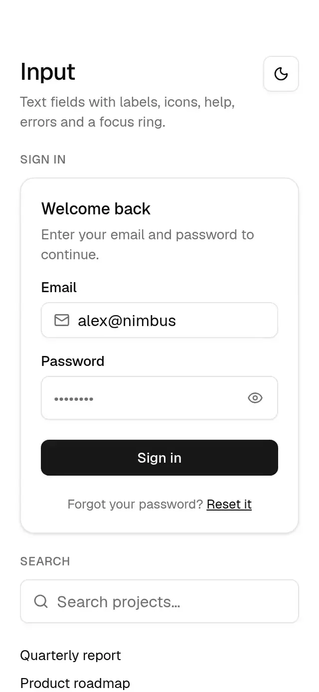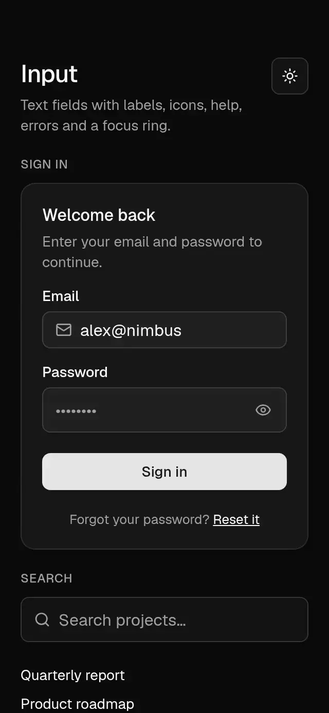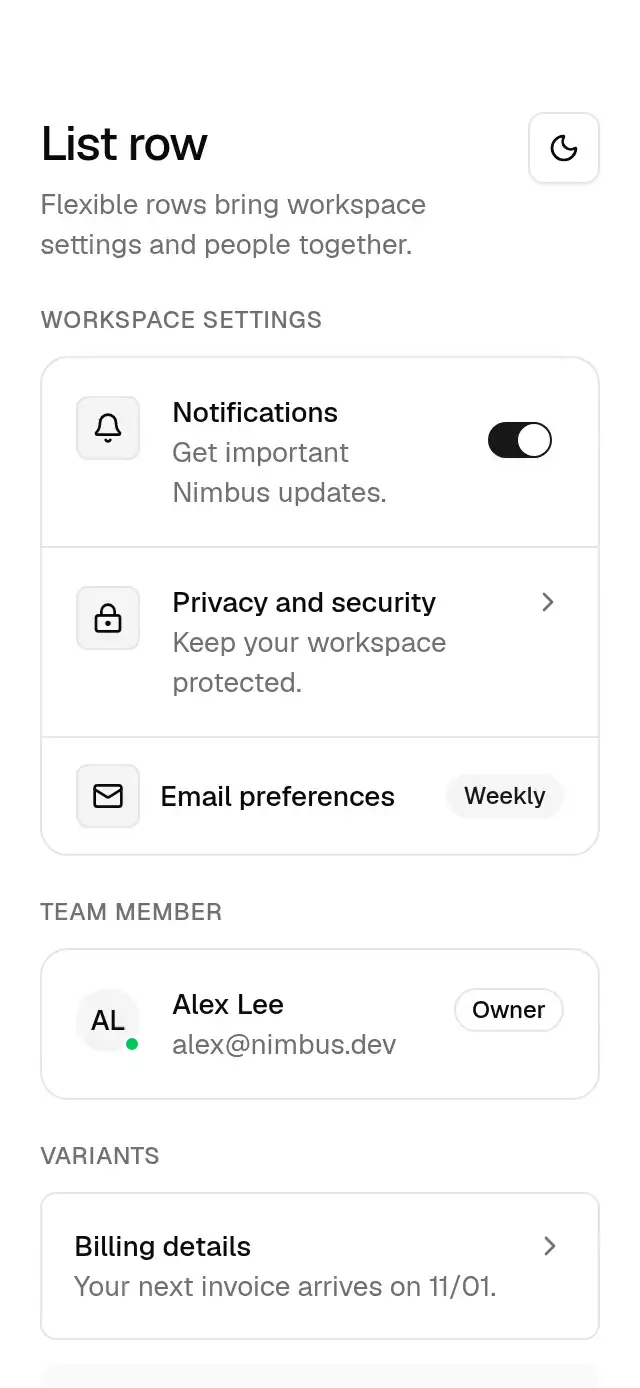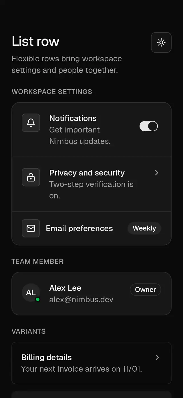
About this component
Related guides
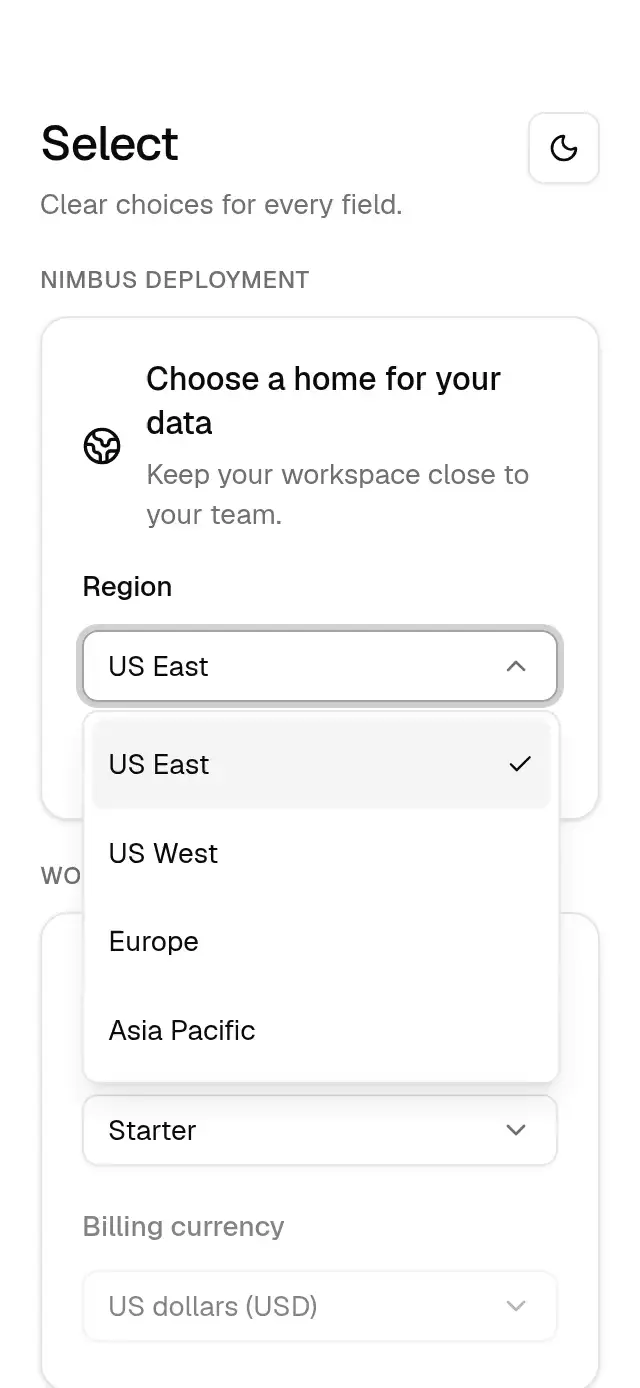
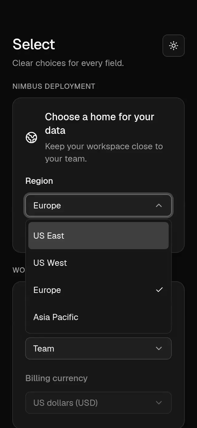
A select field with an anchored option list and configurable options, placeholder, label, and theme.
How it works
- The 36 pt field uses the shared input surface, border, shadow, and a 3 pt focus ring while open.
- The chevron rotates 180° with the 300/30 selection spring, mass 1.
- The list measures the trigger and matches its width, flipping above it when needed.
- A 400/29 spring, mass 1, opens the panel from scale 0.8. Closing takes 150 ms, and selection calls onValueChange.
Install
npx nativeanimation add base-selectThe CLI also copies base-theme. Dependencies, if you copy by hand:
npx expo install react-native-reanimated react-native-gesture-handler react-native-worklets lucide-react-native react-native-svgWrap the host app in GestureHandlerRootView.
Usage
import { BaseSelect } from './base-select';

<BaseSelect
  label="Region"
  value={region}
  onValueChange={setRegion}
  options={[
    { value: 'us-east', label: 'US East' },
    { value: 'europe', label: 'Europe' },
  ]}
/><BaseSelect
label="Plan"
placeholder="Choose a plan"
value={plan}
onValueChange={setPlan}
options={[
{ value: 'starter', label: 'Starter', description: 'For personal projects' },
{ value: 'team', label: 'Team', description: 'For growing teams' },
{ value: 'enterprise', label: 'Enterprise', disabled: true },
]}
/>A transparent native Modal contains the list. It is clamped to the screen with an 8 pt margin, and long option lists scroll. The control owns no safe-area padding; place the field within your screen layout.
Wrap your app in BaseThemeProvider (from base-theme) to choose light/dark and an accent; without it, pieces use the light neutral theme. The theme prop overrides the provider. Load the font families declared in your theme once in the host app.
Props
| Prop | Type | Default | Description |
|---|---|---|---|
value | string | — | Selected option value (controlled). |
onValueChange | (value: string) => void | — | Called when an enabled option is selected. |
options | BaseSelectOption[] | — | Options with value, label, optional description and disabled. |
placeholder | string | 'Select an option' | Displayed when value has no matching option. |
label | string | — | Visible field label. |
disabled | boolean | false | Dims and blocks the control. |
open / onOpenChange | boolean / (open: boolean) => void | uncontrolled | Optional external open state. |
accessibilityLabel | string | label or placeholder | Accessible field name. |
theme | BaseTheme | provider | Overrides the shared family theme. |
style | StyleProp<ViewStyle> | — | Container style. |
testID | string | — | Stable test identifier. |
Compatibility
Expo SDK 58 · React Native 0.88 · Reanimated 4.7 · react-native-worklets 0.13. Runs on iOS, Android and web, in Expo Go and development builds. Part of Native Animation Base, a free family that shares one theme.
Accessibility
The trigger is a combobox with its expanded, disabled, and current value states. Options expose selected and disabled states. Outside taps, Android back, accessibility escape, and web Escape close the list. Enter/Space or arrow keys open it on web; Tab and Enter/Space navigate and choose options. Reduce Motion makes all transitions immediate.
Touch targets
Options are at least 48 dp tall on Android and 44 pt tall on iOS and 44 px tall on web. The field target is 48 dp tall on Android and 44 pt on iOS and 44 px on web. Longer lists scroll within the screen. Keep the field at least 48 dp wide on Android or 44 pt wide on iOS and 44 px wide on web. Leave enough room between neighboring fields for their full targets.
Part of a shared foundation
Use it in a screen
Compose Base Select with other Base components and a single shared theme. Ask your agent to read each API, then connect real navigation, state, and callbacks.
Go further.
Base covers the everyday. Choose a more expressive interaction when your app calls for it.
Vertical Range Window ↗
A vertical range control with independent handles and a draggable interval band, with configurable bounds, palette, and fonts.
Another way to solve this task · $9Document Corner Capture ↗
A document review tool with draggable corners and an image loupe, with configurable image, labels, palette, and fonts.
Source code
Loading public source…