About this animation
Related guides
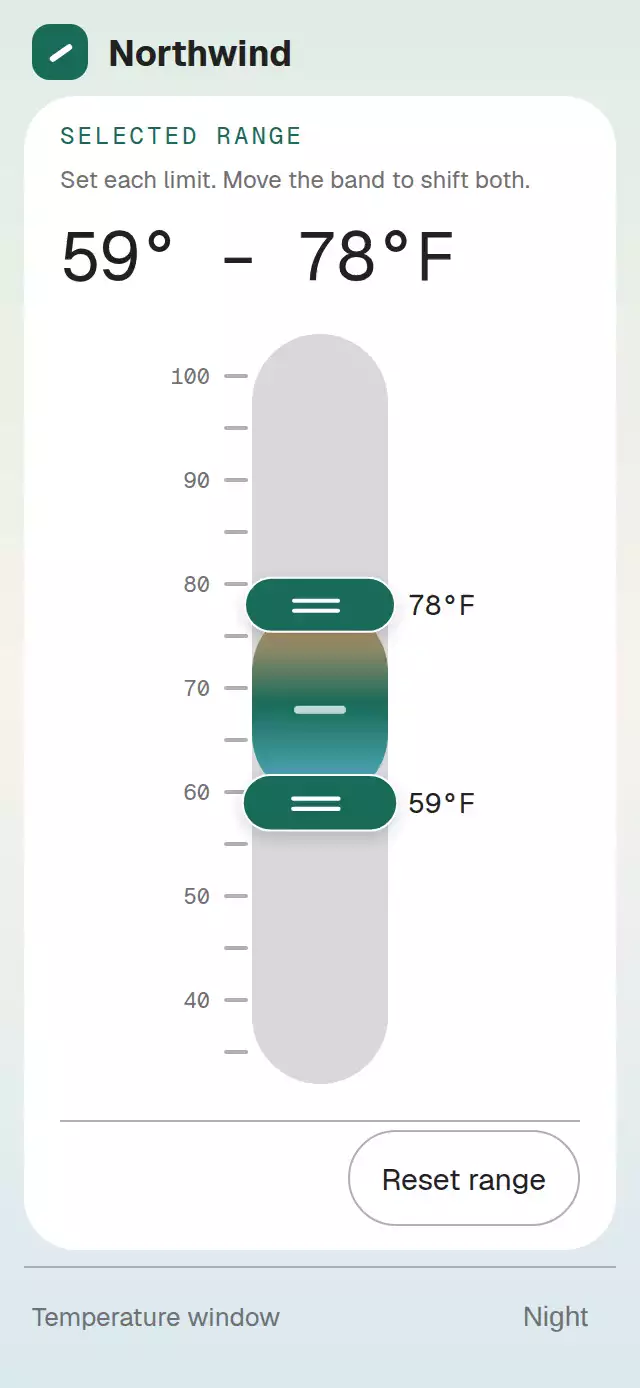
A vertical range control with independent handles and a draggable interval band, with configurable bounds, palette, and fonts.
How it works
- Normalize the domain and initial interval to
min,max,step,minSpan, andmaxSpan. Keep both endpoints together in one shared range value. - A handle drag changes its endpoint; a band drag moves the entire interval while preserving its span. Interaction state identifies the active minimum, maximum, or window.
- Send quantized provisional values through
onRangeChangeandonRangeRequest. On release, normalize the final interval and emit oneonRangeCommit; controlledrangeupdates remain authoritative. - Apply the same clamping and quantization to ref, keyboard, and accessibility actions. Animate the linked band and readout from the shared state, using final positions instead of springs with reduced motion.
Vertical range windows work for temperature, price, time, equalizer bands, and lighting. The host owns validation and persistence through the request and commit callbacks.
Install
Copy VerticalRangeWindow.tsx and index.ts into your project. Install dependencies with npx expo install expo-linear-gradient react-native-gesture-handler react-native-reanimated react-native-worklets. The component uses expo-linear-gradient, react-native-gesture-handler, react-native-reanimated, and react-native-worklets, already present in the host app. No images or additional assets are required.
Usage
<VerticalRangeWindow
  min={32}
  max={104}
  step={1}
  defaultRange={{ min: 52, max: 78 }}
  formatValue={(value) => `${value}°F`}
  onRangeChange={(next, meta) => preview(next, meta.reason)}
  onRangeCommit={(next) => save(next)}
  accessibilityLabel="Ambient temperature range"
/>
Props
| Prop | Type | Default | Description |
|---|---|---|---|
range | RangeValue | undefined | Controlled { min, max } interval. |
defaultRange | RangeValue | 34%–67% of the domain | Initial uncontrolled interval, clamped and quantized. |
min, max | number | Required | Domain bounds. |
step | number | 1 | Quantization step; invalid or nonpositive values use 1. |
minSpan | number | 0 | Minimum interval span. |
maxSpan | number | Infinity | Maximum span; nonfinite values resolve to the domain span. |
onRangeChange | (next: RangeValue, meta: RangeMeta) => void | undefined | Provisional and final changes. |
onRangeCommit | (next: RangeValue, meta: RangeMeta) => void | undefined | One final change per release, keyboard/accessibility adjustment, or reset. |
onRangeRequest | (next: RangeValue, meta: RangeMeta) => void | undefined | Receives the same proposals as onRangeChange for host validation. |
formatRange | (value: RangeValue) => string | undefined | Large readout; fallback joins formatted endpoints with an en dash. |
formatValue | (value: number, edge: RangeEdge) => string | String(value) | Formats each endpoint. |
labels | Partial<RangeLabels> | Built-in English labels | Minimum, Maximum, Window, disabled, error, instructions, and reset copy. |
palette | Partial<RangePalette> | Paper/Night palette | Semantic overrides, including rangeCool and rangeWarm for the gradient. |
motion | RangeMotion | undefined | reduce: true enables reduced motion in addition to the system preference. |
colorScheme | 'light' | 'dark' | 'auto' | undefined (Paper) | Only 'auto' follows the system; 'dark' selects Night. |
showDistribution | boolean | undefined (off) | Vary tick lengths with distribution values. |
distribution | readonly number[] | Built-in 12-value sequence | Optional tick distribution. |
fontFamily, titleFontFamily, monoFontFamily | string | undefined | Host-loaded font families; omitted values use platform fonts. titleFontFamily is declared but is not rendered by the current implementation. |
disabled | boolean | undefined (enabled) | Disable interaction. |
error | string | undefined | Display an error and disable interaction. |
style | StyleProp<ViewStyle> | undefined | Root styling. |
testID | string | undefined | Root identifier; child controls use vertical-range-window as the fallback prefix. |
accessibilityLabel | string | labels.window ('Selected range') | Root accessibility label. |
RangeMeta contains reason, active, and requestId. The ref exposes setRange(next, active?), focusEdge, focusWindow, reset, and cancel. setRange defaults active to 'window', animates to the normalized interval, and emits change/request callbacks without a commit. reset commits the normalized initial interval. Values are clamped and quantized before callbacks.
Compatibility
Targets Expo SDK 58, React Native 0.88.0, Reanimated 4.7.1 with Worklets 0.13.0, Gesture Handler 3.3, and Expo Linear Gradient 58.0.3. Supports iOS, Android, and web with Expo Go-compatible native dependencies. The host must provide GestureHandlerRootView. The component adapts to its measured container and applies no safe-area padding.
Accessibility
The minimum handle, maximum handle, and selected window expose adjustable controls. Handle labels combine labels.min or labels.max with the formatted value; the window label includes both values. The root uses accessibilityLabel or labels.window. Increment/decrement actions move by one step; Escape cancels. Handles provide at least 48 dp targets, controls expose disabled state when disabled or showing an error, and errors use a polite live region. The range text redundantly communicates the current interval. Reduced Motion applies final positions without springs and fades the changing readout.