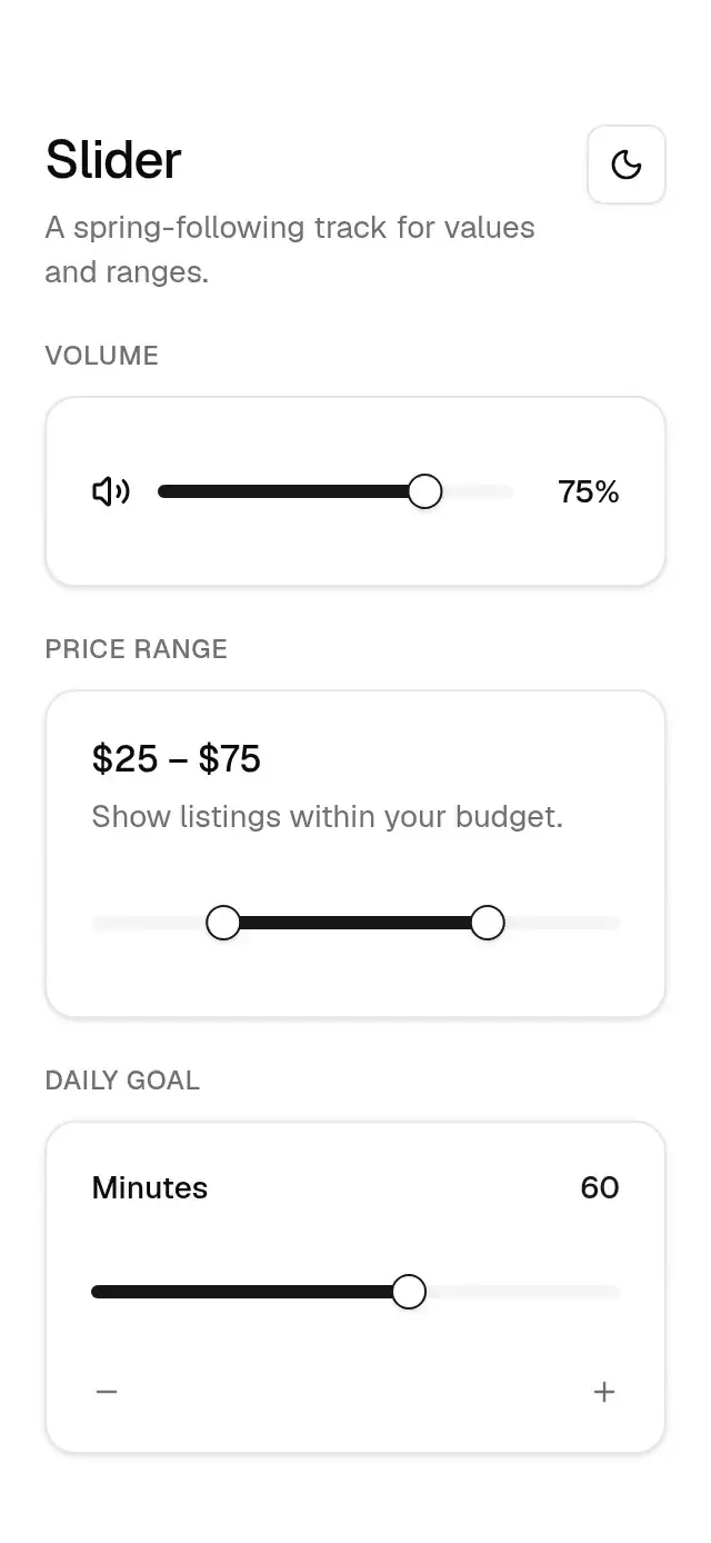
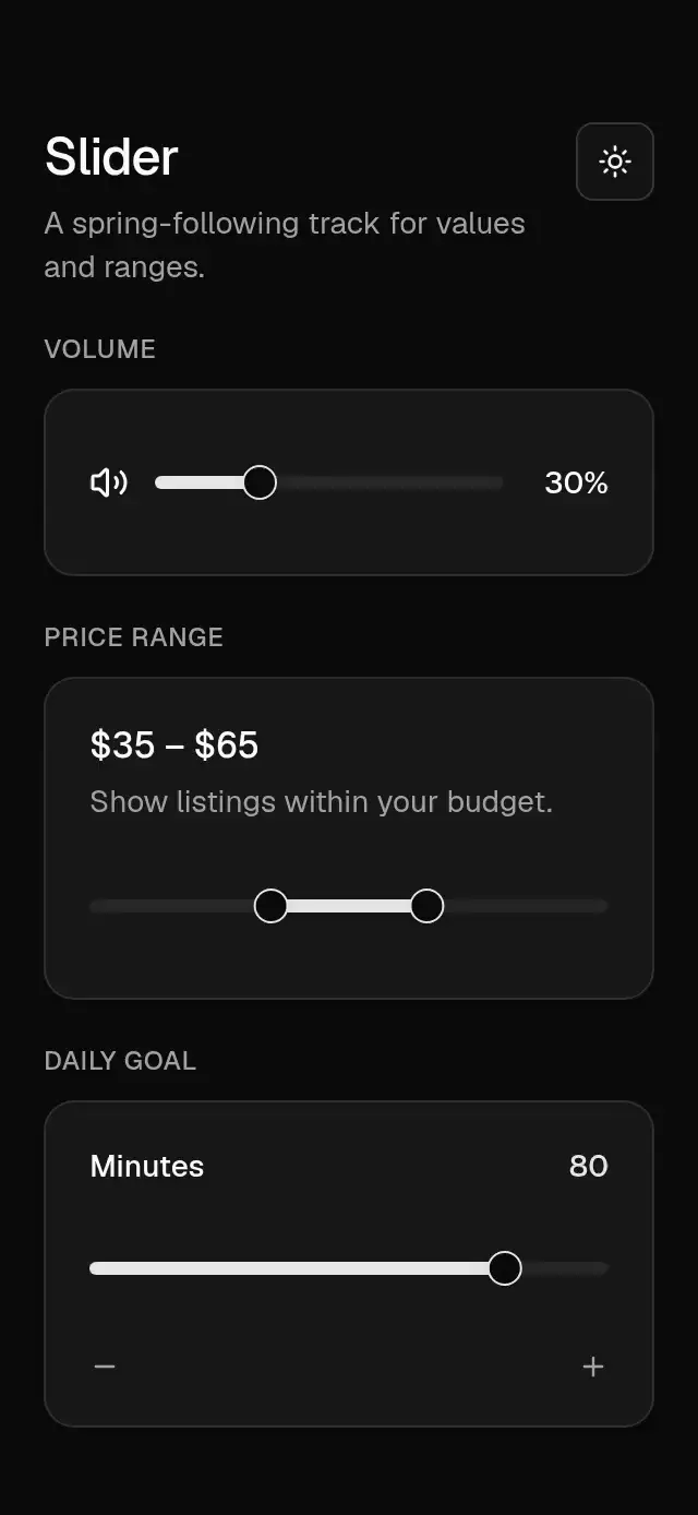
import Animated, {
  ReduceMotion,
  useAnimatedStyle,
  useSharedValue,
  withSpring,
  withTiming,
} from 'react-native-reanimated';
import {
  useBaseReducedMotion,
  alpha,
  spring,
  timing,
  useBaseTheme,
  type BaseTheme,
} from '../base-theme';
import React, { useEffect, useMemo, useState } from 'react';
import {
  Platform,
  View,
  type AccessibilityActionEvent,
  type LayoutChangeEvent,
  type StyleProp,
  type ViewStyle,
} from 'react-native';
import { Gesture, GestureDetector } from 'react-native-gesture-handler';
import { scheduleOnRN } from 'react-native-worklets';

export type BaseSliderValue = number | [number, number];
export type BaseSliderProps = {
  value?: BaseSliderValue;
  defaultValue?: BaseSliderValue;
  onValueChange?: (value: BaseSliderValue) => void;
  onValueCommit?: (value: BaseSliderValue) => void;
  min?: number;
  max?: number;
  step?: number;
  disabled?: boolean;
  accessibilityLabel?: string;
  theme?: BaseTheme;
  testID?: string;
  style?: StyleProp<ViewStyle>;
};

const TRACK_HEIGHT = 6;
const THUMB_SIZE = 16;

function clamp(value: number, min: number, max: number) {
  'worklet';
  return Math.max(min, Math.min(max, value));
}
function quantize(value: number, min: number, max: number, step: number) {
  'worklet';
  return clamp(min + Math.round((value - min) / step) * step, min, max);
}

export function BaseSlider({
  value: controlled,
  defaultValue = 0,
  onValueChange,
  onValueCommit,
  min = 0,
  max = 100,
  step = 1,
  disabled = false,
  accessibilityLabel = 'Slider',
  theme: override,
  testID,
  style,
}: BaseSliderProps) {
  const theme = useBaseTheme(override);
  const reduced = useBaseReducedMotion();
  const range = Array.isArray(controlled ?? defaultValue);
  const source = controlled ?? defaultValue;
  const initial = Array.isArray(source)
    ? ([source[0], source[1]] as [number, number])
    : ([source as number, 0] as [number, number]);
  const normalizedInitial: [number, number] =
    range && initial[1] === 0 ? [initial[0], initial[0]] : initial;
  const [internal, setInternal] = useState<BaseSliderValue>(
    controlled ??
      (range
        ? [normalizedInitial[0], normalizedInitial[1]]
        : normalizedInitial[0]),
  );
  const current = controlled ?? internal;
  const values = useMemo(
    () => (Array.isArray(current) ? current : [current]),
    [current],
  );
  const isRange = Array.isArray(current);
  const width = useSharedValue(0);
  const positions = useMemo(
    () => values.map((item) => (max === min ? 0 : (item - min) / (max - min))),
    [max, min, values],
  );
  const left = useSharedValue(positions[0] ?? 0);
  const right = useSharedValue(positions[1] ?? positions[0] ?? 0);
  const leftWidth = useSharedValue(THUMB_SIZE);
  const rightWidth = useSharedValue(THUMB_SIZE);
  const ringLeft = useSharedValue(0);
  const ringRight = useSharedValue(0);
  const active = useSharedValue(0);
  const lastStep = useSharedValue(Number.NaN);

  useEffect(() => {
    left.set(
      reduced
        ? (positions[0] ?? 0)
        : withSpring(positions[0] ?? 0, {
            reduceMotion: ReduceMotion.Never,
            stiffness: 400,
            damping: 32,
            mass: 1,
          }),
    );
    if (isRange)
      right.set(
        reduced
          ? (positions[1] ?? 0)
          : withSpring(positions[1] ?? 0, {
              reduceMotion: ReduceMotion.Never,
              stiffness: 400,
              damping: 32,
              mass: 1,
            }),
      );
  }, [isRange, left, positions, reduced, right, theme]);

  const valueAt = (progress: number, thumb: number): BaseSliderValue => {
    'worklet';
    const next = quantize(min + progress * (max - min), min, max, step);
    if (!isRange) return next;
    const other = thumb === 0 ? values[1] : values[0];
    return thumb === 0
      ? [Math.min(next, other), other]
      : [other, Math.max(next, other)];
  };
  const publish = (next: BaseSliderValue) => {
    if (controlled === undefined) setInternal(next);
    onValueChange?.(next);
  };
  const publishCommit = (next: BaseSliderValue) => onValueCommit?.(next);
  const chooseThumb = (progress: number) => {
    'worklet';
    return !isRange ||
      Math.abs(progress - left.get()) <= Math.abs(progress - right.get())
      ? 0
      : 1;
  };
  const setProgress = (progress: number, thumb: number) => {
    'worklet';
    const clamped = Math.max(0, Math.min(1, progress));
    const target = thumb === 0 ? left : right;
    target.set(
      reduced
        ? clamped
        : withSpring(clamped, {
            reduceMotion: ReduceMotion.Never,
            stiffness: 400,
            damping: 32,
            mass: 1,
          }),
    );
    const next = quantize(min + clamped * (max - min), min, max, step);
    if (next !== lastStep.get()) {
      lastStep.set(next);
      const payload = valueAt(clamped, thumb);
      scheduleOnRN(publish, payload);
    }
  };
  const finish = (thumb: number) => {
    'worklet';
    const progress = thumb === 0 ? left.get() : right.get();
    scheduleOnRN(publishCommit, valueAt(progress, thumb));
  };
  const trackPan = Gesture.Pan()
    .enabled(!disabled)
    .minDistance(4)
    .onBegin((event) => {
      const progress = width.get() <= 0 ? 0 : event.x / width.get();
      const thumb = chooseThumb(progress);
      active.set(thumb + 1);
      if (!reduced) {
        (thumb === 0 ? leftWidth : rightWidth).set(
          withSpring(THUMB_SIZE * theme.motion.stretch, spring(theme, 'thumb')),
        );
        (thumb === 0 ? ringLeft : ringRight).set(
          withTiming(1, timing(theme, 'color')),
        );
      }
      setProgress(progress, thumb);
    })
    .onUpdate((event) => {
      const thumb = Math.max(0, active.get() - 1);
      setProgress(width.get() <= 0 ? 0 : event.x / width.get(), thumb);
    })
    .onFinalize(() => {
      const thumb = Math.max(0, active.get() - 1);
      (thumb === 0 ? leftWidth : rightWidth).set(
        reduced ? THUMB_SIZE : withSpring(THUMB_SIZE, spring(theme, 'thumb')),
      );
      (thumb === 0 ? ringLeft : ringRight).set(
        withTiming(0, timing(theme, 'color', reduced)),
      );
      finish(thumb);
      active.set(0);
    });
  const trackTap = Gesture.Tap()
    .enabled(!disabled)
    .onEnd((event) => {
      const progress = width.get() <= 0 ? 0 : event.x / width.get();
      const thumb = chooseThumb(progress);
      setProgress(progress, thumb);
      finish(thumb);
    });
  const gesture = Gesture.Exclusive(trackPan, trackTap);

  const leftStyle = useAnimatedStyle(() => ({
    width: leftWidth.get(),
    transform: [{ translateX: left.get() * width.get() - leftWidth.get() / 2 }],
  }));
  const rightStyle = useAnimatedStyle(() => ({
    width: rightWidth.get(),
    transform: [
      { translateX: right.get() * width.get() - rightWidth.get() / 2 },
    ],
  }));
  const leftRing = useAnimatedStyle(() => ({
    width: leftWidth.get() + 8,
    height: leftWidth.get() + 8,
    opacity: ringLeft.get(),
  }));
  const rightRing = useAnimatedStyle(() => ({
    width: rightWidth.get() + 8,
    height: rightWidth.get() + 8,
    opacity: ringRight.get(),
  }));
  const fillStyle = useAnimatedStyle(() => {
    const start = isRange ? left.get() : 0;
    const end = isRange ? right.get() : left.get();
    return {
      left: `${start * 100}%`,
      width: `${Math.max(0, end - start) * 100}%`,
    };
  });
  const onLayout = (event: LayoutChangeEvent) =>
    width.set(event.nativeEvent.layout.width);
  const adjust = (direction: number) => {
    if (disabled) return;
    const currentValue = values[0];
    const next = quantize(currentValue + direction * step, min, max, step);
    publish(isRange ? [next, values[1]] : next);
  };
  const onAccessibilityAction = (event: AccessibilityActionEvent) => {
    if (event.nativeEvent.actionName === 'increment') adjust(1);
    if (event.nativeEvent.actionName === 'decrement') adjust(-1);
  };
  return (
    <GestureDetector gesture={gesture}>
      <View
        testID={testID}
        accessible
        accessibilityRole="adjustable"
        accessibilityLabel={accessibilityLabel}
        accessibilityValue={{ min, max, now: values[0] }}
        accessibilityState={{ disabled }}
        aria-disabled={disabled}
        aria-valuemin={min}
        aria-valuemax={max}
        aria-valuenow={values[0]}
        {
          /* RN Web forwards DOM events rather than native event objects. */
          ...((Platform.OS === 'web'
            ? {
                tabIndex: disabled ? -1 : 0,
                onKeyDownCapture: (event: React.KeyboardEvent) => {
                  if (
                    [
                      'ArrowRight',
                      'ArrowUp',
                      'ArrowLeft',
                      'ArrowDown',
                      'Enter',
                      ' ',
                    ].includes(event.key)
                  ) {
                    event.preventDefault();
                    event.stopPropagation();
                    adjust(
                      event.key === 'ArrowLeft' || event.key === 'ArrowDown'
                        ? -1
                        : 1,
                    );
                  }
                },
              }
            : {}) as object)
        }
        accessibilityActions={[{ name: 'increment' }, { name: 'decrement' }]}
        onAccessibilityAction={onAccessibilityAction}
        onLayout={onLayout}
        style={[
          {
            height: Platform.OS === 'android' ? 48 : 44,
            marginVertical: Platform.OS === 'android' ? -2 : 0,
            width: '100%',
            justifyContent: 'center',
            opacity: disabled ? 0.5 : 1,
          },
          style,
        ]}
      >
        <View
          style={{
            height: TRACK_HEIGHT,
            borderRadius: theme.radius.full,
            backgroundColor: theme.colors.muted,
            overflow: 'hidden',
          }}
        >
          <Animated.View
            style={[
              {
                position: 'absolute',
                top: 0,
                bottom: 0,
                backgroundColor: theme.colors.primary,
              },
              fillStyle,
            ]}
          />
        </View>
        <Animated.View
          pointerEvents="none"
          style={[
            {
              position: 'absolute',
              top: Platform.OS === 'android' ? 16 : 14,
              left: 0,
              height: THUMB_SIZE + 8,
              borderRadius: theme.radius.full,
              backgroundColor: alpha(theme.colors.ring, 0.2),
            },
            leftRing,
          ]}
        />
        {isRange ? (
          <Animated.View
            pointerEvents="none"
            style={[
              {
                position: 'absolute',
                top: Platform.OS === 'android' ? 16 : 14,
                left: 0,
                height: THUMB_SIZE + 8,
                borderRadius: theme.radius.full,
                backgroundColor: alpha(theme.colors.ring, 0.2),
              },
              rightRing,
            ]}
          />
        ) : null}
        <Animated.View
          testID={testID ? `${testID}-thumb` : undefined}
          style={[
            {
              position: 'absolute',
              left: 0,
              top: Platform.OS === 'android' ? 16 : 14,
              height: THUMB_SIZE,
              borderRadius: theme.radius.full,
              borderWidth: 1,
              borderColor: theme.colors.primary,
              backgroundColor: theme.colors.background,
              boxShadow: theme.shadow.sm,
            },
            leftStyle,
          ]}
        />
        {isRange ? (
          <Animated.View
            style={[
              {
                position: 'absolute',
                left: 0,
                top: Platform.OS === 'android' ? 16 : 14,
                height: THUMB_SIZE,
                borderRadius: theme.radius.full,
                borderWidth: 1,
                borderColor: theme.colors.primary,
                backgroundColor: theme.colors.background,
                boxShadow: theme.shadow.sm,
              },
              rightStyle,
            ]}
          />
        ) : null}
      </View>
    </GestureDetector>
  );
}

export default BaseSlider;