import Animated, {
  ReduceMotion,
  interpolate,
  useAnimatedStyle,
  useSharedValue,
  withSpring,
  withTiming,
} from 'react-native-reanimated';
import {
  baseActivationProps,
  useBaseReducedMotion,
  spring,
  timing,
  useBaseTheme,
  type BaseTheme,
} from '../base-theme';
import React, { useEffect, useState } from 'react';
import {
  Platform,
  Text,
  View,
  type StyleProp,
  type ViewStyle,
} from 'react-native';
import { Gesture, GestureDetector } from 'react-native-gesture-handler';
import { scheduleOnRN } from 'react-native-worklets';

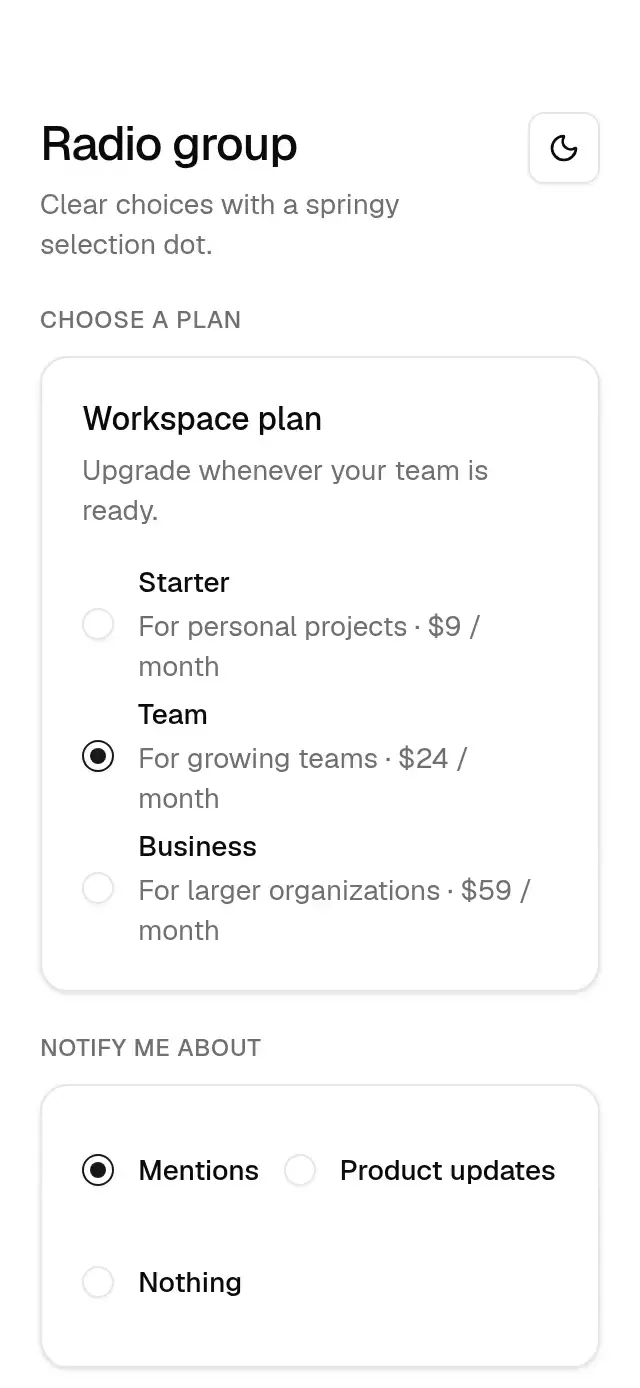
export type BaseRadioOption = {
  value: string;
  label: string;
  description?: string;
  disabled?: boolean;
};
export type BaseRadioProps = {
  value: string;
  selected?: boolean;
  onPress?: (value: string) => void;
  label: string;
  description?: string;
  disabled?: boolean;
  theme?: BaseTheme;
  testID?: string;
  style?: StyleProp<ViewStyle>;
};

function RadioDot({
  selected,
  theme,
  reduced,
}: {
  selected: boolean;
  theme: BaseTheme;
  reduced: boolean;
}) {
  const progress = useSharedValue(selected ? 1 : 0);
  useEffect(() => {
    progress.set(
      selected
        ? reduced
          ? 1
          : withSpring(1, {
              reduceMotion: ReduceMotion.Never,
              stiffness: 200,
              damping: 16,
              mass: 1,
            })
        : reduced
          ? 0
          : withTiming(0, timing(theme, 'panelOut', reduced)),
    );
  }, [progress, reduced, selected, theme]);
  const style = useAnimatedStyle(() => ({
    transform: [{ scale: interpolate(progress.get(), [0, 1], [0, 1]) }],
    opacity: progress.get(),
  }));
  return (
    <Animated.View
      style={[
        {
          width: 8,
          height: 8,
          borderRadius: theme.radius.full,
          backgroundColor: theme.colors.primary,
        },
        style,
      ]}
    />
  );
}

export function BaseRadio({
  value,
  selected = false,
  onPress,
  label,
  description,
  disabled = false,
  theme: override,
  testID,
  style,
}: BaseRadioProps) {
  const theme = useBaseTheme(override);
  const reduced = useBaseReducedMotion();
  const pressed = useSharedValue(1);
  const tap = Gesture.Tap()
    .enabled(!disabled)
    .onBegin(() => {
      if (!reduced)
        pressed.set(
          withSpring(theme.motion.scales.choice, spring(theme, 'press')),
        );
    })
    .onFinalize(() =>
      pressed.set(reduced ? 1 : withSpring(1, spring(theme, 'press'))),
    )
    .onEnd((_event, success) => {
      if (success && onPress) scheduleOnRN(onPress, value);
    });
  const rowStyle = useAnimatedStyle(() => ({
    transform: [{ scale: pressed.get() }],
  }));
  return (
    <GestureDetector gesture={tap}>
      <Animated.View
        testID={testID}
        accessible
        accessibilityRole="radio"
        accessibilityState={{ checked: selected, disabled }}
        aria-checked={selected}
        aria-disabled={disabled}
        {
          /* RN Web forwards DOM events rather than native event objects. */
          ...(baseActivationProps(() => onPress?.(value), disabled) as object)
        }
        accessibilityLabel={label}
        style={[
          {
            minHeight: Platform.OS === 'android' ? 48 : 44,
            minWidth: Platform.OS === 'android' ? 48 : 44,
            flexDirection: 'row',
            alignItems: 'center',
            gap: 12,
            opacity: disabled ? 0.5 : 1,
          },
          style,
          rowStyle,
        ]}
      >
        <View
          style={{
            width: 16,
            height: 16,
            borderRadius: theme.radius.full,
            borderWidth: 1,
            borderColor: selected ? theme.colors.primary : theme.colors.input,
            backgroundColor: theme.colors.inputSurface,
            boxShadow: theme.shadow.xs,
            alignItems: 'center',
            justifyContent: 'center',
          }}
        >
          <RadioDot selected={selected} theme={theme} reduced={reduced} />
        </View>
        <View style={{ flex: 1, minWidth: 0, gap: description ? 2 : 0 }}>
          <Text
            style={{
              fontFamily: theme.fonts.medium,
              fontSize: 14,
              lineHeight: 20,
              color: theme.colors.foreground,
            }}
          >
            {label}
          </Text>
          {description ? (
            <Text
              style={{
                fontFamily: theme.fonts.regular,
                fontSize: 14,
                lineHeight: 20,
                color: theme.colors.mutedForeground,
              }}
            >
              {description}
            </Text>
          ) : null}
        </View>
      </Animated.View>
    </GestureDetector>
  );
}

export type BaseRadioGroupProps = {
  value?: string;
  defaultValue?: string;
  onValueChange?: (value: string) => void;
  options: BaseRadioOption[];
  orientation?: 'horizontal' | 'vertical';
  theme?: BaseTheme;
  testID?: string;
  accessibilityLabel?: string;
  style?: StyleProp<ViewStyle>;
};

export function BaseRadioGroup({
  value: controlled,
  defaultValue,
  onValueChange,
  options,
  orientation = 'vertical',
  theme: override,
  testID,
  accessibilityLabel = 'Radio options',
  style,
}: BaseRadioGroupProps) {
  const theme = useBaseTheme(override);
  const [internal, setInternal] = useState(defaultValue ?? '');
  const value = controlled ?? internal;
  const change = (next: string) => {
    if (controlled === undefined) setInternal(next);
    onValueChange?.(next);
  };
  return (
    <View
      testID={testID}
      accessibilityRole="radiogroup"
      accessibilityLabel={accessibilityLabel}
      style={[
        {
          gap: orientation === 'vertical' ? 4 : 12,
          flexDirection: orientation === 'horizontal' ? 'row' : 'column',
          flexWrap: orientation === 'horizontal' ? 'wrap' : undefined,
        },
        style,
      ]}
    >
      {options.map((option) => (
        <BaseRadio
          key={option.value}
          {...option}
          value={option.value}
          selected={value === option.value}
          onPress={change}
          theme={theme}
          testID={testID ? `${testID}-${option.value}` : undefined}
        />
      ))}
    </View>
  );
}

export default BaseRadioGroup;