About this component
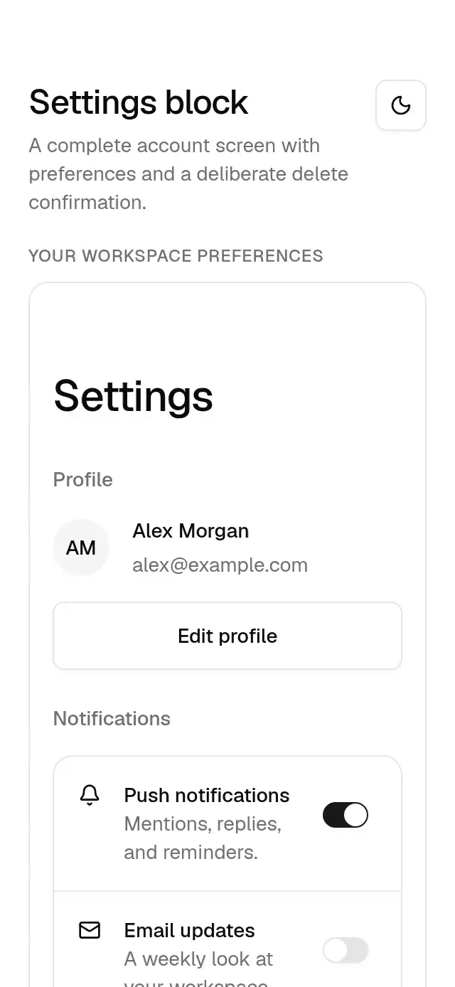
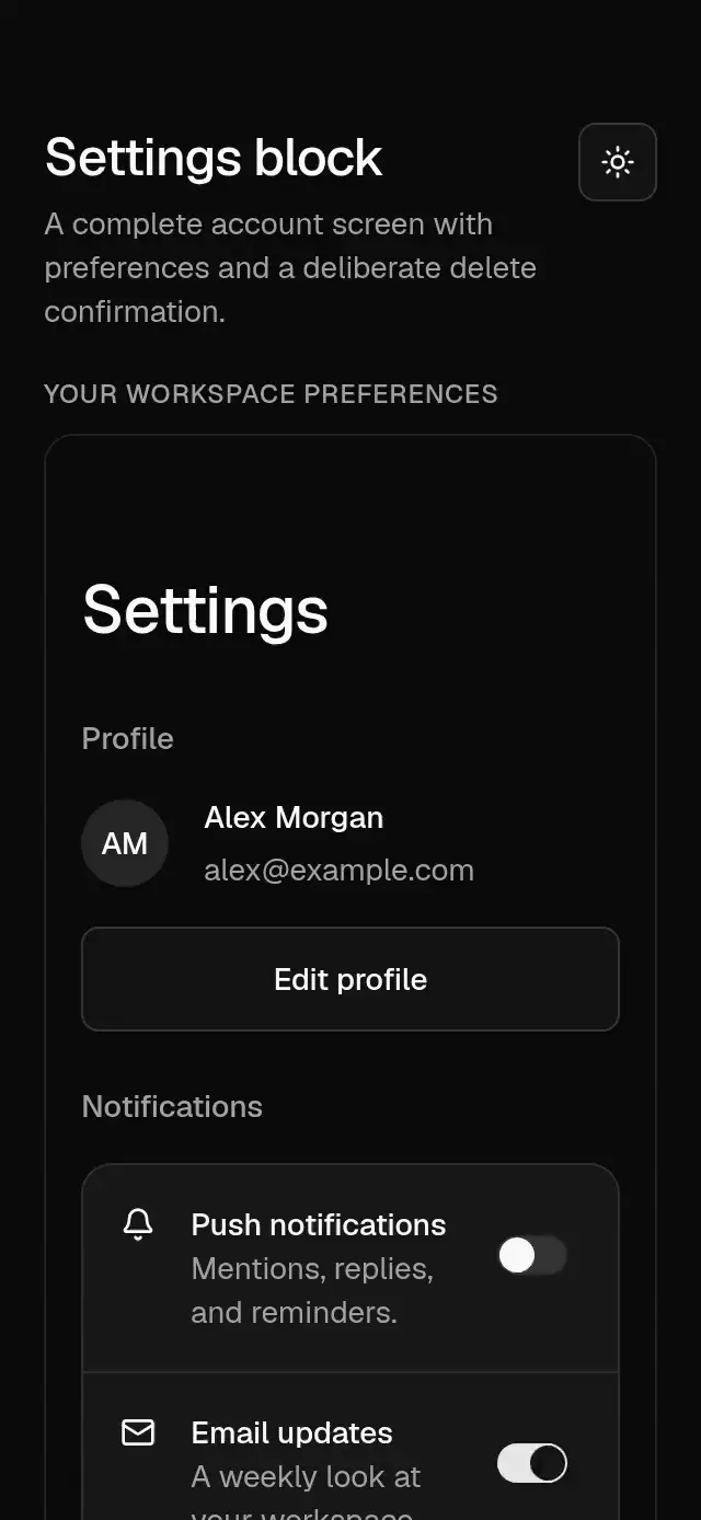
An account settings screen with configurable profile data, notification preferences, language and appearance choices, destructive confirmation, copy, callbacks, loading, errors, insets, and theme.
How it works
- Composes a large scroll-aware header, avatar profile, list rows with notification switches, a language select, appearance toggles, and a destructive confirmation dialog.
- Sections reveal over 300 ms on the theme out curve, staggered by 30 ms, from opacity 0 and a 6 pt vertical offset.
- Header border/title handoff follows a shared scroll value on the UI thread without React updates per frame.
- Every preference change emits the full next values. Appearance is a preference: the host chooses how to apply light/dark/system and persists values if needed.
- Profile editing and account deletion are host callbacks. The delete action only calls the host after confirmation; the dialog can be controlled, held busy, or display a host error.
Install
npx nativeanimation add base-settings-blockThe CLI copies the exact family modules listed in registryDependencies, including their transitive dependencies. To copy by hand, copy those modules too and install their native packages with:
npx expo install react-native-gesture-handler react-native-reanimated react-native-worklets lucide-react-native react-native-svgMount GestureHandlerRootView at the app root. Load the Geist regular and medium fonts once, or supply your own font names through the theme. Free forever. MIT.
Usage
import { BaseSettingsBlock } from './base-settings-block';

<BaseSettingsBlock
  profile={{ name: 'Alex Morgan', email: 'alex@example.com', initials: 'AM' }}
  values={preferences}
  onValuesChange={setPreferences}
  onEditProfile={openProfileEditor}
  deleteOpen={deleteOpen}
  onDeleteOpenChange={setDeleteOpen}
  onDeleteAccount={deleteAccount}
  deleting={deleting}
  deleteError={deleteError}
  insets={insets}
/>
Wrap your app in BaseThemeProvider from base-theme to choose light/dark and neutral, blue, green, or violet accents. A theme prop overrides the provider and is inherited by nested controls, sheets, and dialogs. Place the block inside a bounded container with flex: 1; screens scroll vertically when space is limited. Supply safe-area insets from the host.
SettingsValues contains push, email, language, and appearance. The appearance preference does not change the shared provider automatically: apply your app theme in onValuesChange. Close a controlled delete dialog after successful deletion; keep it open with deleteError after failure.
Use with an agent
Use Native Animation MCP to add base-settings-block with a profile, notification switches, language and theme preferences, and delete-account confirmation.
Props
| Prop | Type | Default | Description |
|---|---|---|---|
copy | Partial<copy> | Northwind copy | All section titles, descriptions, dialog labels, accessible names, and version. |
profile | SettingsProfile | Alex Morgan / alex@example.com / AM | Name, email, initials, and optional avatar source. |
values / defaultValues | SettingsValues / Partial<SettingsValues> | push=true, email=false, first language, system | Controlled or initial preferences. |
onValuesChange | (values: SettingsValues) => void | — | Host applies and persists preferences. |
languages | BaseSelectOption[] | English (US), Spanish, French | Caller-owned value/label options. |
appearances | BaseToggleItem[] | Light / Dark / System | Caller-owned values, labels, and optional icons. |
icons | { push?, email?, language?, danger?: ReactNode } | — | Optional row icons. |
onEditProfile | () => void | — | Requests the host profile editor. |
deleteOpen / onDeleteOpenChange | boolean / (open: boolean) => void | local false | Optional controlled confirmation visibility. |
onDeleteAccount | () => void | — | Called only after the destructive confirmation. |
deleting / deleteError | boolean / string | false / — | Busy state and error inside the confirmation dialog. |
insets | { top?: number; bottom?: number } | 0 / 0 | Host safe-area insets; no internal SafeAreaView. |
theme | BaseTheme | nearest provider | Full shared theme override inherited by every nested control. |
onBack / backLabel | () => void / string | — / Back | Optional host back action and its accessible name. |
loading / error | boolean / string | false / — | Host pending state and failure message. |
testID | string | piece ID | Stable identifier on the screen primary action. |
style | StyleProp<ViewStyle> | flex: 1 | Container override. |
copy supports these keys: title, profile, editProfile, notifications, push, pushDescription, email, emailDescription, preferences, language, theme, languagePlaceholder, danger, deleteAccount, deleteDescription, deleteTitle, deleteWarning, cancel, confirm, close, errorTitle, version, loading, back. Unspecified keys keep the generic English defaults. Icons and content remain caller-owned.
Compatibility
Expo SDK 58 · React Native 0.88 · Reanimated 4.7 · react-native-worklets 0.13. Targets iOS, Android, and web, in Expo Go and development builds. Native bundle compilation does not replace device interaction testing. Part of Native Animation Base. Free forever. MIT. No router, network, or storage dependency.
Go further
- drilldown-settings-nav for nested settings navigation.
- inline-edit-profile for an in-place profile editor.
Accessibility
Rows containing interactive switches stay nonpressable, preserving separate semantics. Profile text wraps; select and appearance controls expose selected values. Header actions and buttons have named touch targets. The alert dialog is nondismissible while deleting. Reduce Motion removes reveal shifts and header title displacement.
Part of a shared foundation
Use it in a screen
Compose Base Settings Block with other Base components and a single shared theme. Ask your agent to read each API, then connect real navigation, state, and callbacks.
Go further.
Base covers the everyday. Choose a more expressive interaction when your app calls for it.
Stacked Category Cards ↗
A category stack whose tabs unfold into detail cards, with configurable categories, title, colors, and fonts.
Another way to solve this task · $9Review Approval Card ↗
A moderation queue with swipe-to-approve or decline feedback, with configurable reviews, labels, colors, and fonts.
Source code
Loading public source…